Choosing shadow and tree plan blocks for a landscape presentation
How to pick and place shadow-and-tree plan CAD blocks so a landscape presentation drawing reads with real depth, scale and light direction.
Sumana KumarUpdated 5 May 20265 min read
Why shadow and tree blocks get chosen together
A tree in plan view without a shadow is just a circle, and once you've noticed that you can't unsee it on a lot of landscape presentation drawings, because a canopy outline alone gives almost no information about height or the quality of light falling across the site. Pairing every tree plan block with a corresponding shadow block, cast in a single consistent direction across the whole site plan, is what turns a collection of green circles into something that actually reads as a landscape someone could stand in.
This matters more on landscape and site presentation drawings than almost anywhere else in a project set, because so much of what a landscape design is actually selling, shade, dappled light, a sense of enclosure under a canopy, is invisible in plan view unless shadow is doing the work of implying it. I keep coming back to this on client-facing landscape work specifically, because clients evaluating a planting scheme are almost always picturing themselves standing under that shade, and a flat unshaded circle just doesn't trigger that association the way a proper cast shadow does.
Picking the right tree block for canopy scale
Tree plan blocks vary enormously in represented canopy diameter, and matching that to the actual species and maturity you're designing for matters for credibility, a mature pine or oak canopy typically shows somewhere in the range of 4000mm to 8000mm across in plan depending on species and age, while a young or ornamental tree might read closer to 2000mm to 3000mm. Using an oversized canopy block to make a sparse planting scheme look fuller is a shortcut that reads as dishonest to anyone who actually knows landscape scale, usually a landscape architect on the review side, so it's worth resisting even when a thin planting plan feels underwhelming on the page.
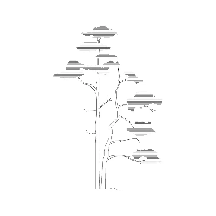
The pine elevation block and its plan-view counterparts are useful here specifically because they're drawn at a believable scale relationship between trunk, canopy and represented height, which keeps the whole planting plan internally consistent once you start repeating the same block across a site.
Getting shadow direction and length consistent
Pick one light direction for the entire drawing before placing a single shadow block, typically northwest to northeast depending on your latitude and the time of day you're representing, and stick to it across every tree, structure and piece of site furniture on the plan. Shadow length should scale roughly with canopy height too, a mature tree casts a proportionally longer shadow than a young ornamental one at the same sun angle, so resist the temptation to use one generic shadow size copied under every tree regardless of its actual height.
The fastest way I've found to catch inconsistent shadows before a review is to zoom out to the full site scale and squint, quite literally, since at a glance any shadow pointing the wrong direction jumps out immediately even if it's easy to miss while you're zoomed into one corner of the plan doing the actual placement work. If the site plan shows a building alongside the landscape, check that building shadows and tree shadows share the exact same direction and rough proportion too, since a mismatch between architectural and landscape shadow conventions is a common seam where two people working on different parts of the same drawing didn't coordinate before merging their work.
Layering shadow blocks without muddying the plan
Shadows need to sit on their own layer beneath the tree canopy and furniture layers but above the hardscape and paving layer, so they read as falling across the ground plane rather than floating above it or disappearing beneath paving patterns. Keep the shadow fill a light, semi-transparent gray or a simple light hatch rather than a solid dark fill, since a heavy shadow block can end up reading as a dark paved area or a water feature by mistake, which genuinely happens more often than you'd expect on a busy site plan.
Where trees overlap and their shadows would naturally overlap too, let that happen rather than manually trimming shadows to avoid overlap, since overlapping shadow is itself a scale cue, it tells the viewer the trees are close enough together that their canopies interact, which is exactly the kind of spatial information a landscape presentation drawing should be communicating.
Pulling it together with figures for scale
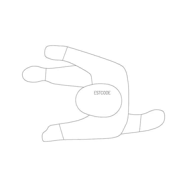
Once tree and shadow blocks are placed and consistent, add a small number of human figure plan blocks near key gathering areas, a seating court, a path junction, since figures do more to establish real-world scale on a landscape plan than dimension strings alone, most viewers process human scale intuitively in a way they don't process a printed number. Keep the figure count modest, the same restraint that applies to entourage on a building plan applies here, and let the trees and shadow work carry most of the atmospheric load.
The combination, correctly scaled tree canopies, one consistent shadow direction, a handful of figures at gathering points, is honestly most of what separates a landscape plan that reads as a real place from one that reads as a diagram with some green circles scattered on it, and none of it requires anything beyond careful, consistent use of blocks that are already sitting in a well-organized library.
Seasonal and species variation worth planning for
If a landscape presentation is meant to show a planting scheme across seasons, or if the design mixes deciduous and evergreen species in a meaningful way, that's worth reflecting through block choice rather than treating every tree on the plan identically. A deciduous canopy block with a lighter, more open fill reads appropriately different from a dense evergreen canopy, and if the presentation set includes a winter condition alongside a summer one, swapping in a bare-branch version of a deciduous tree for the winter sheet communicates something genuinely useful about how the space will actually feel and function through the year, especially for shade and privacy considerations that shift seasonally.
This extra layer of detail isn't necessary for every landscape presentation, a straightforward site plan often doesn't need seasonal variants, but for a design where seasonal change is actually part of the pitch, showing that variation through consistent, correctly matched block choices does more to communicate the design intent than a single static planting plan ever could on its own.
Further reading
Questions
Frequently asked
Should every tree plan block have a matching shadow block?+
Yes for a presentation drawing, since a canopy outline alone gives almost no sense of height or light. A consistently cast shadow is one of the fastest ways to make a landscape plan read as a real place rather than a diagram.
What canopy size is realistic for a mature tree in plan view?+
It varies by species and age, but a mature pine or oak typically reads somewhere in the range of 4000mm to 8000mm across in plan, while a young or ornamental tree is often closer to 2000mm to 3000mm.
How do I keep shadow direction consistent across a whole site plan?+
Pick one light direction before placing any shadow blocks and apply it to every tree, structure and piece of site furniture on the plan. Zooming out to view the full site at once is the fastest way to spot a shadow pointing the wrong way.
Free downloads from this article

Free CAD block library
Download the blocks from this article — free, no signup