Picture frame CAD blocks: landscape vs portrait orientation
Landscape or portrait picture frame CAD blocks: how orientation, sizing, and grouping shape a convincing wall art elevation.
Saumyajit MaityUpdated 27 June 20265 min read
Orientation is the first decision, not the frame style
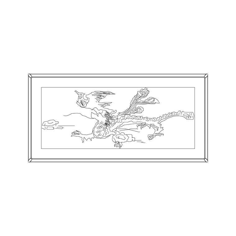
Before you even think about frame style, thin metal versus wide wood versus something ornate, the first real decision on a picture frame block is orientation, landscape or portrait, and it's a decision that gets skipped more often than it should because people just grab whatever frame block is sitting at the top of the library. Orientation controls how the frame occupies the wall, how it relates to the furniture beneath it, and honestly how balanced the whole elevation reads once you step back from it, so it deserves the same deliberate thought you'd give to choosing a curtain style or a clock.
It's a decision that compounds too, because once you've picked an orientation for the anchor piece on a wall, every supporting frame around it inherits that decision whether you intend it to or not, so getting the first frame right on a given wall segment saves you from reworking the whole grouping later once you realize the initial choice was fighting the furniture underneath it.
When landscape wins the wall
A landscape orientated frame, wider than it is tall, is the block to reach for above a low, long piece of furniture, a console table, a credenza, a sofa back, anything where the furniture itself is establishing a horizontal line that the artwork should echo rather than fight. It's also the natural choice for a big-landscape-picture-frame style statement piece meant to anchor a large blank wall on its own, since a wide horizontal frame reads as a deliberate focal point rather than an afterthought, and it doesn't compete with a narrow vertical element like a floor lamp or a tall vase placed nearby.
A landscape frame also tends to be the safer choice above furniture with visible legs or an open base, a console table with slender legs for instance, because the horizontal mass of the frame balances the visual weight of the furniture piece below it, whereas a tall narrow frame above the same piece can make the whole grouping feel top heavy and slightly precarious even though nothing about it is structurally unstable.
When portrait wins the wall
Portrait orientation, taller than it is wide, works where you're filling a narrower vertical gap, between two windows, beside a doorway, in a hallway where wall width is genuinely limited. It also pairs more naturally in a stacked or gallery grouping where you're building visual height rather than width, and it's the better match sitting above furniture that already reads tall and narrow, a slim console or a bar cart for instance, where a wide landscape frame would overhang the piece awkwardly on both sides.
Portrait frames are also the more forgiving choice in a room where ceiling height is limited, because a tall narrow frame reads as drawing the eye upward without actually requiring as much wall height as a large landscape piece would, a useful trick on a lower ceiling elevation where you still want a strong wall art moment without the frame overwhelming the available vertical space.
Grouping frames without a gallery wall accident
Grouping frames is where most elevations go wrong, honestly, because it's tempting to scatter five or six frame blocks across a wall at random sizes and call it a gallery wall, and it reads as chaotic rather than curated almost every time. What actually works is picking one dominant orientation and size, then letting one or two smaller frames of the other orientation punctuate it, and keeping a consistent gap, typically somewhere around 50 to 100 millimeters between frame edges reads as intentional on a real wall, tighter than that starts to look crowded, wider starts to look disconnected.
Odd numbered groupings, three or five frames rather than two or four, also tend to photograph and render more naturally, there's a reason interior stylists lean on this so consistently, an even numbered grouping has a built in symmetry that can look slightly stiff, while an odd number almost forces a bit of asymmetric, more organic spacing even when you're trying to keep it fairly ordered.
Real frame sizes to work from
Real frame sizes vary a lot obviously, but as a working range, a small accent frame is often in the 200 by 250 millimeter territory, a medium single piece lands somewhere around 400 by 500, and a genuine statement landscape piece, the kind that's doing the job of a big-landscape-picture-frame block on a large wall, can run 800 millimeters wide or more. Cross check whatever size you're inserting against the wall width and the furniture beneath it before finalizing, a frame block dropped in at default insertion scale without checking is one of the most common scale errors on a styled elevation, right alongside oversized curtain blocks.
Don't forget to factor in the frame's actual border width when checking overall footprint against the wall, a 400 by 500 millimeter image size inside a wide, heavily molded frame can easily add another 40 to 60 millimeters per side once the frame itself is included, which matters when you're trying to fit a specific grouping into a fixed wall width without it running into an adjacent doorway or window trim.
Getting the block into your drawing cleanly
Insert with INSERT rather than copy and paste so the base point lands accurately, keep frames on their own wall art or decor layer separate from furniture, and if you're building a grouping, block out your spacing with a temporary construction line first, then array or manually place the frame blocks against it so the gaps stay consistent instead of eyeballing each one individually and ending up with visibly uneven spacing once you zoom out. It's a small extra step, but on a project with several similar walls repeating across multiple units, building that spacing logic once and reusing it consistently saves real time over the course of a full elevation set, and it keeps every wall in the package reading as part of the same considered design language rather than each one being solved independently from scratch.
Once the grouping is placed, step back and check the whole wall at actual plot scale rather than just zoomed in on the frames themselves, spacing that looks fine at a close zoom level can read as uneven once you're seeing the wall in the context of the full elevation sheet, so that final zoomed out check is worth doing before you call the wall finished.
Further reading
Questions
Frequently asked
How do I decide fast between landscape and portrait for a frame?+
Look at the furniture directly beneath the frame's location, horizontal furniture like a console or sofa pairs with landscape orientation, narrow vertical gaps or tall slim furniture pair with portrait.
What's a good gap between frames in a grouping?+
Somewhere around 50 to 100 millimeters between edges tends to read as intentional, tighter looks crowded and wider starts to look like separate, unrelated pieces.
Does frame aspect ratio follow a standard like paper sizes?+
Not strictly, though some frame manufacturers do echo ISO paper proportions for print-ready inserts, worth checking if the elevation needs to reflect a specific commercially available frame rather than a custom size.
Free downloads from this article
Free CAD block library
Download the blocks from this article — free, no signup