Open-Plan Office Layout: Workstation CAD Blocks and Spacing Rules
Aisle widths, cluster patterns and clearance rules for arranging workstation CAD blocks in an open plan office layout.
Saumyajit MaityUpdated 7 May 202610 min read
The aisle that disappeared once the chairs came out
I once reviewed a layout where four workstation clusters were arranged in neat rows across an open floor, and on the drawing it looked completely fine, clean rectangular blocks with what read as reasonable gaps between them. The problem only showed up when someone walked the actual space with the furniture installed, because the gap that looked like an aisle on the plan turned out to be the distance between two desk edges, and once chairs were pushed back and someone was standing behind a seated colleague, the walkway had effectively vanished. Nobody had drawn the chair's pushed back position or a person's actual shoulder width into the plan, so the numbers on the drawing and the numbers people needed in real life were two different things.
That gap between what a floor plan shows and what an open office actually needs to function is basically the entire subject of spacing in open plan layouts, and it's worth being specific about rather than eyeballing it, because workstation clusters compound small spacing mistakes across a whole floor in a way a single desk in a private office never does.
Two kinds of aisle, and why they need different widths
An open plan office really has two distinct categories of walking space, and treating them as the same thing is where most spacing problems start. Main circulation, the path people use to get from the entrance to their desk or to a meeting room, generally wants somewhere in the 1200mm to 1500mm range so two people can pass comfortably, including someone carrying a laptop or a box of files. Secondary aisles, the gaps between the backs of two rows of desks where people aren't expected to pass each other constantly, can run tighter, often 900mm to 1000mm, since that space mostly needs to fit one person walking through plus a chair pulled back on either side.
The mistake is applying one width everywhere, either wasting floor area by giving every gap main circulation width, or worse, applying secondary aisle widths to what's actually the main path through the floor, which is exactly the kind of thing that reads fine in a drawing and fails the moment two people need to pass each other during a busy morning.
A useful habit is labeling every aisle in the drawing as either main or secondary before assigning it a width, rather than eyeballing the gap and assuming it's fine. On a floor with several workstation clusters, it's common to have three or four secondary aisles feeding into a single main path near a fire exit or the entrance, and that main path needs to be sized for the combined traffic of everything feeding into it, not just for one person walking through, which is a detail that gets missed when aisles are sized cluster by cluster rather than as a whole floor system.
How cluster patterns eat floor space differently
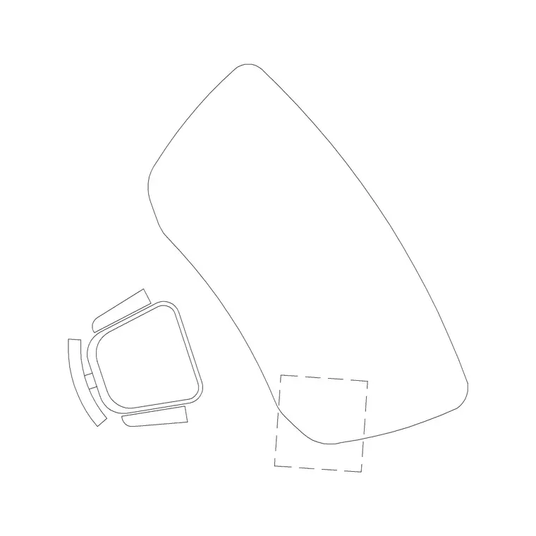
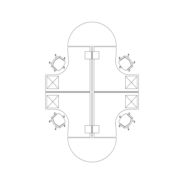
Workstation blocks in an open plan setting generally get arranged in one of a few repeating patterns, and each one has a different floor area cost for the same headcount. A row of long straight desks, like several 8-workstation blocks placed end to end along a wall, is the most floor efficient pattern per person, since it minimizes the amount of aisle space relative to desk space, but it also means everyone in that row shares one long sightline down the desk, which some teams like and others find exposing. A pod arrangement using something like the 4-seater-workstation-curve groups people into smaller clusters facing inward, which costs a bit more floor area per person because each pod needs its own access aisle on more sides, but it creates more of a team identity around a shared space.
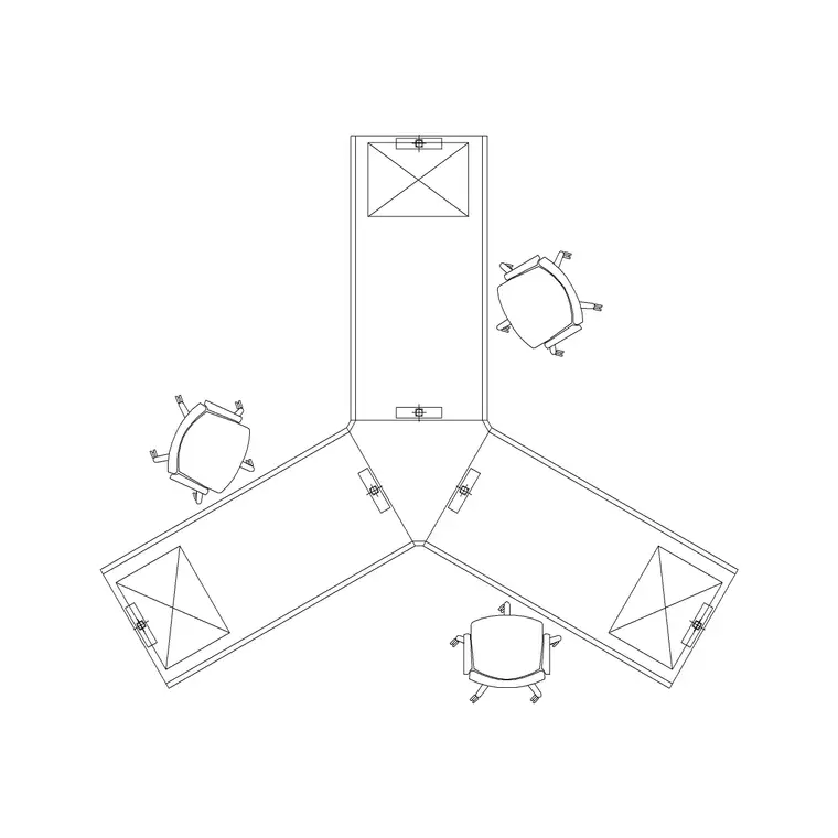
A triangular-workstation cluster sits somewhere between the two, often used to break up a large open floor into smaller visual groupings without the full floor cost of individual pods, and it's worth considering specifically in a room that's wide enough to feel impersonal as one continuous open area but not big enough to justify fully separate team pods.
The general pattern worth remembering across all three is that floor efficiency and team cohesion trade off against each other fairly directly, straight rows maximize the first, pods maximize the second, and triangular clusters sit in between. There isn't a universally correct choice here, a customer support team handling high call volume often benefits from the row layout's efficiency and doesn't need the pod's sense of enclosure, while a product team that spends half its day in ad hoc huddles tends to get more actual value from pods even at the floor area cost, so the right pattern really does depend on how the specific team works rather than which pattern is more common.
Where a side rack workstation earns its spot
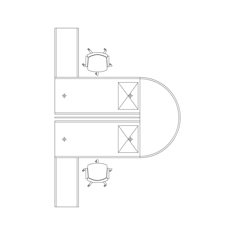
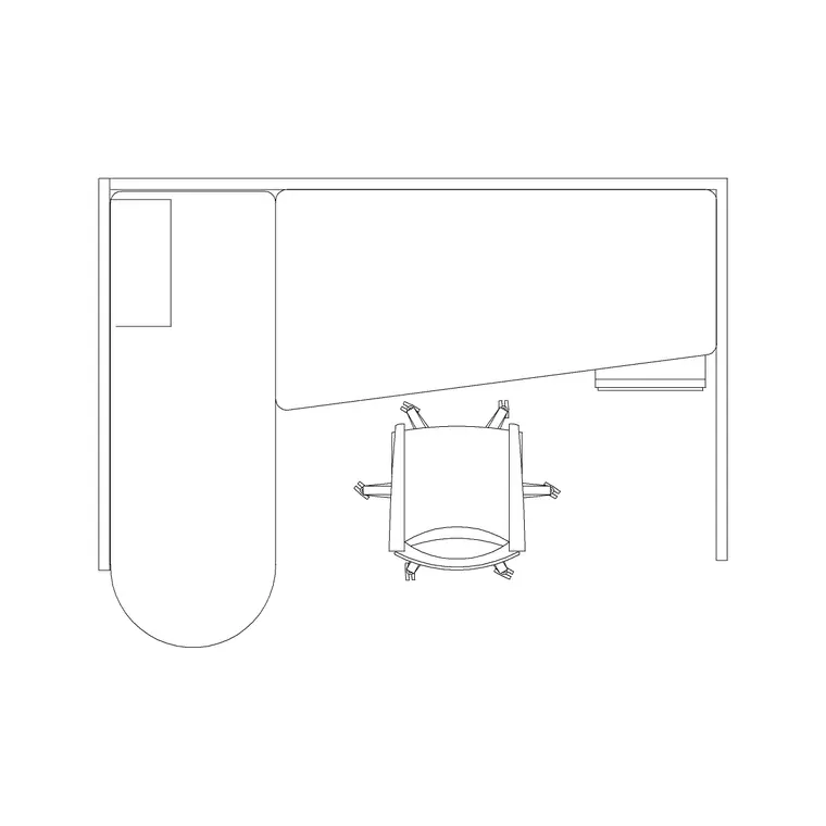
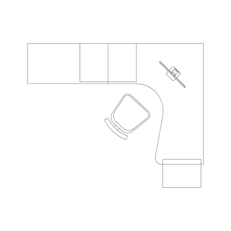
The 2-workstation-with-side-rack block is a good example of a workstation type that's specifically suited to the edges of an open plan floor rather than the middle of it, since the side rack usually needs to back onto a wall for storage access rather than sitting exposed in an aisle. Placing this kind of block along a perimeter wall, rather than floating it in the center of the room the way you might a pod cluster, keeps the storage side accessible without eating into the main circulation space that the rest of the floor depends on.
It's a small placement decision, but it matters more than it looks like it should, because a side rack workstation dropped into the middle of an open plan layout either forces an aisle on a side that doesn't need one, or ends up with the storage rack backing directly onto another desk's working area, which defeats the point of having storage there in the first place.
The same logic extends to any workstation block with an attached storage or filing element, not just this specific one, storage needs a wall or another piece of storage to back onto, and the moment a storage bearing desk gets floated in open floor space, the layout ends up spending aisle width on a side of the desk that was never meant to be walked past in the first place, which is floor area you could otherwise have given to the main circulation paths that actually need it.
Higher density benching and its spacing tradeoffs
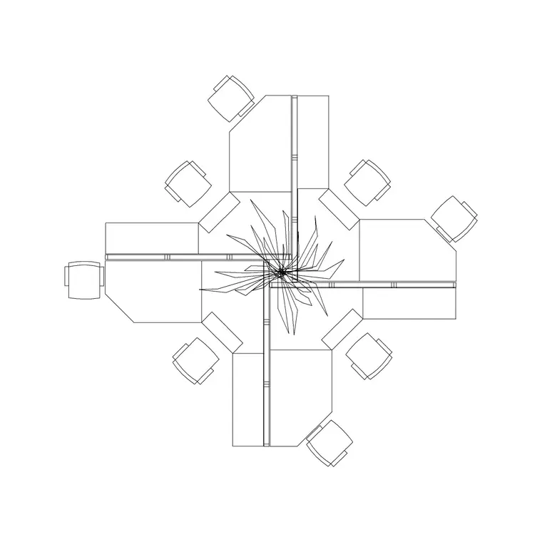
Something like the desginer-workstation block, laid out as a denser bench arrangement, can fit more people into the same floor area than a pod based layout, but that density has to be paid for somewhere, and it's almost always paid for in aisle width. A denser bench run only works acoustically and functionally if the aisles around it are held to the wider end of the secondary aisle range rather than the tighter end, because more people sitting closer together generates more ambient noise and more foot traffic through whatever aisle serves that row.
The tradeoff worth naming clearly is that you can pack desks tighter to fit more headcount into a floor, but only if you're willing to give the surrounding circulation space back in return, and trying to save space on both at once is how a dense bench layout ends up feeling genuinely cramped rather than just efficient.
Adding partitions without closing the floor in
The workstation-with-partition block does real work in an open plan setting, breaking sightlines between adjacent desks and giving each person a bit of visual separation from their neighbor, but partitions placed without thinking about the floor as a whole can start to feel like a maze rather than an open plan office at all. A useful rule is keeping partition height low enough that someone standing can still see across the floor toward windows or a shared space, while still blocking the seated sightline between two adjacent desks, which preserves the feeling of an open room while still giving each desk its own bit of privacy.
Where this goes wrong most often is applying full partitions to every single desk edge in a layout, which technically maximizes privacy per desk but ends up making a genuinely open floor feel like a corridor of small enclosed cubicles, defeating the actual point of choosing an open plan layout over private offices in the first place.
Testing the layout with a people block before committing
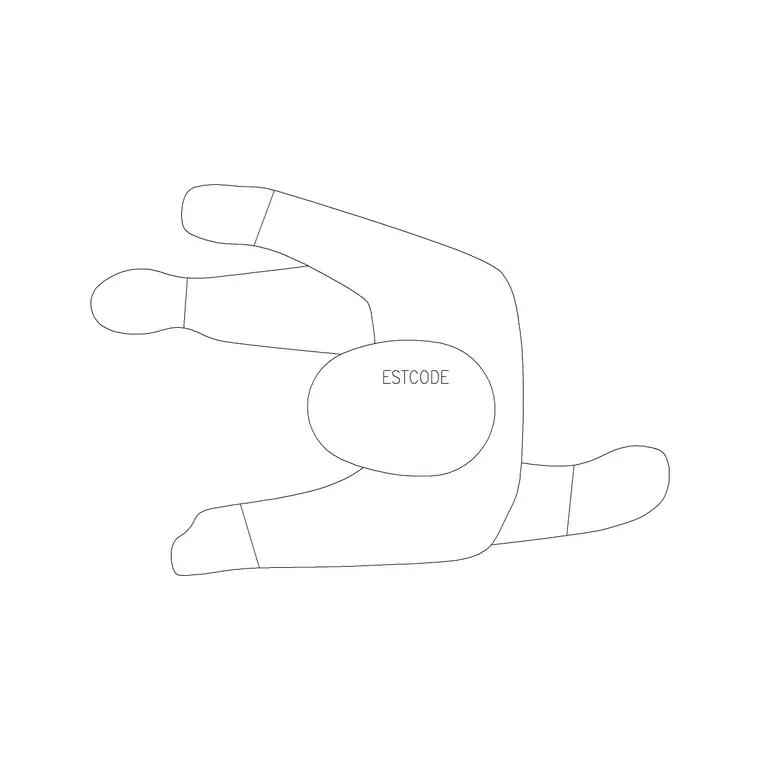
The single most useful habit for open plan spacing is dropping a people block into the drawing at the busiest points in the layout, the main aisle at its narrowest point, the gap behind a dense bench row, the space in front of a pod's shared corner, before treating any of the spacing as final. A human figure at scale next to a chair pushed back from a desk shows immediately whether the gap that looked fine as a dimension on the drawing actually accommodates a real person walking through it while someone else is seated with their chair out.
This is a genuinely quick check to run inside the same file as the workstation blocks themselves, and it catches the exact failure from the opening of this piece, an aisle that measures correctly on paper but disappears the moment real furniture and real people occupy the space it was meant to leave clear.
Common spacing mistakes worth checking for directly
A handful of mistakes show up repeatedly across open plan layouts regardless of which workstation blocks are used. Measuring aisle width from desk edge to desk edge rather than from the outer edge of a pushed back chair is probably the most common one, and it alone accounts for a large share of aisles that feel tighter in person than they measured on the drawing. Treating every gap in the layout as the same width, rather than distinguishing main circulation from secondary aisles, is the second. And placing storage heavy blocks like the side rack workstation in the center of a floor rather than against a perimeter wall is the third, since it forces awkward aisle decisions on a side of the desk that was never meant to need one.
None of these are complicated fixes once you know to look for them, but they're exactly the kind of thing that only becomes obvious after the furniture is installed unless you deliberately check for them in the drawing first.
A fourth one worth naming separately is ignoring how partitions and cluster shape interact with the aisle right next to them. A curved pod like 4-seater-workstation-curve pushes its widest point slightly further into the surrounding aisle than a straight bench of the same seat count would, since the curve has to go somewhere, and if the aisle width was measured against the straight bench version of the layout rather than the curved one actually being used, the real clearance ends up narrower than the drawing suggests. It's a small difference per pod, but across a floor with several curved clusters in a row it adds up to a genuinely tighter aisle than the plan implies.
A working checklist for spacing an open plan floor
Before finalizing an open plan layout, it's worth running through a short list in order. Confirm main circulation paths sit in the 1200mm to 1500mm range and secondary aisles between desk backs sit in the 900mm to 1000mm range, measured from the outer edge of a pushed back chair rather than the desk itself. Decide on a cluster pattern, straight rows, pods or a triangular grouping, based on how much floor area is genuinely available versus how much team identity the space needs to convey. Place storage heavy blocks against perimeter walls rather than floating them in open aisles, and keep any partitions low enough to preserve sightlines to windows even while blocking desk to desk sightlines at seated height.
Then, before calling the layout finished, drop a people block into the tightest points in the plan and confirm the space actually holds a real person walking through it while someone else is seated with their chair pulled out, because that single check is what separates a floor plan that works on screen from one that works the day people actually move through it.
It's worth running this same checklist again any time the floor gets reconfigured later, not just on the first pass, since open plan floors tend to get reshuffled as teams grow or move between departments far more often than a private office layout ever does. A spacing rule that held up for the original arrangement doesn't automatically survive a reshuffle that adds an extra pod or turns a straight row into a denser bench, so treating this as a repeatable check rather than a one time exercise is what actually keeps an open plan floor comfortable over the years it's in use, not just on the day it first opens.
Further reading
Questions
Frequently asked
How wide should the main aisle be in an open plan office layout?+
Main circulation paths, the routes people use to move between the entrance, meeting rooms and their desks, generally want somewhere in the 1200mm to 1500mm range so two people can pass comfortably. Secondary aisles between the backs of desk rows can run tighter, often 900mm to 1000mm.
Should aisle width be measured from the desk edge or the chair?+
Measure from the outer edge of a chair pushed back into its standing position, not from the desk edge itself. Measuring from the desk alone is the single most common reason an aisle that looks fine on a drawing feels cramped once real furniture and people occupy it.
What's the difference between arranging workstations in rows versus pods?+
Straight rows, like several 8-workstation blocks end to end, are the most floor efficient pattern per person since they minimize aisle space relative to desk space. Pod arrangements using blocks like 4-seater-workstation-curve cost more floor area per person but create a stronger sense of team grouping within an open floor.
Where should a workstation block with a side storage rack be placed?+
Along a perimeter wall rather than in the middle of an open plan floor. The 2-workstation-with-side-rack block needs its storage side backing onto something, usually a wall, and placing it centrally either forces an unnecessary aisle or backs the rack directly onto another desk's working area.
Free downloads from this article

Free CAD block library
Download the blocks from this article — free, no signup