Line-only block vs a shaded or rendered block for presentations
Line work drafts and prints cleanly, shading sells a concept to a client. How to pick the right one for each deliverable.
Saumyajit MaityUpdated 22 April 20265 min read
Two very different audiences for the same room
A construction set and a client presentation board are, at the end of the day, communicating with completely different audiences, one is a contractor reading dimensions and specifications, the other is a client trying to picture a finished room, and the blocks you reach for should honestly change depending on which of those two people you are drawing for. Line-only blocks, which is what you will find in most free DWG libraries including this one, are built for the first audience, clean vector outlines with no fill, no shading, nothing that gets in the way of a dimension string or a note. Shaded or rendered representation is built for the second audience, and it is a different tool for a different job, not a fancier version of the same thing.
Why line-only wins for anything technical
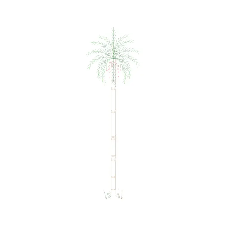
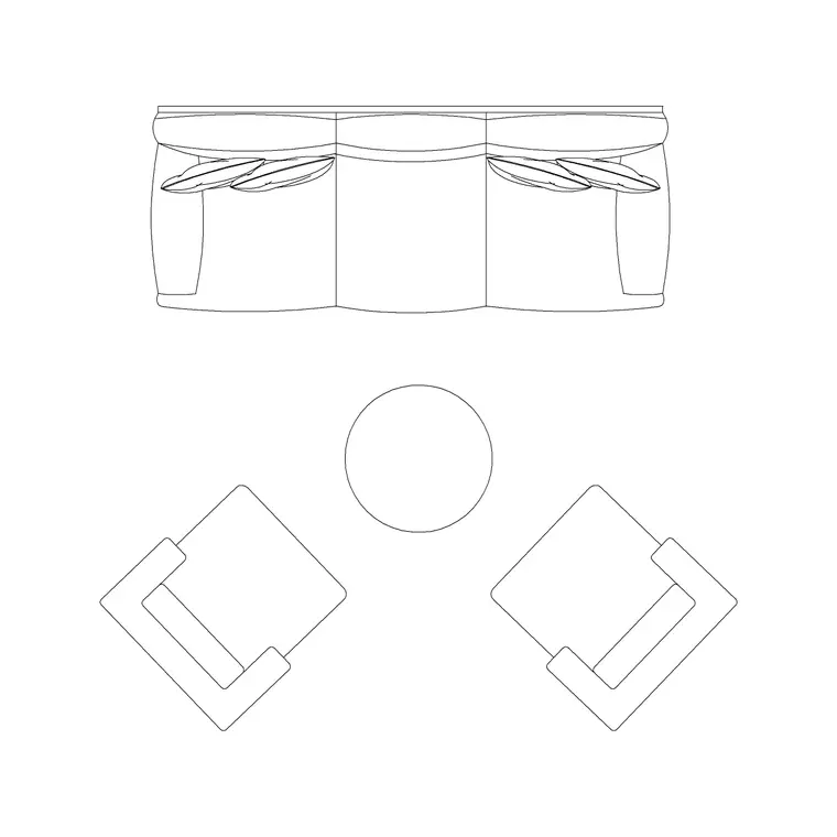
A line-only block like Sofa Set Plan 1 or Pine Elevation 1 prints predictably at any scale, layers cleanly with hatching and poche you add yourself, and does not fight with dimension lines or text for visual attention on a busy sheet. This matters more than it sounds like it should, because a shaded block dropped into a plan drawn at 1 to 50 tends to either disappear into mud at that scale or dominate the sheet and pull the eye away from the actual technical content, the walls, the dimensions, the door swings. For anything going to a contractor, a permitting office, or into a set with dimension strings and notes, line-only is not a compromise, it is genuinely the correct tool.
Black and white plotting is the other reason line-only holds up so well across the industry, most working drawings still get printed or PDFed in monochrome for clarity and to keep printing costs down, and shading that looked fine on a color screen can collapse into indistinguishable gray blocks the moment it hits a black and white plot. A clean outline never has that problem, since it was designed from the start to read correctly with nothing but line weight doing the work.
Why shading earns its place in presentation work
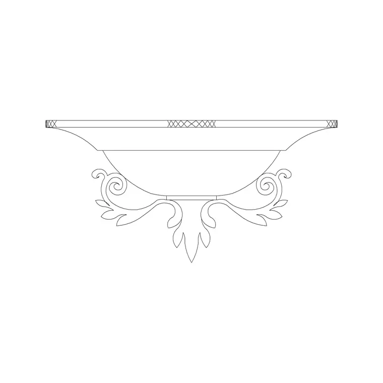
A presentation board or a client facing rendering is trying to do something completely different, it is trying to help someone who cannot read a floor plan fluently understand what a finished space will actually feel like, and flat line work asks a lot of an untrained eye in that context. This is where shaded furniture, rendered lighting fixtures like a ceiling lamp shown with some tonal depth, and material hatching genuinely help, because they are translating technical drafting into something closer to how the room will actually look and photograph. Isometric or axonometric presentation views, still technically 2D line and hatch work but arranged to read like a pseudo 3D view, sit right in the middle of this and are worth knowing as an option when full rendering is more than the deliverable calls for.
Color is doing a lot of the persuasive work here too, not just shading in the grayscale sense. A warm hatch fill on a sofa and a soft tonal wash on flooring can carry a client through a concept presentation far more effectively than the exact same plan left entirely in black outline, even though structurally nothing about the drawing has actually changed, only how it is dressed for the audience reading it.
What I actually do on a real project
I keep the working set entirely line-only, sourced from a consistent library so the line weights and styles agree with each other, right, and I treat the presentation board as a completely separate deliverable built from the same plan but dressed up separately, sometimes with rendered furniture, sometimes just with hatching and a warmer color palette applied over the same clean line work. What I try never to do is let shading creep into the working drawings, because a chair drawn with a gradient fill on it is genuinely harder for a contractor's eye to parse quickly than the same chair as a clean outline, even though it looks nicer sitting on its own.
I also keep the presentation treatment, hatching, tonal fills, color washes, on its own clearly named layer or layer group sitting on top of the same base geometry, so turning a working sheet into a presentation board, or reverting one back, is a matter of freezing or thawing a layer rather than rebuilding the drawing from scratch each time.
A mistake that's easy to make under deadline pressure
The mistake I see most often is shading creeping into a working set under deadline pressure, usually because a shaded furniture block was already sitting in a drawing from an earlier presentation pass and nobody went back to swap it out before the sheet got issued for construction. A shaded sofa sitting among otherwise clean line work on a permit set does not just look inconsistent, it can genuinely slow a plan reviewer down, since their eye keeps snagging on the one piece of furniture that reads differently from everything surrounding it, and on a set where dimension strings and door swings need to be scanned quickly, that is a real cost, not just a cosmetic one. Keeping the two file types genuinely separate, rather than one master file toggled between looks, is the most reliable way I have found to stop this from happening, because a shared file always tempts someone to leave the shading on "just this once" to save time.
A simple test for which one you need
Ask who is reading the sheet and what decision they need to make from it. If the answer is a contractor deciding where to frame a wall or a plumber deciding where to run a line, line-only, every time. If the answer is a client deciding whether they like a layout enough to approve it, some amount of shading or rendering earns its keep. Most projects need both at different points, so building the working set in clean line work first and layering presentation treatment on top afterward, rather than the other way around, tends to be the faster path overall.
The reverse order, starting from a shaded presentation drawing and trying to strip it back down into a clean technical set, is almost always slower, because you end up fighting fills and gradients that were never meant to be removed cleanly rather than simply adding treatment on top of geometry that was line-only from the start.
Further reading
Questions
Frequently asked
Can I add shading to a line-only DWG block myself instead of downloading a rendered version?+
Yes, applying a hatch pattern or a solid fill with a lighter lineweight on top of a clean outline block is a common way to get a presentation look without sourcing a separate rendered file, and it keeps everything on one consistent base drawing.
Do rendered or shaded blocks print worse at construction drawing scales?+
Often yes, shading and gradients can turn muddy or overly dark at typical plan scales like 1 to 50 or 1 to 100, which is part of why line-only outlines remain the standard for working drawings.
Is an isometric view the same as a full 3D render?+
No, an isometric or axonometric view is still 2D line and hatch work, just arranged at a fixed viewing angle to read like a pseudo 3D view. It sits between flat orthographic drafting and a full render in both effort and visual impact.
Free downloads from this article


Free CAD block library
Download the blocks from this article — free, no signup