Layering entourage blocks for a believable rendered plan
A step-by-step layering order for trees, people and furniture entourage that makes a rendered floor plan feel inhabited instead of staged.
Saumyajit MaityUpdated 26 June 20265 min read
Why layering order matters more than block choice
I used to think a rendered plan looked lifeless because the individual blocks weren't good enough, and then I started paying closer attention to layering order instead of block quality and the difference was night and day. A believable rendered plan reads like a real moment in a real space, someone left a chair pulled out, a tree casts shade across part of a terrace, a couple of figures are mid-conversation near a window, and none of that comes from any single block being fancy, it comes from how the layers stack and interact with each other.
So before you touch which specific sofa or tree block to use, get the layering order right, because the right order with basic blocks beats the wrong order with expensive ones every time I've tested it side by side.
Start with the architectural base and hardscape
The bottom layer is always your walls, flooring pattern and any hardscape, paving, decking, whatever the plan is actually sitting on, and this stays locked while everything else builds on top. Get this layer's line weight and hatching finalized before adding a single entourage block, because if you have to go back and adjust wall thickness or flooring pattern after you've placed forty trees and figures on top, you're going to spend an hour just moving things out of the way and back again.
This base layer is essentially your floor plan in its rawest form, and a floor plan on its own, without any entourage, should already be readable and correctly proportioned, entourage exists to add life to a plan that already works, not to disguise one that doesn't.
Next, place fixed furniture and large-scale elements
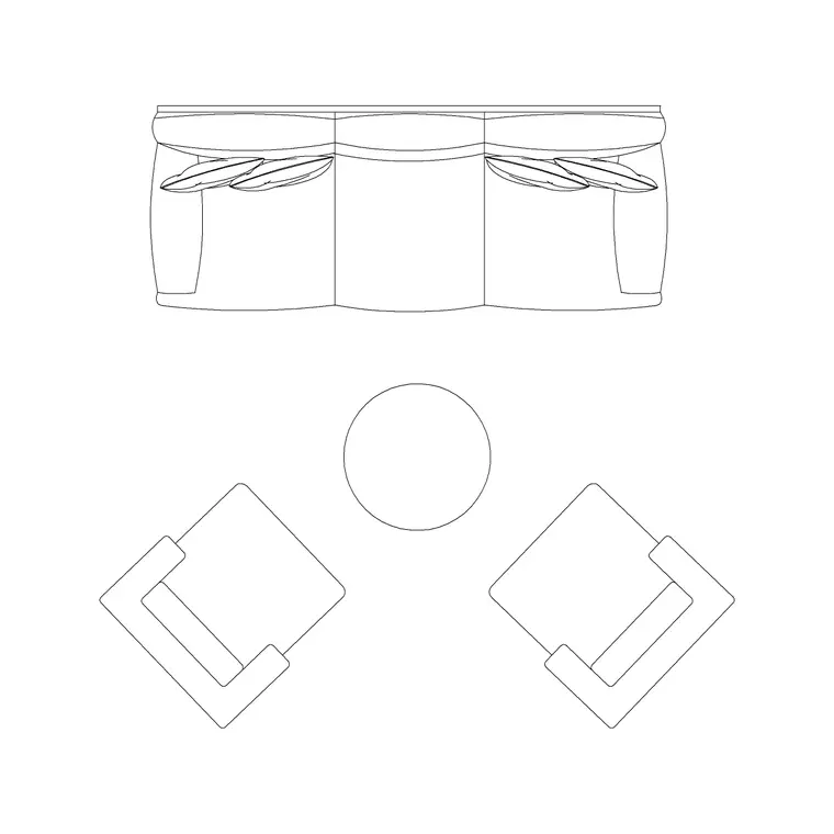
Once the base is locked, bring in furniture blocks, sofa sets, tables, casework, anything that's staying in one place and defining how the room is actually used. A sofa set plan block typically runs around 1900mm to 2200mm across for a standard three-seat configuration, and getting these placed correctly against real clearances, usually 900mm minimum for a walking path, matters more for believability than anything you add later, because a viewer's eye checks furniture logic almost instinctively even if they couldn't articulate why a room feels off.
This is also the point to bring in larger trees or landscape elements if the plan includes exterior space, since they anchor scale for everything that comes after and it's much easier to position smaller entourage relative to an already-placed tree canopy than the other way around.
Then layer in people for scale and story
Human figure plan blocks go in next, and this is where a lot of otherwise good plans fall apart, because figures get scattered evenly across open space like they're standing in a grid rather than doing anything a person would actually do. What I actually do is cluster two or three figures near a natural gathering point, a kitchen island, a seating group, an entry, and leave other areas of the plan figure-free entirely, because real spaces have empty corners just as often as occupied ones.
A standing adult figure in plan view is typically represented with a footprint somewhere around 400mm to 450mm across the shoulders, small enough that it's easy to accidentally place several overlapping without noticing at a glance, so zoom in and check for overlap once you've placed a cluster, overlapping figures read as a mistake rather than a crowd.
Finish with light entourage, texture and shadow
The last layer is the finishing pass, wall lamp or fixture blocks marking light sources, small plants or accessories that don't change the functional read of the room, and shadow blocks or a shadow effect cast from the trees and larger furniture to tie everything down to the ground plane. Shadows especially are underused, a tree with no shadow floats on the page, the same tree with a shadow cast in a consistent direction across the whole plan instantly reads as sitting in real light.
Check that every shadow in the drawing falls in the same direction, this sounds obvious but it's the single most common giveaway on rendered plans I review, half the shadows falling northwest and half falling southeast because blocks were dragged in from different source files without anyone checking, and it undoes a lot of the believability the rest of the layering work built up.
A final pass for density and balance
Once everything's placed, step back, literally zoom out to the scale you'll actually be printing or presenting at, and look for dead zones and overcrowded zones side by side. A believable plan has variation in density the same way a real building does, hallways are sparse, living rooms and gathering points are denser, and if your whole plan reads at one even density throughout it's a signal you layered mechanically rather than compositionally.
This final check takes maybe ten minutes and it's the step people skip most often because by the time you've placed a hundred entourage blocks the instinct is to call it done, but it's genuinely the difference between a plan that looks populated and one that looks inhabited.
Testing the plan against real occupancy
A trick that's helped me more than almost anything else in this workflow is to walk through the plan mentally as if I actually lived or worked there, tracing a plausible path from the entry to the kitchen to a seating area, and asking whether the furniture and entourage placement supports that path or gets in its way. If a cluster of figures is standing directly in the middle of what would obviously be the main circulation route through the room, that's not a believable moment, it's a placement error, and it's worth catching before a reviewer catches it for you.
This kind of check is quick once you get in the habit of it, and it's a good final gate to run right after the density pass, since density and occupancy logic are related but not identical, a plan can have exactly the right amount of entourage overall and still have it clustered in a way nobody would actually stand or sit, and that mismatch is usually more noticeable to a viewer than raw density ever is. It's a small habit but it changes how you place blocks going forward too, once you've caught a few of these mistakes you start avoiding them at placement time instead of catching them on review.
Further reading
Questions
Frequently asked
What order should I layer entourage blocks in a rendered plan?+
Base architecture and hardscape first, then fixed furniture and large trees, then human figures for scale and story, then finishing entourage like lamps and shadows last. Working in that order avoids having to shift placed blocks around later.
How many human figures should go on a floor plan?+
There's no fixed count, but cluster two or three near natural gathering points like a kitchen island or seating group rather than spreading them evenly across the whole plan, which reads as artificial.
Why do shadows matter so much on a rendered plan?+
A consistent shadow direction across every tree, figure and piece of furniture ties the whole plan to a believable light source. Inconsistent shadow directions, often from mixing blocks pulled from different files, are one of the fastest tells that a plan was assembled rather than composed.
Free downloads from this article


Free CAD block library
Download the blocks from this article — free, no signup