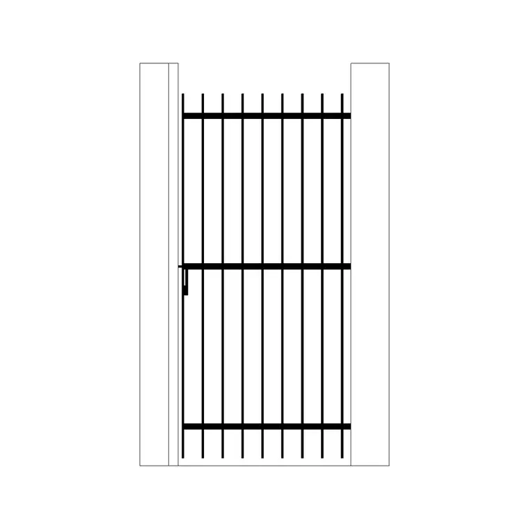
Building a presentation-ready elevation from CAD blocks
How to assemble a clean, believable elevation for a client or jury review using downloaded CAD blocks, from base geometry to final line weight pass.
Sumana KumarUpdated 15 June 20265 min read
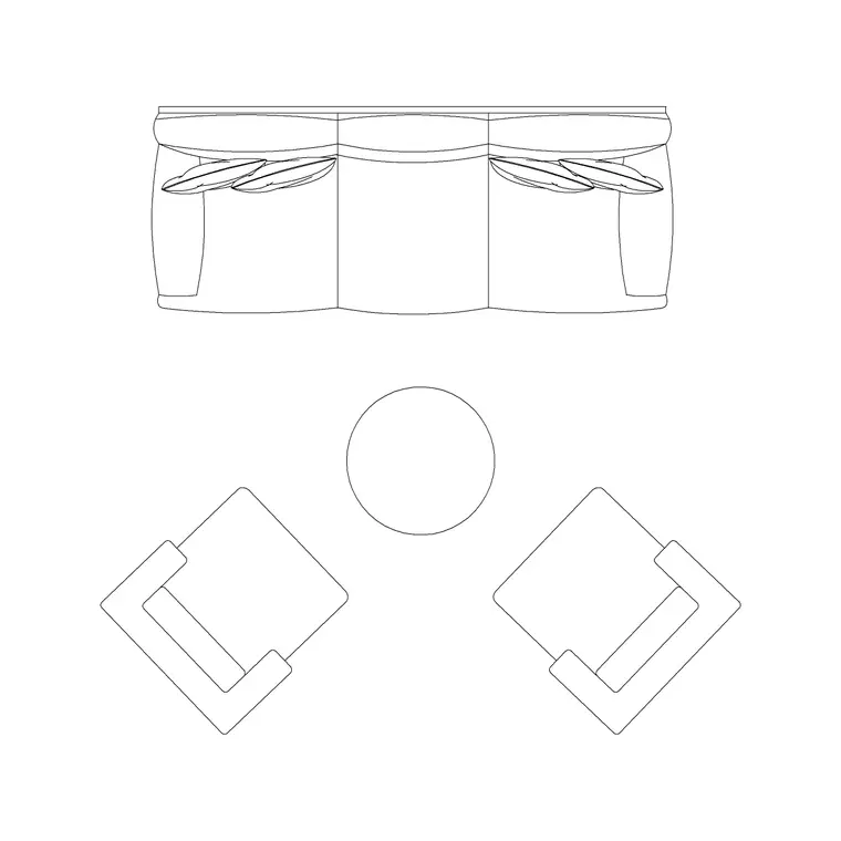
What makes an elevation read as presentation-ready
An elevation that's going in front of a client or a jury has to do two jobs at once, it has to be technically correct and it also has to look like something a person would want to look at, and those two goals pull against each other more than people expect. I've built elevations for design review boards where the wall section was accurate down to the millimetre but the drawing itself looked flat and lifeless because every block sat at the same line weight with no depth cues, and the fix almost never involves redrawing anything from scratch.
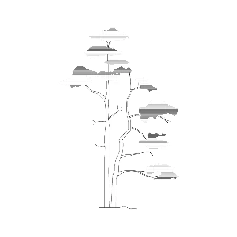
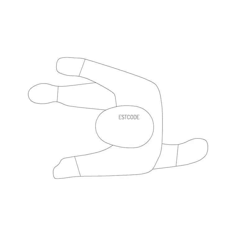
What actually turns a working elevation into a presentation elevation is layering in the right supporting blocks at the right density, a pine tree or two from the trees-and-plants library breaking up a long blank wall, a wall lamp block marking a lit facade at night, a couple of human figures at the base giving the building a sense of real scale, and then a pass on line weights so the building outline reads heavier than the entourage around it. None of that requires custom drafting, it's assembly and judgement.
Starting from the base building blocks
Start with your architectural elevation drawn in AutoCAD or whatever DWG-native tool you're working in, walls, openings, roofline, all the geometry that has to be dimensionally correct because someone is eventually going to build from it or at least price it off this drawing. Keep that layer locked down while you work on top of it, because the moment you start dragging in entourage blocks it's easy to accidentally nudge a window jamb half a millimetre and not notice until review.
Downloaded elevation blocks like the pine tree elevation on the site come pre-drawn at a real-world scale, and the practical move is to insert them at 1:1 in model space the same as your building geometry rather than scaling them up in a viewport later, so everything stays proportionate no matter what sheet scale you eventually plot at. This is basically the same discipline as building a technical drawing set, the base geometry stays authoritative and everything decorative sits on layers above it that you can freeze independently for the working set.
Choosing which entourage actually belongs in an elevation
Not every block that exists needs to go into your elevation, and overloading a facade with trees, cars, people and lighting fixtures all competing for attention is one of the fastest ways to bury the building you're actually presenting. What I do is ask what story this particular elevation is telling, a residential front elevation usually wants one or two trees positioned to soften a corner and a couple of human figures near the entry to establish scale, while a commercial night elevation wants wall lamp and fixture blocks lit up along the facade with the trees pulled back or dropped entirely so they don't compete with the lighting story.
For instance, on a boutique retail elevation I worked on the tree blocks actually made it worse because they hid the storefront glazing the client cared about most, so I pulled them and leaned on a single wall lamp block and two human figures instead, and the drawing read cleaner and sold the design better. The rule I keep coming back to is that entourage should support the read of the building, not decorate around it.
Layering and line weight for the final pass
Once the supporting blocks are placed, the layer structure is what separates a busy elevation from a legible one. Put the building outline and major wall lines on a heavier line weight, something in the 0.5mm to 0.7mm range if you're using AutoCAD's plot style tables, keep entourage like trees and figures noticeably lighter around 0.25mm to 0.35mm so they visually recede, and reserve the heaviest weight, close to 0.9mm, for the ground line and roofline that anchor the whole composition.
That hierarchy is what an orthographic projection is supposed to communicate in the first place, front-on geometry with enough depth cues that a viewer's eye still understands what's near and what's far even though everything is technically flattened onto one plane. Getting the line weight hierarchy right does more for the perceived quality of a presentation elevation than almost any other single move, and it costs you nothing extra to download or model.
Common mistakes worth avoiding
The one I see most often is scale mismatch, a human figure block inserted at a size that makes the building read as either a dollhouse or a skyscraper depending on which way the error goes, so always sanity check a figure against a known dimension like a door head height before you finalize anything. The second is over-cluttering the sky and ground plane with entourage that has nothing to do with the building, tree blocks scattered for no compositional reason, cars parked in an elevation that doesn't even show a driveway.
The third, and this one is sneaky, is forgetting that entourage blocks downloaded from different sources often come in on different layers with different default colors, so when you plot everything can come out in a jarring mix of colors and weights that looks unplanned. Before you finalize a set for print or PDF, do a full layer audit and standardize colors and line weight assignments across every block you've brought in, it takes fifteen minutes and it's the difference between a set that looks curated and one that looks scavenged.
A short checklist before the elevation goes out
Once the composition feels right, I run through the same short list every time before a presentation elevation actually goes to a client or a review board, and it catches most of the small issues before anyone else sees them. Confirm every block, building geometry and entourage alike, is sitting at true real-world scale rather than eyeballed, check that ground line and any horizon or context line is continuous across the full width of the drawing with no gaps where a block happens to overlap it, and verify that shadow direction, if you've added any, is consistent with whatever light direction the rest of your presentation set is using.
Last, plot a test sheet at the actual final size, not a scaled preview on screen, since detail that reads fine zoomed in can either vanish or turn into a smudge once it's actually at plotted scale. This whole pass takes maybe twenty minutes on a typical elevation, and it's consistently the cheapest twenty minutes you'll spend relative to how much it improves the finished piece, because almost everything on this list is a placement or layer fix rather than anything requiring new drafting work.
Further reading
Questions
Frequently asked
What scale should I insert elevation blocks at for a presentation drawing?+
Insert at 1:1 in model space alongside your building geometry, the same as construction drawings, and let your sheet or viewport scale handle the final plotted size. This keeps proportions consistent if you switch sheet scales later.
How many entourage blocks is too many on one elevation?+
There's no fixed number, but if a viewer's eye lands on a tree or a figure before it lands on the building, you've got too much. Most presentation elevations read best with a handful of well-placed pieces rather than a crowded facade.
Should entourage and building outlines use the same line weight?+
No, keep the building outline heavier, typically 0.5mm to 0.7mm, and entourage like trees and human figures lighter around 0.25mm to 0.35mm, so the building stays the visual focus.
Free downloads from this article

Free CAD block library
Download the blocks from this article — free, no signup