Gradient vs Solid vs Pattern Hatch: Presentation Plan Techniques
A practical comparison of AutoCAD's three hatch types for presentation plans, when solid, pattern, or gradient fill actually communicates best.
Saumyajit MaityUpdated 8 June 202611 min read
Three hatch families, one drawing, three different jobs
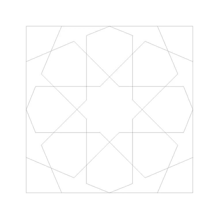
AutoCAD's hatch command actually gives you three distinct fill families under one dialog, solid, pattern, and gradient, and a lot of drafters default to whichever one their office template happens to use without really thinking about which one is communicating the right thing for that specific sheet. A construction set and a presentation plan are, at the end of the day, trying to do different jobs, the construction set needs to be unambiguous and buildable, so solid poché and material pattern hatches dominate there, while a presentation plan, the one going in front of a client or a planning board, has more room for a gradient wash or a rendered looking fill because its job is communicating design intent quickly rather than specifying exact construction detail.
This guide is specifically about the presentation side of that split, when each of the three hatch types earns its place on a client facing plan, and where combining a hatch fill with real drawn geometry, an actual paver block or a real tree symbol rather than a schematic fill, communicates more convincingly than a hatch alone. I will be upfront the same way I was in the earlier posts in this series: we are a library of real DWG and DXF blocks, not a source of hatch pattern files themselves, so everything here about pattern and gradient hatch is general AutoCAD knowledge, and where I reference an actual downloadable product it is because a real matching item exists in our paving or trees and plants categories.
Solid hatch and the poché convention
Solid hatch, a flat, single tone fill with no repeating pattern at all, is the oldest convention in architectural drafting for showing cut elements, walls, columns, anything sliced through in a section or shown filled in a plan to read as mass rather than outline. This convention, sometimes called poché after the French drafting tradition, exists specifically so a reviewer's eye can separate solid structure from open space at a glance without reading every line weight individually, and it still does that job better than almost any pattern fill for that specific purpose.
On a presentation plan, solid hatch is usually reserved for building footprints, walls, or any element you want read as unambiguously solid rather than textured, a courtyard's low garden wall for instance, filled solid so it registers instantly as a wall rather than something the eye has to decode. The mistake I see most often on presentation sheets is using solid hatch for everything, paving included, when a pattern or even a real paver block would communicate the actual material far more usefully to a client trying to picture what the finished surface looks like underfoot.
Pattern hatch for material indication, at a scale that actually reads
Pattern hatch is where most material communication happens on both construction and presentation drawings, a repeating line family standing in for brick, gravel, decking, or paving without drawing every joint by hand, and for a large site plan filled at a distant scale it remains the more practical choice over placing individual real blocks, since a big paved plaza filled unit by unit would bloat the file for very little visual gain at that zoom level.
Where pattern hatch starts to underperform on a presentation sheet specifically is any area a client or reviewer is likely to zoom into, a courtyard, an entry sequence, a small terrace, because a fill pattern reads as a texture rather than as actual material, and clients reviewing a presentation set often want to see the real joint layout, not an approximated repeat. This is exactly the point where our paving category earns its place in a presentation workflow rather than a construction one, paving-block-1, paving-block-3, and the other numbered units drawn as real discrete geometry read far more convincingly at a zoomed in presentation scale than a pattern fill does, because you are showing the client the actual paver layout rather than a schematic stand in for one. Reserve the pattern hatch for the broad field, and swap to real blocks for the foreground area a reviewer will actually study.
Gradient hatch: a presentation effect, not a drafting standard
Gradient hatch, a smooth tonal blend between one or two colours rather than a repeating line pattern, exists purely as a presentation device, there is no construction or drafting standard that calls for a gradient fill, and you will not find it doing any structural or material communication job the way solid and pattern hatch do. Its real use is rendering effect on a plan people are going to look at rather than build from, a soft blue to white gradient suggesting a water feature's depth, a green gradient washing across a lawn to suggest shadow or grade change, that kind of atmospheric suggestion rather than literal material indication.
The catch here is gradient hatch does not always plot the way it displays on screen, particularly on older plotter drivers or when a sheet gets converted to grayscale for a black and white print run, where a subtle two colour gradient can flatten into a visible banded stripe rather than a smooth blend. If a presentation sheet is going to both a colour PDF and a black and white handout, it is worth actually test plotting the gradient hatch to both outputs before finalizing the sheet, rather than assuming it will translate the same way, since this is one of the more common last minute surprises on a presentation set.
Pairing hatch fills with real blocks for a convincing landscape presentation
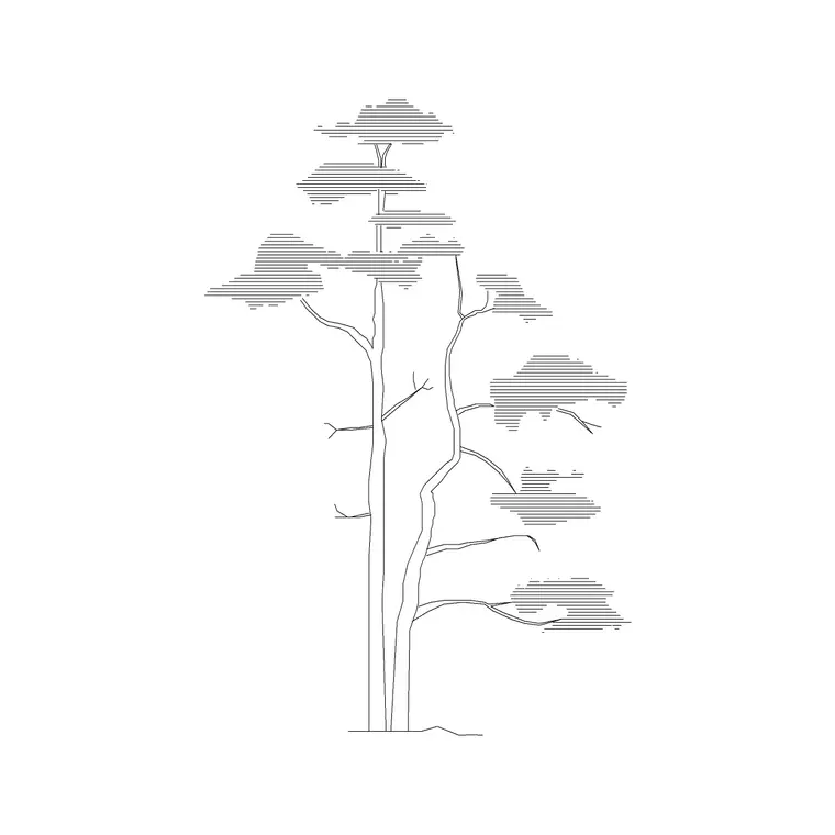
A presentation plan that is entirely hatch, no real furniture, no real trees, no real paving units, tends to read as a diagram rather than a place, and the fastest way to push a plan from diagram toward something a client can actually picture standing in is layering real drawn blocks on top of the broad hatch fields doing the background work. A lawn area filled with a light pattern or gradient hatch reads far more convincingly once real tree and plant blocks, pine-elevation-1 or pine-plan-1 for instance, or one of the several hundred other products across our trees and plants category, are placed at realistic spacing across it rather than leaving the hatch to imply vegetation on its own.
The same logic applies to hardscape, a paved courtyard filled with a broad pattern hatch for the general field, then real paver blocks laid out at the entry sequence or any foreground area the client's eye will land on first, gives a presentation sheet a sense of real material without the cost of drawing every single paver across the entire site by hand. This layering approach, hatch for the broad field, real blocks for the foreground and any area getting scrutinized, is honestly the most efficient way I know to make a presentation plan look considered without spending disproportionate time on areas nobody is going to zoom into anyway.
Draw order and transparency when layering real blocks over a hatch field
Once you start layering real paver or tree blocks directly on top of a broad hatch field, as the previous section recommends for any foreground area a client is likely to study closely, draw order becomes a real, practical concern rather than a cosmetic afterthought, since a hatch fill sitting on top of a real block in the drawing's draw order will simply obscure it, printing as a flat fill over geometry that is technically present in the file but invisible on the plotted sheet. AutoCAD's draw order commands, sending an object to the back or bringing it to the front relative to everything else in the same space, exist specifically to resolve this, and the habit worth building is sending every broad hatch field to the back as a matter of course right after creating it, rather than only fixing draw order reactively once a real block mysteriously fails to show up in a print.
Transparency is the other tool worth knowing about for this specific layering situation, since a hatch set with partial transparency lets whatever sits beneath it, another hatch, a real block, a base colour fill, read through it rather than being fully obscured, which is a genuinely useful effect for something like a soft gradient wash suggesting shadow across a paved area without hiding the real paver blocks laid out underneath it. Applying transparency through the Properties palette on the hatch object itself, rather than trying to achieve the same visual effect by picking a lighter solid colour, keeps the underlying geometry visible and editable rather than merely faked through colour choice alone.
Print and plot considerations across the three hatch types
- Solid hatch plots reliably at any scale but check its fill colour survives conversion to grayscale for black and white handouts, since a light solid fill can nearly disappear in a straight grayscale conversion - Pattern hatch needs its line weight checked at actual plot scale, a pattern that reads clearly on screen can merge into a grey smear if the line weight is too heavy for how small the pattern prints at the final sheet scale - Gradient hatch should be test plotted to every output format the sheet is actually going to, colour PDF, black and white handout, and physical plotter, before being treated as final, since it is the least predictable of the three across different output paths
None of these checks take long individually, but skipping them collectively is exactly how a presentation sheet that looked perfect on screen comes out looking wrong in the client's hands, which is a genuinely avoidable outcome with maybe ten minutes of test plotting before the meeting rather than after it.
Keeping hatch colours consistent across a multi sheet presentation set
A presentation set spanning several sheets, a ground floor plan, an upper floor plan, a roof plan, a landscape plan, reads as a coherent package specifically when the same material or element is represented with the same hatch pattern and colour on every sheet it appears on, and drifting even slightly, a slightly different green for lawn on the landscape sheet than the green used for the same lawn area on an overall site plan, is exactly the kind of small inconsistency that undermines an otherwise well produced set without a reviewer necessarily being able to say exactly why it feels off. Building a simple hatch standard once, a short reference noting which pattern, colour, and scale represents which material across the whole set, and checking new sheets against it as they get produced, is a small discipline that pays for itself the first time a set goes to a client review with every sheet actually agreeing with every other one.
This matters more on a presentation set than a construction set precisely because a presentation set's whole job is visual communication, a construction set can get away with slight inconsistency between sheets since a contractor is reading dimensions and notes rather than judging visual coherence, but a client looking at a rendered package is judging the whole thing as a single coherent presentation, and any sheet that visually disagrees with its neighbours reads as a lapse in quality control even if every individual sheet is technically correct on its own terms.
A worked layout: a small courtyard using all three hatch types together
Picture a small residential courtyard presentation plan: the house wall bordering the space gets a solid hatch, dark and unambiguous, so it registers instantly as structure. The main paved field, the bulk of the courtyard floor, gets a pattern hatch at a scale matched to a realistic paver joint spacing, filling the area efficiently without the file weight of placing every unit individually. Then, at the entry sequence closest to the door, where a client reviewing the plan is most likely to focus, real paver blocks from the paving category get laid out unit by unit, showing the actual joint layout at a spot worth the extra detail.
Around the courtyard's perimeter, real tree and plant blocks from the trees and plants category get placed at realistic spacing rather than left to a hatch or a schematic circle, and if there is a small lawn panel in one corner, a soft gradient hatch washes across it to suggest grade or shadow without pretending to be a literal material indication. That combination, solid for structure, pattern for the efficient broad field, gradient for atmosphere, and real blocks anywhere the client's eye will actually land, is a genuinely reliable formula for a presentation plan that reads as considered rather than assembled at the last minute.
A quick decision rule: pattern hatch or real block?
- If the area is large and will be viewed at a distant, zoomed out scale, a broad site plan for instance, pattern hatch is the more practical choice, it fills the space efficiently and nobody is going to be counting individual units at that scale anyway - If the area is small and a client or reviewer is genuinely going to zoom into it, an entry courtyard, a garden path, a real drawn block reads more convincingly and lets you show actual joint or spacing detail a pattern cannot - If you are unsure which category a given area falls into, default to pattern hatch for a first pass and swap in real blocks only for the specific zones that end up getting singled out in review, rather than guessing up front
This rule has held up across most of the presentation plans I have worked through, and it keeps you from either over detailing an area nobody will scrutinize or under detailing the one spot a client actually leans in to look at.
Further reading
Questions
Frequently asked
Is gradient hatch a recognized drafting standard?+
No. Solid and pattern hatch both have long standing conventions in architectural drafting, poché for solid fills and material indication for pattern fills, but gradient hatch is purely a presentation rendering effect with no construction standard behind it. Reserve it for atmosphere, water, shadow, grade suggestion, on client facing sheets rather than any sheet meant for construction reference.
Does cadblockdwg.com sell hatch pattern files for paving or landscape materials?+
No, we don't host .PAT hatch pattern files at all. What we do have are real drawn DWG and DXF blocks, including 83 paving products and around 870 across the trees and plants category, which work well alongside hatch fills on a presentation plan rather than as hatch pattern downloads themselves.
Why does my gradient hatch look fine in colour but wrong in a black and white print?+
Gradient hatch relies on colour transition to read as a smooth blend, and converting that to grayscale for a black and white handout can flatten it into visible banding rather than a smooth wash, particularly on older plotter drivers. Test plot to every output the sheet is actually going to before treating it as final.
Should a construction set use the same hatch choices as a presentation set?+
Generally no. A construction set favours unambiguous solid and pattern hatch because it needs to be buildable and precise, while a presentation set has room for gradient hatch and real drawn blocks because its job is communicating design intent to a client rather than specifying exact construction detail.
Free downloads from this article

Free CAD block library
Download the blocks from this article — free, no signup