Choosing entourage figure density for a believable floor plan
How many people CAD blocks a floor plan actually needs, and why overcrowding or under populating both hurt readability.
Sumana KumarUpdated 1 June 20265 min read
The two failure modes I see most often
There are basically two ways a floor plan's entourage goes wrong, either it's completely empty, which leaves the client guessing at scale and occupancy, or it's stuffed with a person in every single chair and every square meter of open floor, which is somehow just as unconvincing, because real rooms are never simultaneously at full capacity. Getting the density right, not the exact count but the overall feel of it, is one of those small drafting decisions that quietly signals whether the person who made the plan actually understands how the space gets used.
Why empty plans undersell the space
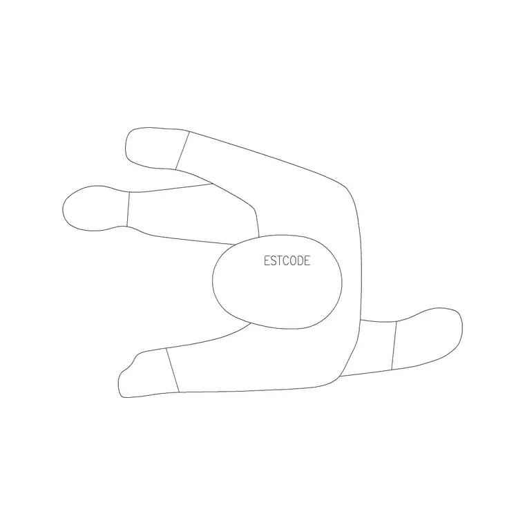
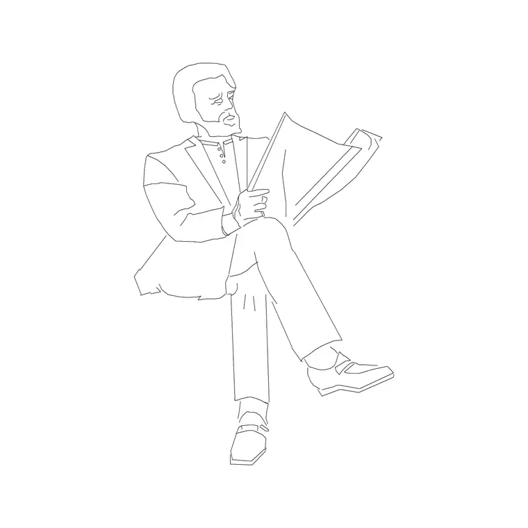
A completely bare floor plan, furniture only, no people, forces the reader to do all the scale interpretation themselves, and most clients, even sophisticated ones, are not fluent enough in reading dimension strings and furniture symbols to instantly gauge whether a living room feels generous or cramped. A handful of well-placed figures, standing at the kitchen island from human-figure-plan-1, sitting at the dining table from human-figure-sitting-1, does more to communicate real scale in three seconds than a dimension line does in thirty, because the human brain is wired to judge space relative to other humans, not relative to a number.
It's also worth separating circulation figures from seating figures when you're judging density, a corridor or hallway with zero people in it reads as perfectly normal since corridors are transitional by nature, but a living room or lounge with zero seated figures anywhere reads as unused or unfinished, so the same low density that's fine in one part of a plan can read as a mistake in another, and it's worth judging room by room rather than applying one flat rule across the whole sheet.
Why overcrowded plans backfire
On the other end, I've seen plans where literally every chair has a seated figure and every open floor area has a standing one, and the effect is the opposite of what the drafter intended, it reads as staged and cluttered rather than lively, and worse, it actually competes visually with the furniture and finishes the plan is supposed to be selling. At the end of the day a floor plan is a communication tool first, so if the entourage is loud enough to distract from the walls, doors and furniture, the density is wrong regardless of how nice any individual figure block looks.
A density approach that's worked for me
For a residential plan, I generally occupy somewhere around a third of the seating in any given room, more in a hero space like a living or dining area that's meant to feel social, less in a bedroom or study where a single figure or none at all reads more naturally. For a commercial or hospitality plan, density can run a bit higher at the focal points, the reception desk, the main bar, the best table, but I still leave circulation paths and secondary zones sparser, since a corridor packed wall to wall with standing figures reads as a fire drill, not normal use.
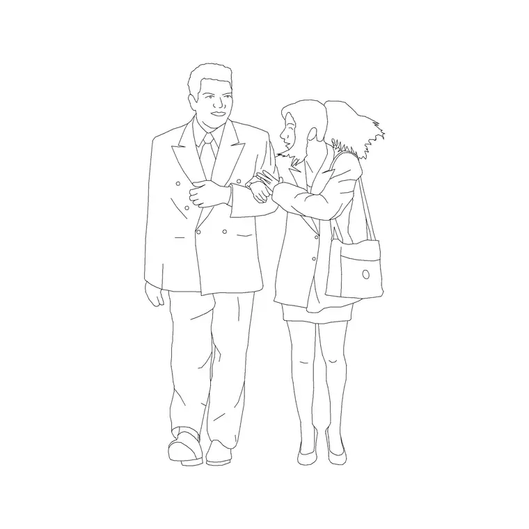
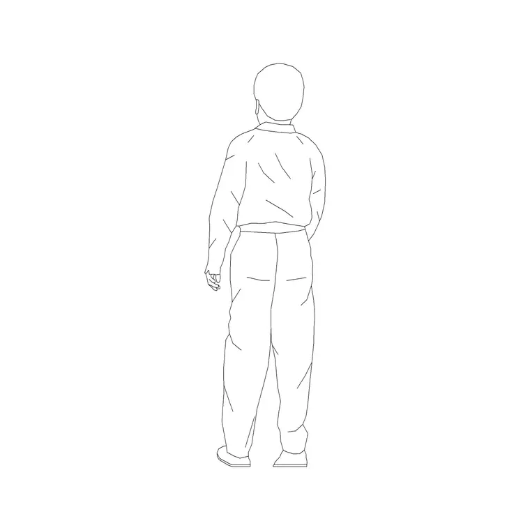
For instance, a four bedroom house plan with one family in couple or couple-human-figure at the dining table, a kid-1 figure on the living room rug, and a single standing figure from human-figure-plan-1 in the kitchen tells a complete, believable story without a single other figure needed anywhere else on that sheet.
Outdoor and landscape entourage generally wants a bit more visible activity than an interior residential room, since a plaza, courtyard or park reads as failed public space if it's completely empty in a way a private bedroom never would, so I'll usually push density up meaningfully for any public realm sheet compared to the same third of seating rule I use indoors, while still avoiding the evenly gridded, robotic spacing that gives away a lazily populated crowd rather than a genuinely varied one.
Matching density to the type of drawing
A technical construction document, one meant for a contractor rather than a client, generally wants the lowest density of all, sometimes just enough figures to confirm door swings and clearances rather than to tell a lifestyle story, since extra entourage on a working drawing can actually clutter the dimension callouts a builder is trying to read. A marketing floor plan or a render meant to sell the space wants noticeably more life, mixed poses, a couple or two, maybe a kid figure, enough to make the space feel inhabited without tipping into clutter.
A quick self check before you finalize a sheet
Step back from the plan, squint a little, and ask whether your eye goes to the furniture and layout first or to the crowd of little people first. If it's the crowd, pull some figures out. If the plan reads as sterile and empty, add a few, prioritizing the rooms that are meant to feel social over the ones that aren't. That one gut check, done at actual print scale rather than zoomed in on screen, catches most density problems before a client ever sees the sheet.
Do this check at the actual sheet scale the drawing will be printed or exported at, not zoomed into your screen, since figures that look appropriately sized and spaced at a close up screen zoom can read completely differently, often too dense, once the whole sheet is shrunk down to fit a standard print size.
Building a small, reusable entourage kit
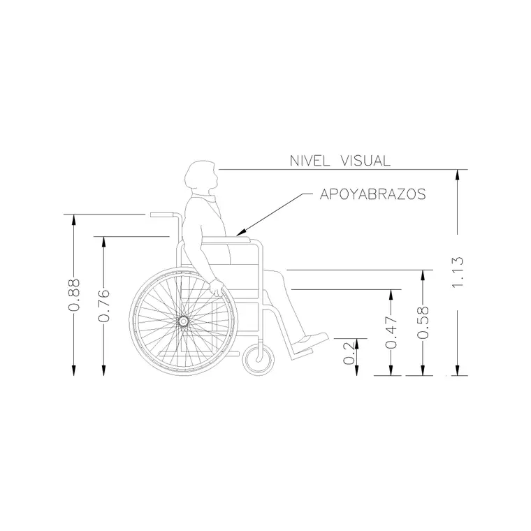
Rather than browsing the People category fresh on every project, I'd pull a small starter kit once, a standing figure like human-figure-plan-1, a sitting figure like human-figure-sitting-1, a couple block, and kid-1, save them into a personal reference DWG, and reuse that same kit across most residential work, adding human-figure-disable-1 whenever a project actually needs an accessibility reference point. Every one of these downloads free with no signup and is licensed for commercial use, so building that kit once costs you maybe ten minutes and saves that same ten minutes on every project after.
The density decisions get a lot faster once you're choosing from a familiar small set rather than second guessing which figure to grab, and honestly that familiarity also helps keep your placement instincts consistent from one plan to the next, which is exactly the kind of small workflow habit that compounds over a busy year of drafting.
Further reading
Questions
Frequently asked
Is there a fixed ratio of people to furniture that works best?+
Not a fixed ratio, but roughly a third of seating occupied in social rooms and sparser elsewhere is a workable starting point that avoids both an empty plan and an overcrowded one.
Should technical construction documents include people figures at all?+
Sparingly, mainly to confirm clearances and door swings, since a construction document is read by a contractor, not sold to a client, and extra entourage can compete with dimension callouts.
Does entourage density change between plan and render?+
Yes, marketing renders generally support higher density and more mixed poses than a working floor plan, since the render's job is to sell a lifestyle rather than just convey dimensions.
Free downloads from this article
Free CAD block library
Download the blocks from this article — free, no signup