Disabled figure CAD blocks and what they signal on a drawing
What a disabled figure CAD block actually communicates on an accessibility drawing, and how to use it as real information, not decoration.
Sumana KumarUpdated 3 April 20265 min read
A block that's also a piece of information
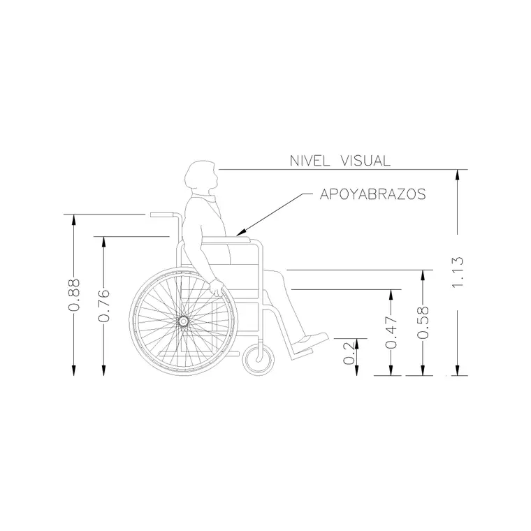
Most people entourage on a drawing is atmosphere, it makes a plan feel occupied without carrying any technical weight of its own, but a disabled figure CAD block is different, because the moment you place one, you're making a claim about that specific spot in the drawing, that it's accessible, that it accommodates a person with a mobility difference, and that claim needs to actually be true for the placement to hold up under review. That's really the core idea behind this whole post, that the human-figure-disable-1 block does double duty as both entourage and as a signal, and treating it purely as decoration is where drawings get into trouble.
What the block signals when placed correctly
Placed at an accessible entrance, a lowered counter, an accessible toilet stall, or along a marked step-free route, the figure is telling the reader that this specific point in the building has been considered for a wheelchair user, and it does that instantly, in a way that's much faster to absorb than a note calling out an accessible route in text. That's honestly the whole value proposition of using a figure at all instead of just a text annotation, spatial information reads faster than text on a busy sheet, and a reviewer scanning quickly for accessibility compliance will find the figure before they find the note.
The same logic applies at a building's main or accessible entrance, placing the figure right at the actual accessible entry point, rather than at whichever entrance looks best in the render, confirms to a reviewer that the accessible route actually connects all the way from the site boundary or parking to the building rather than stopping short somewhere in between, which is one of the more common accessibility gaps that only becomes obvious once someone actually traces the route on paper.
What it signals when placed carelessly
The flip side is that a disabled figure block dropped somewhere with no functional relationship to an accessible feature, just parked in open floor area the way you might place any other standing figure, actually undercuts the drawing's credibility, because now a careful reviewer has to work out whether that spot really is meant to be accessible or whether the figure is just there as generic entourage. I've seen this happen on plans where the drafter wanted a bit of visual diversity in the crowd of people figures, which is a reasonable instinct in a general render, but on anything doubling as an accessibility drawing it reads as sloppy rather than thoughtful.
There's also a reasonable instinct behind wanting a bit of visible diversity in a rendered crowd, and that instinct isn't wrong on its own, it's just that a disabled figure specifically carries more technical weight than swapping in a different standing figure for visual variety, so if the goal is purely diversity in a general render with no accessibility review attached, it's worth being aware that reviewers on more technical sheets may still read it as a compliance claim regardless of your original intent.
Keeping the signal clean on a mixed-use sheet
If your plan is both a marketing render and an accessibility reference, which happens more often than you'd think on smaller projects where budget doesn't stretch to separate drawings, the fix is to be deliberate: place the disabled figure block only at the points that are genuinely part of the accessible route or accessible fixtures you're calling out, and put it on its own clearly named layer, something like A-ANNO-ACCESS, separate from your general people entourage layer. That way anyone reviewing specifically for accessibility can isolate that layer and see exactly what's being claimed, without wading through the rest of the crowd.
Universal design as the bigger idea behind the symbol
It's worth zooming out for a second, because the whole point of drawing accessible features clearly connects back to the broader idea of universal design, designing spaces that work for the widest reasonable range of users without needing special-case retrofits later. A disabled figure block placed thoughtfully at real accessible points is a small, concrete expression of that bigger design intent on the sheet, it's the drawing equivalent of actually following through on an accessibility commitment rather than just stating one in the project brief.
In practice that shows up in small, unglamorous drawing decisions, showing the figure at a ramp with a gradient gentle enough to actually be usable rather than a token ramp symbol nobody checked the slope on, or at a threshold with no level change rather than a step that got value engineered in during construction without anyone updating the accessibility drawing, and those small consistency checks between the accessible figure's placement and the actual detailing around it are what separate a drawing that takes accessibility seriously from one that's just adding a figure to look considerate.
Practical drafting notes
Insert the block with INSERT, scale at 1 for matching units, and check its footprint against the doorway, counter, or stall it's meant to represent, since the combined chair and figure footprint is noticeably larger than a standing adult and a tight fit is exactly the kind of thing worth catching before the sheet goes out. Pair it, where relevant, with the accessible signage or symbol blocks your library includes, and keep the whole accessibility layer visible on any sheet where compliance is actually being reviewed rather than buried under general entourage.
Where the project includes a dedicated accessible parking or drop off zone, it's worth placing the figure there too, since parking and arrival sequencing is one of the first accessibility questions a reviewer or a building user will actually check, well before they get anywhere near an interior fixture.
Downloading the block and rounding out the scene
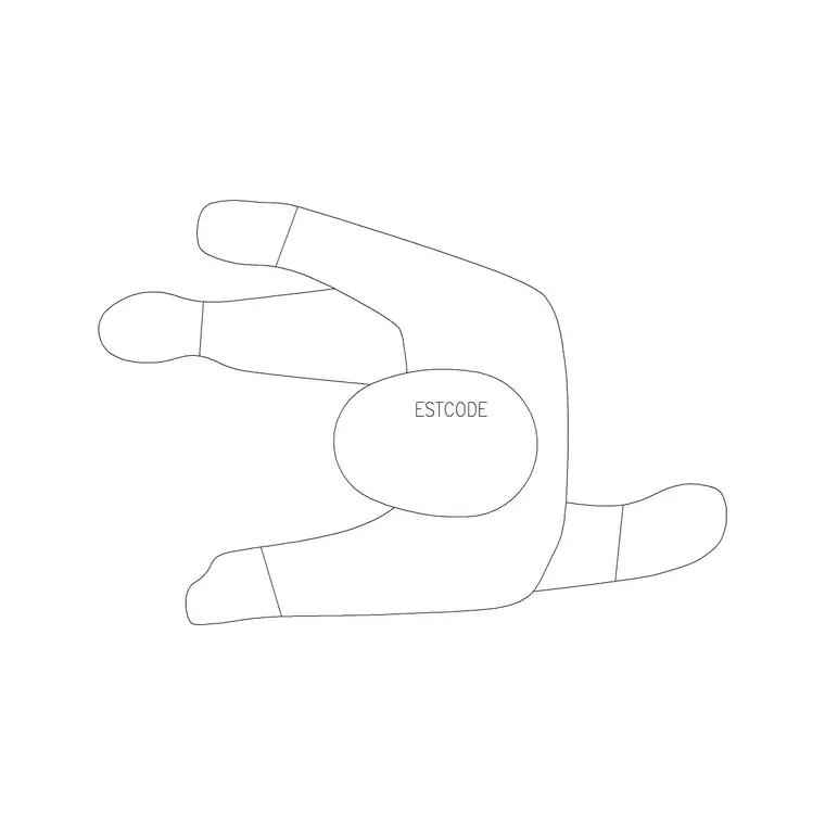
human-figure-disable-1 sits in the People category with the rest of the human figure library, the product page lists the view, plan or elevation, and format, DWG with DXF available on many listings, along with an approximate file size, and it downloads free with no signup, licensed for commercial use, so it's ready to drop into a paid accessibility drawing without a separate license step.
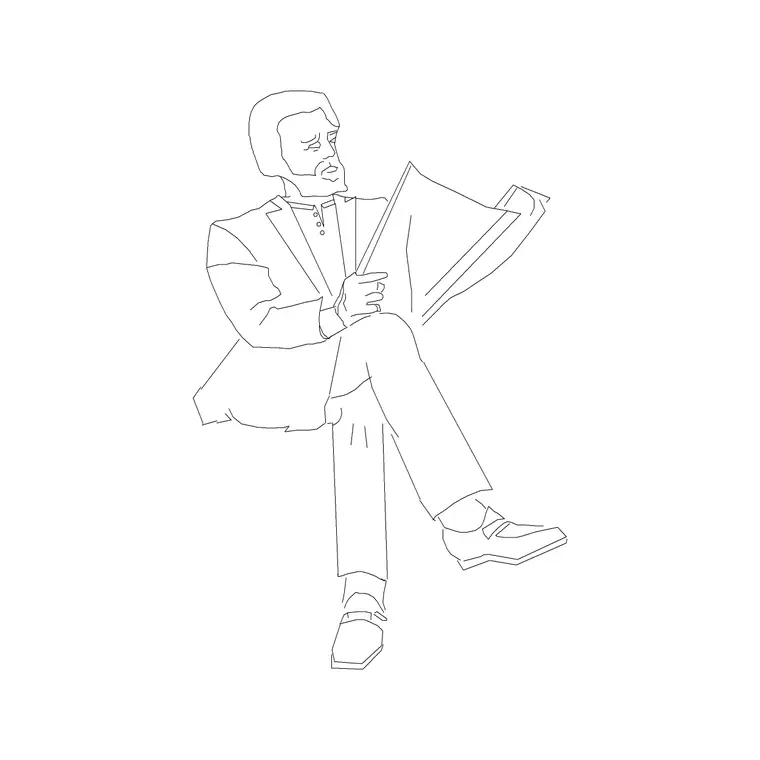
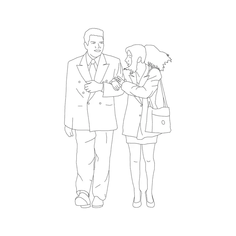
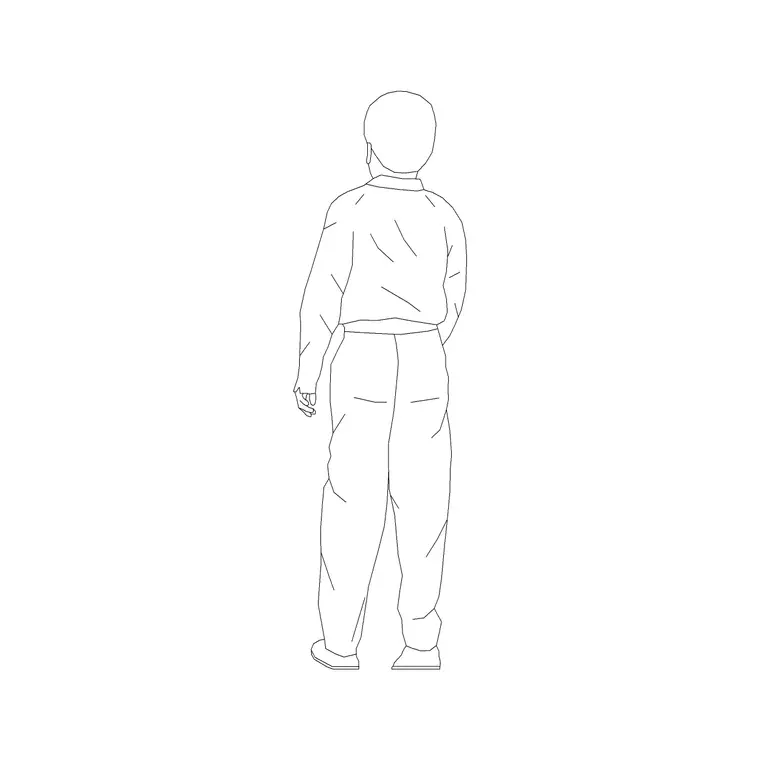
Once the accessible figure is placed correctly at its functional point, round out the rest of the plan with a normal mix from the same category, human-figure-plan-1 for standing figures, human-figure-sitting-1 for seated ones, and couple or kid-1 if the space realistically includes families, so the drawing reads as one coherent, believable population rather than a lone accessibility symbol dropped into an otherwise generic crowd.
Further reading
Questions
Frequently asked
Is a disabled figure block the same as an accessibility symbol?+
No, a disabled figure like human-figure-disable-1 shows a person for scale and occupancy at a real point in the plan, while an accessibility symbol is a separate pictogram used for signage callouts, and drawings often use both.
Where should I avoid placing a disabled figure block?+
Avoid placing it in open floor area with no relationship to an actual accessible route or fixture, since that reads as decorative rather than informative and can confuse a compliance review.
Should the disabled figure be on its own layer?+
Yes, keeping it on a dedicated, clearly named layer separate from general people entourage makes it easy for a reviewer to isolate and check accessibility claims on the sheet.
Free downloads from this article
Free CAD block library
Download the blocks from this article — free, no signup