Classic vs Modern Wall Light CAD Blocks: Choosing a Style Family
Comparing classic, vintage and modern wall light block families in the library, and how to keep a project's elevations consistent.
Saumyajit MaityUpdated 6 May 202611 min read
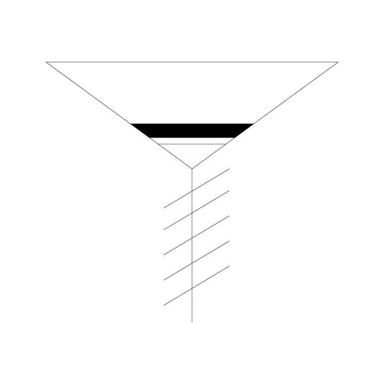
Style consistency matters more on wall lights than almost anything else
A chair or a lamp that's slightly off style from the rest of a room can get away with being an eclectic accent, that's fine, plenty of real interiors mix eras deliberately and it reads as intentional rather than careless. Wall lights are different, because they're usually specified in sets, four or six of the same fixture repeated down a corridor or across a facade, and a style mismatch on a repeated element reads as a mistake far more obviously than it would on a single piece of furniture standing on its own.
The question I get asked most when someone is picking wall light blocks for a project isn't really about size or mounting height, it's which style family to commit to, because once you've drawn six instances of a block down an elevation, swapping the style later means redoing every instance, not just one, and that kind of rework is exactly the sort of thing a tight project schedule has no patience for. So it's worth spending a few minutes upfront comparing what's actually in the catalogue before locking in a choice that the rest of the drawing set will end up depending on.
The classic and vintage family
On the more traditional end, the library carries wall-lights-classical and wall-lights-vintage, along with a second vintage variant, wall-lights-vintage-2, both drawn with the kind of ornamental detailing, curved arms, decorative backplates, that reads as period appropriate rather than contemporary. These work well on projects with existing traditional detailing elsewhere, cornicing, paneled doors, that sort of thing, where a stark modern fixture would look out of place against everything else already fixed on the elevation.
There's also wall-lights-ornamental for a project that wants to lean even further into decorative detail, and wall-lights-luxury if the brief calls for something with a bit more visual weight, both still sitting comfortably in this traditional grouping rather than crossing over into a modern minimal look that would clash with the rest of that same family's detailing.
I used the wall-lights-vintage block on a period townhouse renovation a while back where the client had kept the original cornicing and paneled doors throughout the ground floor, and running a modern minimal fixture down that same hallway would have looked like a mismatched afterthought sitting against everything else already fixed in the space, whereas the vintage block's curved arm and decorative backplate picked up the same visual language as the existing joinery without anyone having to point out why the choice worked, which is really the test a style decision should pass, it should feel unremarkable rather than clever.
The modern and contemporary family
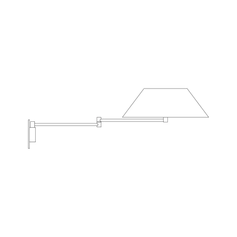
On the other end, wall-lights-modern, along with wall-lights-modern-2 and wall-lights-modern-3, cover a cleaner, more minimal silhouette, generally a simpler backplate and a more geometric shade or diffuser, the kind of fixture that disappears into a contemporary elevation rather than drawing attention to itself the way an ornamental piece would. wall-lights-contemp and wall-lights-contemp-2 sit in roughly the same territory, useful when you want variety across a project without straying into the more decorative traditional grouping described above.
For a project that wants something with more presence but still reads as contemporary rather than traditional, wall-lights-designer is worth checking, it has more visual interest than the plain modern variants without tipping over into the ornamental detailing of the classic family, which makes it a useful middle ground within the modern grouping itself rather than between the two families entirely.
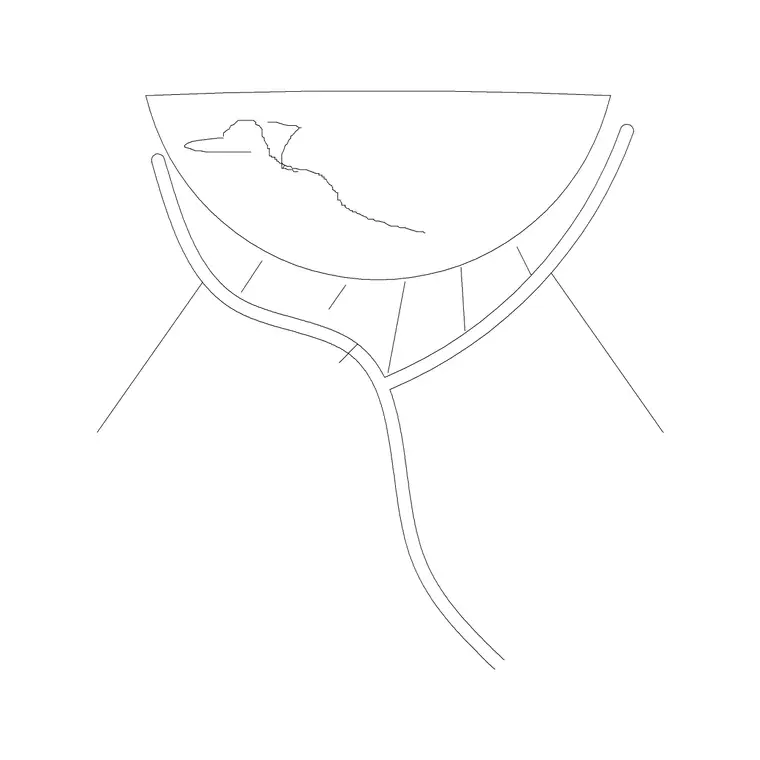
On the opposite end, a new build apartment block I worked on used wall-lights-modern-2 down every corridor precisely because the brief called for a clean, almost invisible circulation lighting scheme that didn't compete with the artwork the developer planned to hang along the same walls, and a more ornamental fixture would have fought for attention with exactly the pieces the corridor was meant to showcase, so the plainer profile wasn't a compromise there, it was genuinely the correct choice for what that specific corridor needed to do.
The transitional middle ground
Not every project sits cleanly at one end of this spectrum, plenty of interiors deliberately mix a traditional shell with more contemporary detailing inside, and the library actually has two blocks built for exactly that in between space, wall-lights-classic-mod and wall-lights-classic-modern. Both are drawn with a simplified take on classic proportions, so the general silhouette still reads as somewhat traditional, without the full ornamental detailing of wall-lights-classical or wall-lights-vintage weighing it down visually.
These two are genuinely useful on renovation projects specifically, where the shell of a building is period but the client's brief leans toward a cleaner look, rather than forcing a choice between a fixture that feels too ornate or one that feels jarringly out of place against the existing architecture the renovation is working within.
A renovation I drafted a couple of years back is a good example of exactly this situation, a Victorian terrace with all its original door trim and skirting intact on the ground floor, but a client who wanted the finished interior to read as considerably lighter and more contemporary than the shell itself, and wall-lights-classic-mod ended up being the right call there specifically because it let the hallway keep a silhouette that made sense against the original trim while still reading as considered and current rather than like an attempt to fully recreate a period fixture the client never actually wanted in the first place.
How to actually decide for a given project
Look at what else is already fixed on the elevation before picking a wall light style, door and window trim profiles are usually the strongest signal, a project with plain, square edged trim throughout is telling you the modern family is the safer default, while paneled doors or decorative cornicing point toward the classic or vintage grouping instead as the more consistent choice.
If the brief is genuinely ambiguous, or the client hasn't committed to a style direction yet, the transitional wall-lights-classic-mod or wall-lights-classic-modern blocks are a reasonable safe middle choice, they read as considered rather than indecisive, and they're less likely to look wrong once the rest of the interior finishes get decided later in the process and the overall design direction firms up around them.
A second, quieter signal worth checking is the client's own reference material, if a project brief arrives with reference photographs or a mood board, those images usually make the style direction obvious well before you've even opened the drawing, and it's worth resisting the urge to default to whichever family you personally reach for most often, since a wall light chosen against the grain of a client's own references is one of the more common causes of a late stage revision request on an otherwise finished elevation.
Detail level and drawing scale change what actually reads
It's worth remembering that a wall light block's ornamental detail only reads clearly at a certain drawing scale, a heavily detailed classical or vintage block that looks convincing at a large interior elevation scale can turn into an indistinct blob of linework once it's shrunk down onto a small overall building elevation covering an entire facade. At smaller scales, consider simplifying to a plain block placeholder for the overall building drawing and only swapping in the fully detailed classic block once you're working at a scale large enough for the ornamentation to actually show and read as intended.
The same logic applies in reverse for the modern family, a plain modern fixture that looks appropriately minimal at a large scale can start to look under detailed or even like a drafting placeholder if it's the only thing on an otherwise richly detailed elevation, so match not just the style family but the level of visual weight to what else is happening on that same sheet.
A concrete version of this problem showed up on a small apartment block elevation I reviewed, where a heavily detailed wall-lights-vintage-2 block, chosen for a ground floor entry at a large scale, had been copied straight onto the small scale overall building elevation without adjustment, and at that reduced scale the ornamental detailing that made the block work at the entry simply turned into a small dark smudge repeated up the facade, indistinguishable from a modern fixture at that distance anyway, so the extra file weight and drafting time spent on the detailed block bought nothing at the scale it was actually being viewed at on that particular sheet.
Practical drafting notes once you've committed to a family
Once a style family is chosen for a project, stick to it across every elevation the fixture appears on, mixing wall-lights-modern on one wall and wall-lights-vintage on another, without a very deliberate design reason for the contrast, is the kind of inconsistency a reviewer catches immediately and will usually flag as a coordination error rather than a design choice. If you do need variety within a family, for instance a single arm fixture at a door versus a double arm fixture on a longer wall, stay within the same style grouping, wall-lights-single and wall-lights-double both sit comfortably in the more minimal, adaptable end of the range and pair reasonably with either family depending on the surrounding detailing.
Keep a note somewhere in the drawing set, a materials schedule or a simple annotation on the reflected ceiling plan, recording which specific block was chosen for this project, so that anyone picking the file up later, including a future version of yourself, doesn't have to rebuild the decision from scratch by comparing elevations across the whole set. This matters more than it sounds on longer projects, where the same wall light might need to appear on a dozen separate room elevations spread across a drawing set that gets revised over several months, and a missing reference note is exactly the kind of small gap that lets a style substitution slip through unnoticed on one sheet while the rest of the set stays correct.
How the wall light choice relates to the rest of the lighting plan
A wall light rarely lives in isolation on a project, it usually sits alongside a ceiling fixture, and sometimes a floor or table lamp nearby if the space is a living room rather than a purely circulation area, and the style family decided on here should generally carry through to those other fixture choices rather than being settled independently. A project running the modern wall light family in a corridor while specifying an ornate vintage chandelier in the adjoining dining room can work, but only if that contrast is a deliberate transition between two distinctly different spaces, a formal dining room against a plainer circulation route, rather than an oversight from the two decisions being made separately by different people on the same job.
The practical habit worth building here is to decide the overall style direction for the whole project first, traditional, modern, or a deliberate transitional mix, before working through each room's specific fixture choices individually, so the wall light decision covered in this guide slots into a direction that's already been set rather than becoming the thing that accidentally sets it. That single upfront decision saves a lot of second guessing later when a wall light chosen in isolation turns out to clash with a chandelier or floor lamp picked weeks later for a different room entirely.
Where style choices go wrong on real projects
The most common issue is picking a style based purely on personal preference rather than what's already fixed elsewhere on the building, a beautifully detailed vintage fixture on an otherwise stark modern facade looks like an error, not a deliberate design choice, unless there's a genuine reason for the contrast that's communicated clearly elsewhere in the documentation accompanying the drawing.
The second issue is starting a project with one style and quietly drifting to another partway through as new elevations get drawn, which is exactly why it's worth locking in the family choice early and noting it somewhere the whole drawing set can reference, rather than relying on memory across a project that might run for months and pass through more than one person's hands before it's finished. The third, worth flagging on its own, is choosing a heavily ornamental block for a project on a tight budget or a fast schedule where the extra visual complexity genuinely doesn't add value, sometimes the honest answer for a simple, functional space is the plain modern family regardless of what the rest of the building's detailing looks like, and forcing an ornate choice onto a space that doesn't call for it is its own kind of inconsistency.
A fourth, subtler issue shows up on larger projects with more than one designer working across different rooms, where two people each making an independently reasonable choice, one leaning classic and one leaning modern, can still add up to an inconsistent whole once every elevation is assembled into a single set. A short style reference circulated to the whole team before individual rooms are drafted avoids this far more reliably than trying to catch the mismatch during a late stage coordination review.
A fifth, worth naming on its own, is assuming a style choice made for the interior elevations will automatically look right on an exterior facade elevation too, when in practice exterior wall lights are viewed under completely different lighting conditions, often lit against a night sky rather than a bright interior, and a fixture that reads as appropriately subtle indoors can look either too dim or oddly stark once it's the only light source visible against a dark exterior wall, which is worth a specific check rather than assuming the interior style decision transfers automatically outside.
Further reading
Questions
Frequently asked
What's the difference between the classic-mod and classical wall light blocks?+
wall-lights-classical and wall-lights-vintage carry full ornamental detailing suited to a traditional building. wall-lights-classic-mod and wall-lights-classic-modern simplify that same silhouette, making them a transitional choice for renovation projects that want a lighter touch.
How do I choose between the modern-2 and modern-3 variants?+
Both sit in the same clean, minimal grouping as wall-lights-modern. The differences are mostly in backplate and shade proportion, so the practical approach is to compare them side by side at the elevation scale you're actually working at and pick whichever reads best against the rest of that facade.
Can I mix classic and modern wall lights in one project?+
It can work, but usually only when the mix is deliberate and consistent, for instance a classic style at a formal entry and a modern style used throughout the rest of the building. Random mixing without a clear reason tends to read as inconsistency rather than intentional design.
Which family should I default to if the brief doesn't specify a style?+
Look at the door and window trim already fixed in the project. Plain, square edged trim usually points to the modern family, while paneled doors or decorative cornicing point toward classic or vintage. If it's genuinely ambiguous, the transitional wall-lights-classic-mod block is a safe middle choice.
Free downloads from this article
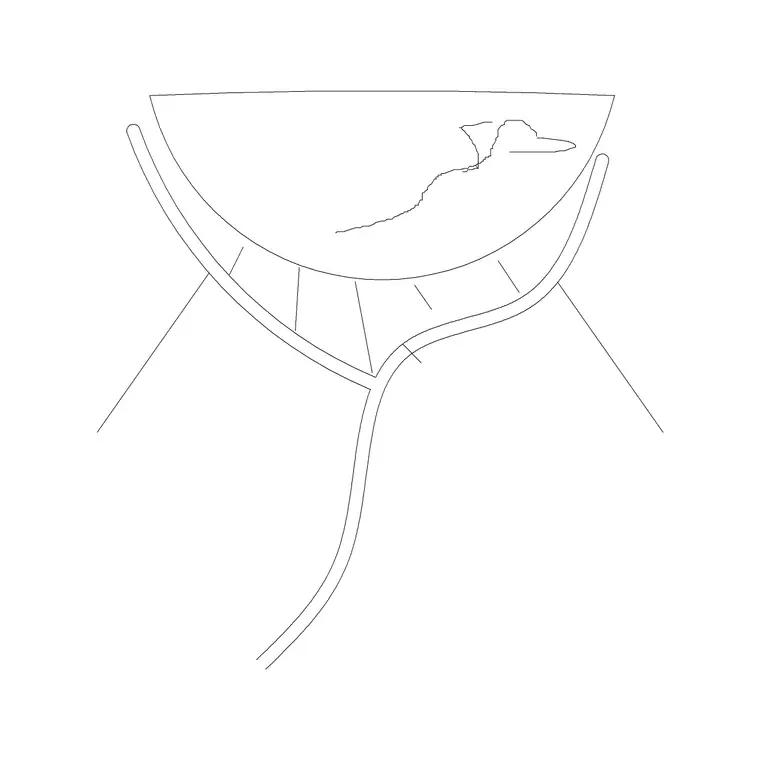
DWGWall Lights Classic Mod
 DWG
DWGWall Lights Classic Modern
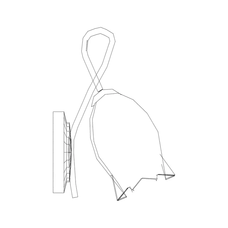 DWG
DWGWall Lights Classical
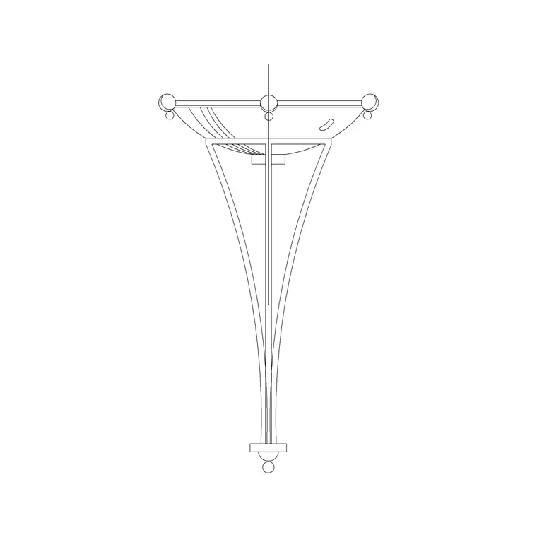 DWG
DWGWall Lights Vintage
 DWG
DWGWall Lights Vintage (2)
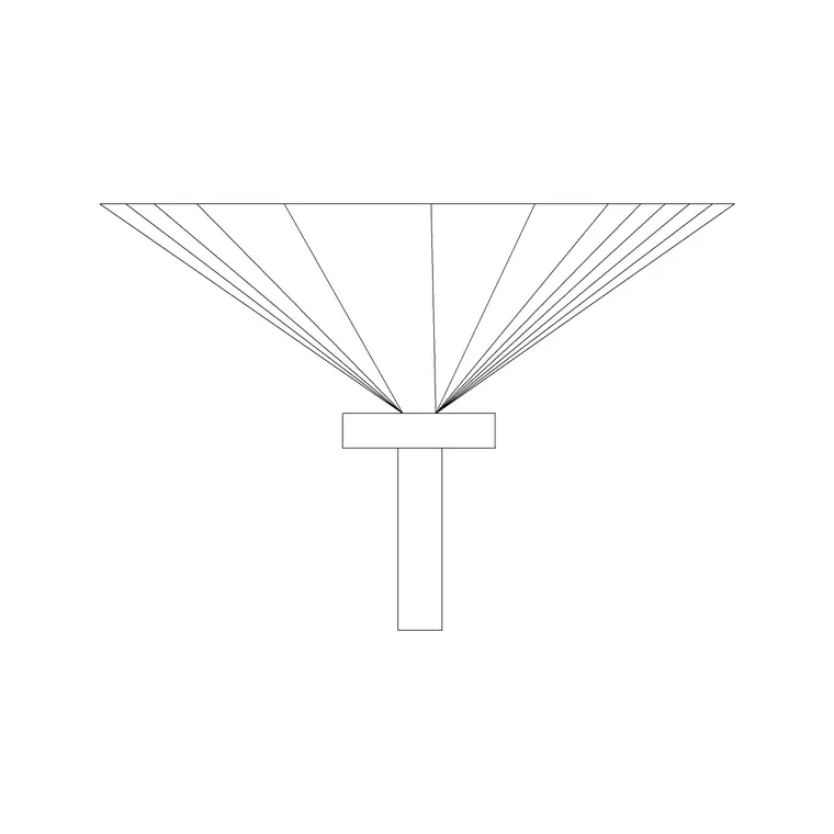 DWG
DWGWall Lights Modern
 DWG
DWGWall Lights Modern (2)
 DWG
DWGWall Lights Designer
Free CAD block library
Download the blocks from this article — free, no signup