Ceiling lamp vs pendant light blocks in a reflected ceiling plan
How to tell flush ceiling lamp and suspended pendant blocks apart on a reflected ceiling plan, and why the drop note matters.
Sumana KumarUpdated 6 May 20265 min read
A reflected ceiling plan is a different drawing than it looks like
A reflected ceiling plan, an RCP, is basically the floor plan flipped so you are looking up at the ceiling as if it were mirrored onto the floor below, and it is where every lighting fixture in the project gets reduced down to a symbol, a position, and a mounting type, stripped of all the elevation detail that makes a chandelier block look impressive on a section drawing. Understanding the difference between a ceiling lamp and a pendant light matters here specifically because RCP symbols usually distinguish between flush mounted fixtures and suspended ones, and mixing that up on the plan sends the wrong instruction to whoever is actually installing the wiring.
Ceiling lamp: flush, close, low profile
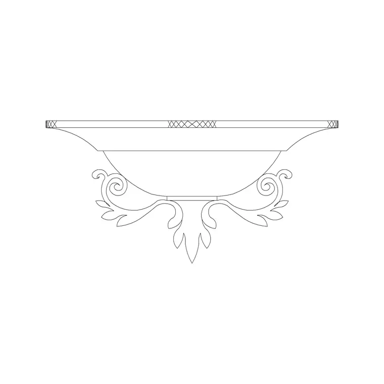
The Ceiling Lamp block sits close against the ceiling surface with minimal drop, which on an RCP typically gets represented as a small circular or compact symbol positioned right at its true plan location with little to no offset annotation needed, since there is effectively no suspension length to note. This is your default for standard height rooms, bedrooms, hallways, most bathrooms, anywhere the ceiling is a conventional 2.4 to 2.7 metres and you do not want a fixture eating into headroom.
Bathrooms and closets are worth a specific mention here, since these rooms often default to a flush ceiling lamp purely for the low profile and the fact that a suspended fixture near a shower or a tight closet ceiling is both a practical hazard and visually awkward in a space with very little room to spare. If a bathroom on your project genuinely calls for a decorative pendant over a freestanding tub, treat that as the one deliberate exception on the RCP rather than the default, and note it clearly so it does not get mistaken for a flush fixture during construction.
Pendant and chandelier: suspended, so the RCP needs a drop note
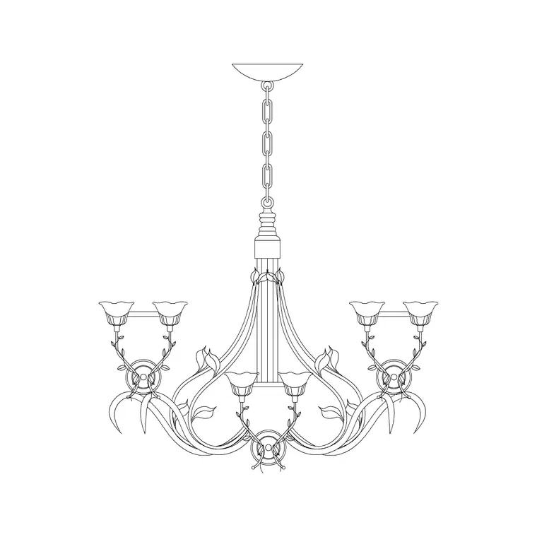
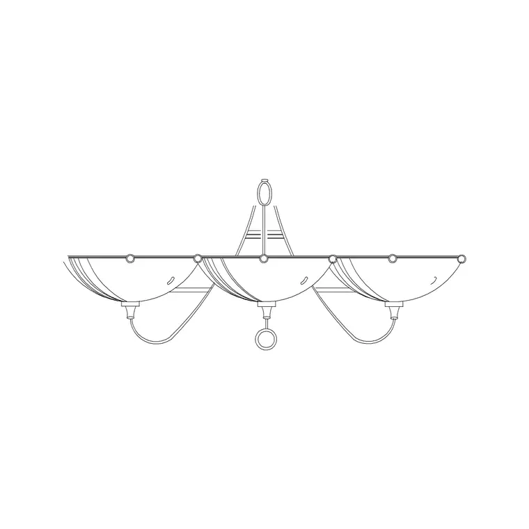
A suspended fixture, whether that is the round chandelier or the long suspended chandelier block, needs its symbol on the RCP annotated with a drop dimension, because the plan alone cannot show how far below the ceiling the fixture actually hangs, and an installer or electrician reading only the RCP has no way to know that without a note or a cross reference to the elevation. This is the step I see skipped most often on RCPs drawn quickly, someone drops the plan symbol in the right x y position and forgets that the whole point of a pendant is the vertical drop, which lives on a different sheet entirely unless it gets written down right there on the plan.
Centring logic differs between the two
Flush ceiling lamps are usually centred on the room or on a specific task zone, over a dining table, centred in a hallway run, and their exact position matters less because the light spreads fairly evenly regardless of a few centimetres either way. Suspended pendants and chandeliers are far less forgiving, since the fixture is a visible object hanging in the room, not just a light source, so its centring against a dining table, an island, or a stair void needs to be precise, and that precision has to be set on the plan first before it ever gets drawn in elevation.
How the two views talk to each other
What I actually do is draft the RCP first with correct plan positions and drop annotations, then use that same positioning data when I build out the elevation or section drawings, so the chandelier's centreline in elevation matches exactly where the RCP said it should be. A building information modeling workflow handles this automatically since the fixture is one object referenced across every view, but in a straight 2D DWG workflow that link is manual, which is exactly why drop notes and consistent centring on the RCP matter so much, they are the only thing keeping the plan and the elevation in agreement.
A small but common failure mode worth naming directly, an RCP drawn at one point in a project and an elevation drawn later can drift out of agreement if fixture positions get retyped as raw coordinates rather than snapped between the two drawings, so where possible keep both views referencing the same underlying insertion point rather than redrawing the fixture position twice by hand. Even in a straight 2D DWG workflow without a full BIM setup, a shared block insertion point or an external reference across sheets goes a long way toward keeping the RCP and the elevation honest with each other through multiple revisions. It is a small discipline to build into a workflow, but it is the difference between an RCP that still matches the elevation on revision five and one that has quietly drifted apart somewhere around revision two without anyone noticing until a site query forces the comparison.
Keeping the symbols distinguishable
On the RCP itself, give flush and suspended fixtures visually distinct symbols or at minimum a different layer and linetype, a solid filled circle for flush ceiling lamps versus a circle with a cross or a drop note for suspended pendants and chandeliers, so anyone scanning the sheet can tell mounting type at a glance without reading every annotation individually. That small bit of drafting discipline is what turns an RCP from a plan that looks complete into one that is actually buildable.
A worked example to make the rule concrete
Take a simple open plan living and dining space with one dining table and one sofa. On the RCP, the dining table gets a suspended fixture centred on the table's own centreline, not the room's, with a drop note reading something like the fixture hangs roughly 750mm above the tabletop plane, cross referenced to the elevation sheet where that dimension is actually drawn out in full. The sofa zone, by contrast, gets two flush ceiling lamps spaced evenly for general ambient coverage, shown as simple filled circles with no drop annotation needed since there is nothing to note. A reviewer scanning that RCP for thirty seconds should immediately understand which fixture is the feature and which fixtures are just filling the room with light, purely from the symbol type and the presence or absence of a drop note, without having to read a single line of a specification document sitting in a folder somewhere else. That is really the whole goal of getting this distinction right on the plan, letting the drawing itself carry the information instead of relying on someone remembering it.
Further reading
Questions
Frequently asked
Do I need to show the drop dimension for every pendant on an RCP?+
Yes, or at minimum reference the elevation sheet where it is dimensioned. Without it, the plan only tells an installer where the fixture goes, not how far it hangs.
What is the visual difference between a flush and suspended symbol on an RCP?+
There is no single universal standard, but a common convention is a solid circle for flush mounted fixtures and a circle with a drop note or a different linetype for suspended ones, kept consistent across your own drawing set.
Can I use the elevation chandelier block directly on the RCP?+
No, the RCP needs a plan view symbol, not the elevation block. Use the elevation version for sections and elevations, and a simple plan symbol at the correct position for the RCP.
Free downloads from this article

Free CAD block library
Download the blocks from this article — free, no signup