Blocks for a mood board that still reads at scale
Why plan-accurate CAD blocks make a mood board more convincing than clipped magazine imagery, and which ones actually earn a spot on one.
Saumyajit MaityUpdated 23 March 20266 min read
The problem with most mood boards is they lie about scale
I've reviewed plenty of mood boards that are gorgeous and completely misleading, a sofa image pulled from a catalogue sitting next to a lamp image pulled from somewhere else entirely, with no consistent relationship between their actual sizes, so a client falls in love with a composition that literally could not exist at the proportions shown. The fix I've settled on over the years is boring but it works, build at least one panel of the mood board out of real, scaled CAD blocks rather than pure imagery, because a block based composition can't accidentally lie about relative size the way a collage of internet photos can.
Furniture as the proportional anchor
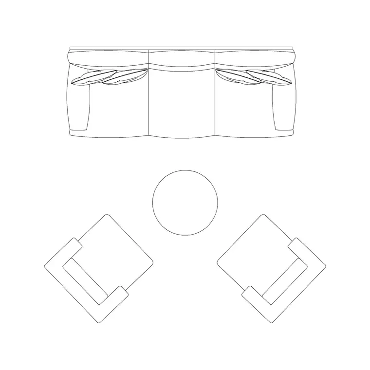
A sofa set plan block, even shown as a simple silhouette rather than a full plan, gives the rest of the board something real to be measured against, since most people have an intuitive sense of how big a sofa is, so once it's on the board at correct proportion, everything else placed next to it inherits believable scale by comparison. This matters more on mood boards than people assume, because the entire point of the exercise is helping a client trust that the finished space will feel the way the board suggests it will.
I'll sometimes go a step further and add a simple human figure or a known reference object, even something as basic as a metre scale bar tucked into a corner of the panel, because most people calibrate size intuitively against a familiar reference rather than reading a stated dimension, and a board that gives the eye something to compare against tends to land its scale message even for a client who never consciously looks at the scale bar itself.
Lens distortion is a subtler version of the same scale problem and it's worth watching for specifically when you're sourcing reference imagery to sit alongside the scaled blocks, since a wide angle interior photograph, the kind a lot of catalogue and showroom photography uses to make a room feel more spacious, exaggerates the apparent size of whatever's closest to the camera and shrinks whatever's further back, and mixing that kind of photography with a correctly scaled plan block on the same panel can quietly reintroduce the exact proportional confusion the block was meant to solve. I try to source reference imagery shot with a longer, flatter lens where I can, or at minimum avoid placing a wide angle shot directly next to a precisely scaled element where the mismatch would be most visible.
Lighting as the mood, quite literally
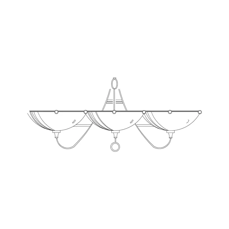
A wall lamp block placed at correct scale next to the furniture silhouette does double duty on a mood board, it signals the fixture style being proposed and it reinforces the proportional honesty of the whole composition, since lighting fixtures are one of the easiest things to accidentally show oversized in a pure imagery collage. I usually pull the lamp onto the same panel as the furniture rather than isolating it, so the relationship between seat height and fixture mounting height reads correctly even in a loosely composed board.
Texture, greenery, and material honesty
A tree or plant elevation block like a pine elevation is useful on a mood board wherever greenery is part of the proposal, indoor or outdoor, because plant material is another category people frequently misjudge from photography alone, a small potted plant photographed close up can look like a statement tree from across the room. Keeping the plant element at correct scale relative to the furniture panel avoids setting an expectation the actual planting budget or space can't deliver.
The same discipline applies to material and finish swatches placed near the furniture panel, keep the swatch physically sized in a way that's roughly proportional to how much of the actual room that material will cover, a small paint chip next to a large upholstery swatch quietly signals accent versus dominant material even before a client reads the caption explaining which is which.
I've also started keeping a rough reference object, a common household item like a floor lamp or a dining chair, sized consistently across every board I build, purely as a private calibration check before the board goes out, since holding every new element up against that same known reference catches a sizing error faster than trying to eyeball proportion fresh on every single project.
Site elements that ground an exterior mood
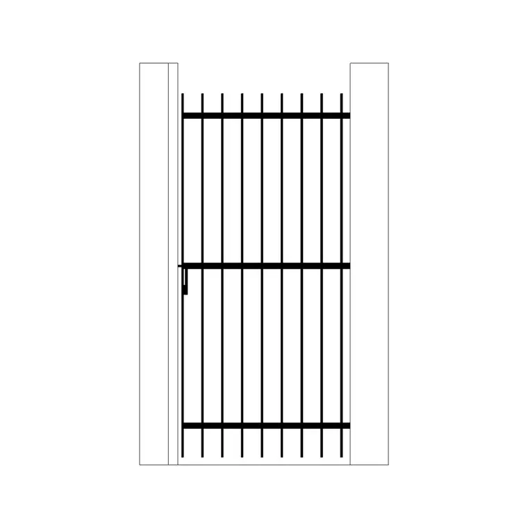
If the board covers an exterior or entry moment, a gate block like an iron gate anchors that portion of the composition the same way furniture anchors an interior panel, giving the client a concrete, scaled reference for an entry sequence rather than an abstract material swatch. A north arrow or simple direction symbol is a small addition worth including too, since it quietly signals the board is grounded in an actual site rather than a generic aspirational image set.
For a multi room proposal, keep one consistent scale across every panel on the board rather than letting each room's furniture silhouette be sized purely to fill its own panel nicely, since a client flipping between panels will start comparing room sizes against each other even if that wasn't the board's intent, and inconsistent scale between panels undermines the same trust that correct scale within a single panel builds.
Balancing accuracy with the emotional job the board still has to do
None of this means a mood board should look like a technical drawing, the emotional job of the board, making a client feel the space before it exists, still matters and scaled blocks don't compete with that, they support it. What I've found is clients actually trust a board more, not less, once they sense the proportions are honest, even if they couldn't articulate why the composition feels more convincing than a purely aspirational collage would have.
The boards that get approved fastest in my experience aren't the ones with the most beautiful individual images, they're the ones where nothing on the page creates a small, nagging doubt in the client's mind about whether the room will actually feel the way it's being presented, and consistent, correctly scaled blocks are a large part of removing that doubt without the client ever being able to name exactly why the board feels more trustworthy.
Walking a client through the board in person, rather than sending it as a file to review alone, is where the scale accuracy actually pays off most visibly, because I can point to the sofa silhouette and say, this is the actual size, here's roughly where your existing armchair would sit next to it, and clients respond to that kind of concrete anchor far more than they respond to a caption stating a dimension in text, since a stated number is abstract in a way that a correctly proportioned shape sitting next to something familiar simply isn't.
Further reading
Questions
Frequently asked
Why use CAD blocks on a mood board instead of just photography?+
Photography from different sources rarely shares a consistent scale, so a collage can accidentally show furniture, lighting and plants at proportions that could never coexist in real life. Scaled CAD blocks keep the relative sizing honest even in a loosely composed board.
Should mood board blocks be shown as detailed drawings or simple silhouettes?+
Simple silhouettes usually work better here, since the board's job is mood and proportion, not construction detail. A sofa set plan block simplified to an outline still anchors scale correctly without competing visually with the imagery around it.
Does adding scaled blocks make a mood board look too technical for a client presentation?+
Not if it's used sparingly, a furniture silhouette or a lighting block for scale reference doesn't read as a technical drawing, it reads as a more grounded, trustworthy composition, and most clients respond well to that even without consciously noticing why.
Free downloads from this article


Free CAD block library
Download the blocks from this article — free, no signup