Blocks you need to build a client presentation board
The furniture, lighting and site blocks that make a client presentation board read clearly at print scale, not just on a laptop screen.
Saumyajit MaityUpdated 6 June 20266 min read
Why boards fall apart in the room, not on screen
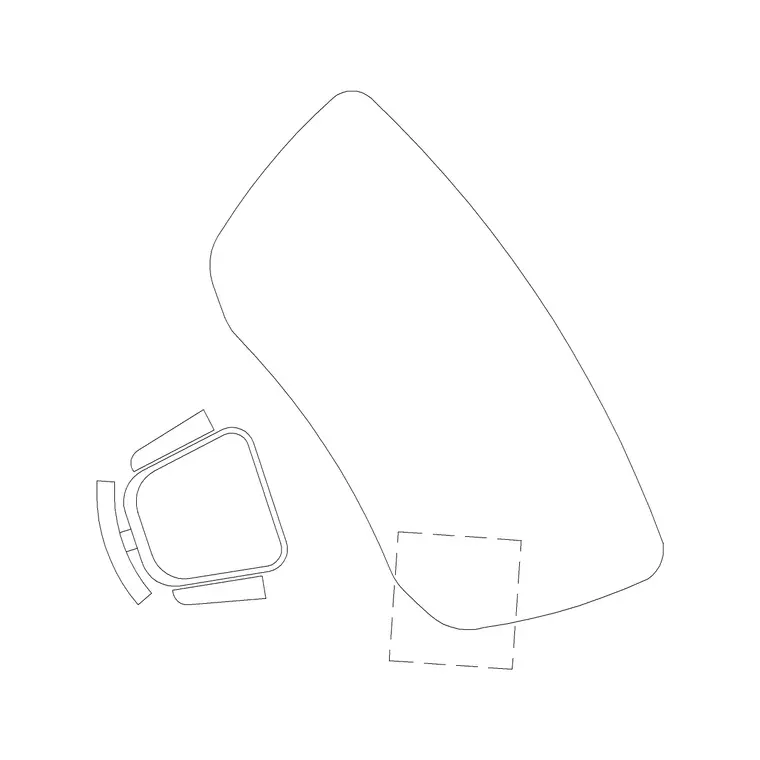
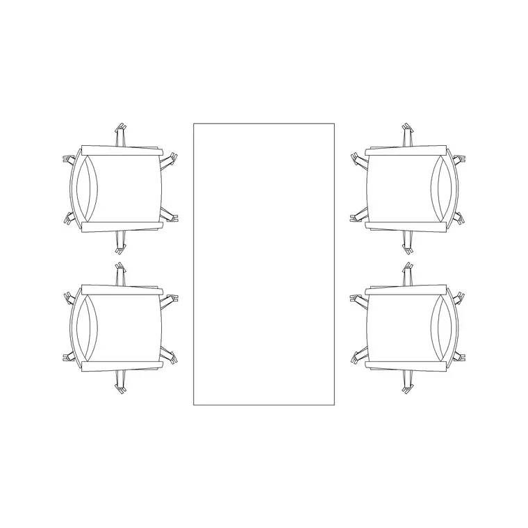
I've sat in enough client presentations to know the exact moment a board stops working, and it's almost never during the design, it's when someone prints the sheet at A1 and every piece of furniture that looked crisp on a 27 inch monitor turns into a smudge. A client presentation board has to do two jobs at once, it has to read as a real, buildable space and it has to look considered enough that a non technical client trusts the design in the room, on paper, from six feet away. That second job is where generic furniture outlines lose to properly drawn blocks, because the difference between a rectangle labelled 'sofa' and an actual sofa set plan with cushion lines and arm returns is the difference between a client nodding along and a client actually picturing themselves sitting there.
So the checklist below is built around that, blocks that hold their line weight and their identity once they're scaled down to fit a sheet, not just blocks that are technically correct.
The furniture layer clients actually look at
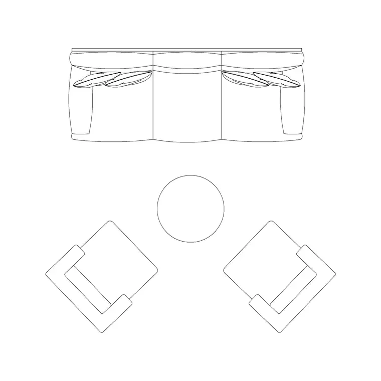
Start with seating, because it's what every client's eye goes to first on a plan. A sofa set plan block gives you the cushion breaks and arm profiles that make a living or lounge zone read as furnished rather than blocked out, and you'll usually find these drawn at realistic widths, a two seater typically sitting in the 150 to 170 cm range and a three seater more like 190 to 220 cm, so cross check the block's actual dimensions against your layout before you commit to a wall run. Pair the seating with coffee tables, side tables, and whatever anchors the composition, a rug outline for instance does more to sell a 'finished room' feeling on a board than people expect.
What I actually do when I'm building a board is drop the furniture in first, get the composition breathing room right, and only then start layering finishes and notes on top, because if the furniture doesn't read at the right density the rest of the board is lipstick on a bad layout.
Lighting and site elements that sell the mood
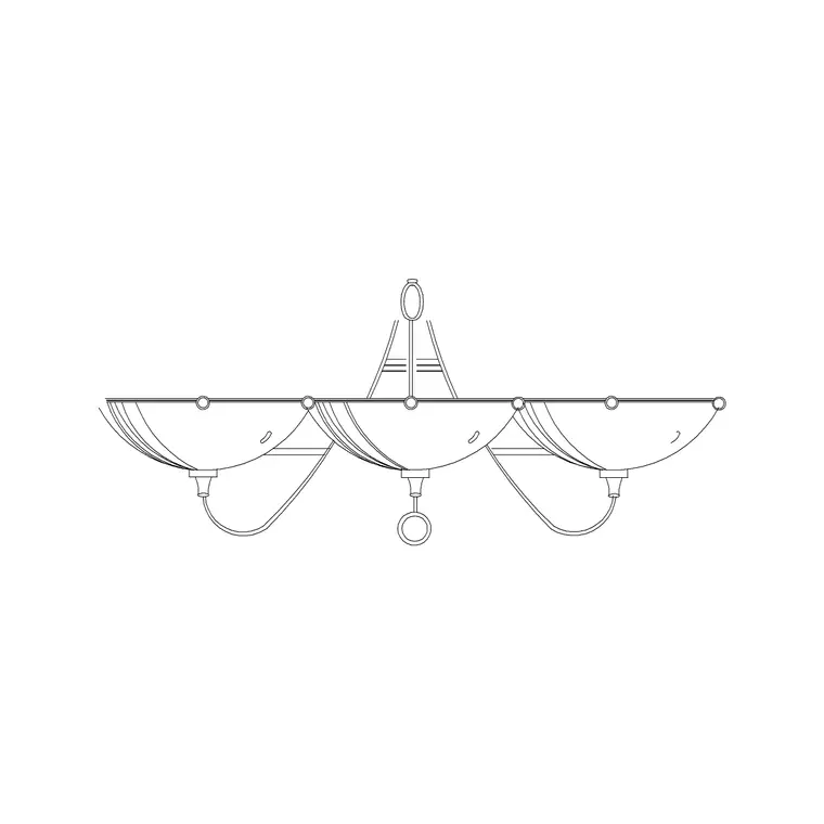
A board that's all plan and no atmosphere feels flat, so I'll usually pull in an elevation view lighting block, a wall lamp for instance, and drop it onto an interior elevation strip alongside the plan so the client sees both the layout and a sense of the wall it lives on. Wall sconces are typically mounted somewhere in the 1000 to 1400 mm range off finished floor for ambient tasks and a bit lower for reading light, and having that block already drawn at scale on an elevation saves you from eyeballing a light fixture's proportions against a door or window on the same sheet.
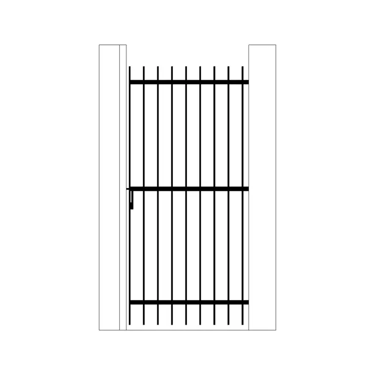
If the presentation includes any exterior context, a gate block like an iron gate earns its place on the site plan portion of the board, it grounds the entry sequence and gives the client something concrete to react to rather than an empty property line.
The small symbols that make a board feel professional
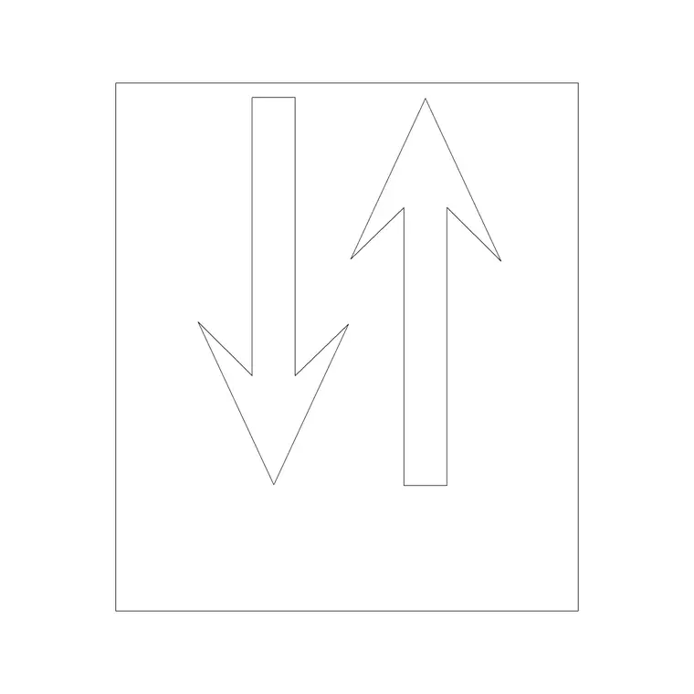
This is the part people skip and it's the part that separates a student looking board from one that reads like it came out of a working office. A north arrow tells the client, even subconsciously, that this is a real drawing and not a mood collage, and if there's any planting shown, even a schematic front garden, a tree elevation block like a pine elevation gives you a vertical element to break up an otherwise flat facade sketch.
None of these are the star of the board, but boards without them read thinner than boards with them, and thinness is exactly what erodes client confidence in a first meeting.
I'll also add a simple scale bar next to the north arrow on any board heading to print, since a scale bar reads correctly regardless of what size the sheet actually gets printed or projected at, whereas a stated scale ratio alone can become misleading if someone later resizes the PDF or prints it at a different sheet size than intended, and a client glancing at a board rarely thinks to check the stated scale text before forming an impression of how big a room actually is.
Keeping the whole thing legible at plot scale
The single biggest mistake I see on presentation boards is furniture and fixture blocks pulled in at whatever scale looked fine on screen, then never checked against the actual print scale of the sheet, an interior plan going out at 1:50 for instance needs blocks with clean, simple linework, because anything with fussy hatching or tiny text just turns to noise once it's reduced. Set your units correctly on insertion, per Autodesk's own AutoCAD documentation the INSUNITS system variable is what governs automatic scaling between block and drawing, and check the result against a known dimension on the sheet, a door leaf or a piece of furniture you already trust, before you move on to the next block.
Presenting more than one option on the same board
For instance, a lot of client meetings ask for two or three layout options side by side rather than a single committed scheme, and when that's the case I keep the same furniture block set and the same scale across every option shown on the board, exactly for the reason a comparison only works if nothing except the actual layout is changing between panels. Swapping a different sofa block or a slightly different scale between Option A and Option B on the same sheet quietly biases the comparison, since a client's eye reacts to the visual weight of the furniture as much as the layout itself, and that's not a variable you want accidentally in play when the client's actually trying to decide between two genuine spatial options.
Assembling without bloating the file
Presentation boards tend to accumulate blocks fast because you're pulling from several categories at once, furniture, lighting, symbols, landscape, so purge unused block definitions before you export, and keep everything on clearly named layers so a last minute client request ('can we lose the rug') is a one click hide rather than a hunt through raw geometry. A clean block based board also exports to PDF far faster and at a smaller file size than one built from exploded, ungrouped lines, which matters when you're emailing a sheet the night before a meeting.
I also keep a consistent file naming convention across every board revision that goes out, something as simple as a date stamp and a revision letter in the filename itself, since presentation boards get emailed back and forth during a project and it's remarkably easy for a client to end up reviewing an outdated PDF that someone forwarded from an earlier round, a mistake that costs a confusing meeting to untangle and is entirely avoidable with a naming habit that costs nothing to maintain.
Further reading
Questions
Frequently asked
What scale should furniture blocks be at for a client presentation board?+
Match whatever the board's plan is printed at, usually 1:50 or 1:100 for a room level board. Insert the block at its real world size and let your drawing's INSUNITS setting handle the scaling rather than manually stretching it, otherwise proportions drift.
Should I use plan view or elevation blocks on a presentation board?+
Use both if the board has room. Plan view sells the layout and furniture density, elevation blocks like a wall lamp on an interior elevation sell the atmosphere and wall composition, and clients respond well to seeing the same space from two angles on one sheet.
How do I stop a board from looking cluttered with too many blocks?+
Pick one hero furniture moment, usually seating, and let everything else, symbols, arrows, planting, sit at a lower visual weight through thinner lineweights or a lighter layer colour, so the eye has a clear place to land first.
Free downloads from this article


Free CAD block library
Download the blocks from this article — free, no signup