Blocks for a space-planning or test-fit exercise
The lean block set you actually need to run a fast test-fit or space-planning study, without over-drawing a layout that might change tomorrow.
Sumana KumarUpdated 15 May 20266 min read
A test-fit is a question, not a finished drawing
The whole point of a test-fit is speed, you're answering 'does this program fit on this floor plate' or 'how many desks can we realistically get in here', and I've watched junior drafters lose an entire afternoon detailing furniture that gets deleted the moment the client says the layout doesn't work. So the rule I work by on any space-planning pass is simple, use blocks, but use the plainest version of the block you have, because a test-fit only needs an accurate footprint and a believable density, not finished linework.
That mindset changes which blocks are actually useful here versus which ones you'd reach for on a client-facing board.
Furniture footprints for fast iteration
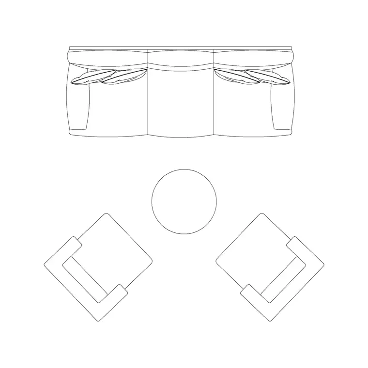
A sofa set plan block is genuinely useful even at test-fit stage, not for its detail but for its footprint, because seating groups eat more floor area than people estimate and a correctly scaled block stops you from underestimating a lounge zone's real depth, typically somewhere in the 150 to 220 cm range depending on configuration. Drop it in, check the clearance around it against circulation, and move on, you're not styling the cushions at this stage.
What I actually do on a test-fit is build a small personal palette of two or three furniture blocks per typical zone, one seating block, one desk or table block, one storage block, and reuse those same three across every option I'm testing, because consistency between options is what makes a client comparison of Option A versus Option B actually fair.
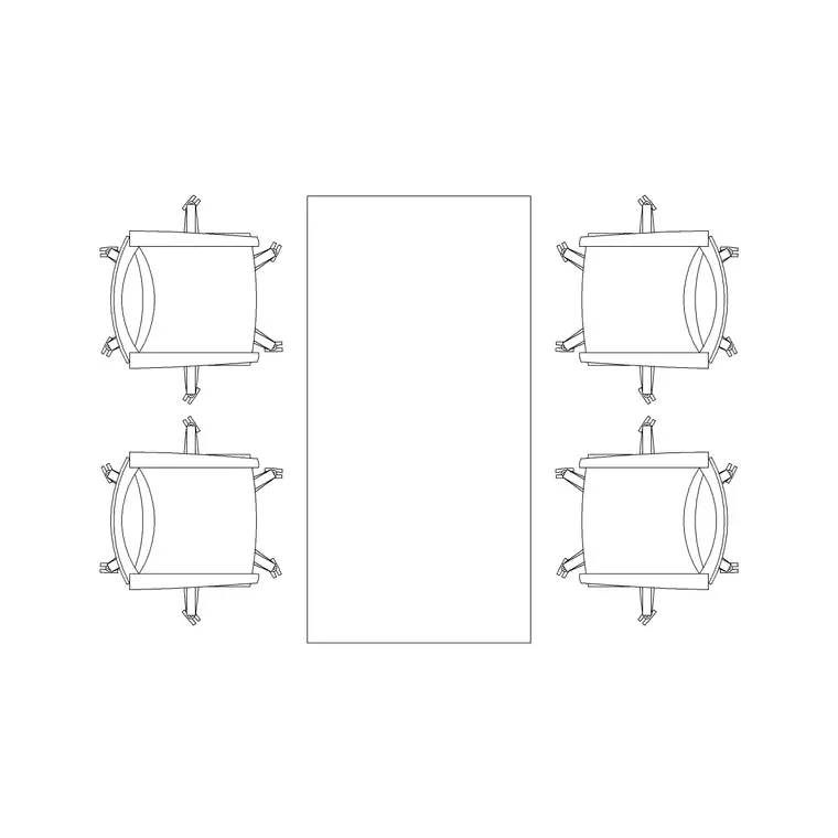
The same logic applies to desks and workstations if the test-fit is for an office program, a single desk footprint block repeated across a floor plate tells you far more about realistic headcount than a generic square metre per person ratio pulled from a leasing brochure, because real circulation, real aisle widths between desk rows, eats into that ratio in ways a back of envelope number never captures. I've had a test-fit come back from a client meeting with 'can we fit ten more people' as the only feedback, and having the desk block already in the file means that's a five minute check, not a redraw.
Storage is the zone people most often forget to test-fit at all, filing, lockers, shared cabinets, because it doesn't feel as urgent as desk count, but storage footprint adds up fast across a whole floor and skipping it at test-fit stage means it either gets squeezed in awkwardly later or, more commonly, quietly dropped from the brief without anyone deciding that on purpose. I keep a simple storage block in the same lean palette as the desk and seating blocks specifically so it doesn't get left out of the fit exercise by default.
Circulation and accessibility from the first pass
It's tempting to leave circulation width and accessibility clearances for a 'later' pass, but that's exactly how a test-fit gets approved and then fails a code check three weeks in, so bring an accessible route symbol like a wheel chair accessible block into the layout early, particularly at corridor pinch points, reception desks, and any door you're testing for clear width. Per the Universal design principles that most accessibility codes are built around, a usable route generally needs enough width for both straight travel and turning, so treat that block as a checking tool, not decoration, and run it against every circulation path you're proposing.
A common mistake at this stage is testing circulation once at the start of the exercise and never again as furniture density increases through the iterations, but a layout that passes an accessibility check at a loose early density can quietly fail it once you've packed in the extra desks or seating a client asked for. Re-run the clearance check against the wheelchair symbol placements every time the furniture count changes meaningfully, not just once at the start, because density creep is the single most common way a test-fit that looked fine on option one fails on option three.
I also keep a copy of the accessible route symbol at a consistent scale across every project's test-fit palette file, rather than resizing it ad hoc each time, since a clearance check is only as trustworthy as the block's own dimensional accuracy, and a symbol that's been stretched slightly out of scale on a previous project and never corrected can quietly pass a clearance check that shouldn't actually pass.
Direction, flow, and quick annotation
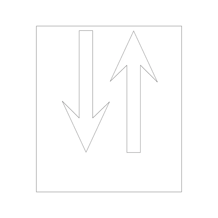
An arrow block earns its place in almost every test-fit I draw, whether it's marking circulation flow through an open plan, a north arrow for orientation, or just a callout pointing at a zone that needs a client decision. Because test-fits get marked up fast and often in a meeting, having a couple of arrow variants already in your working palette saves you from drawing ad hoc leader lines that don't match anything else on the sheet.
I'll also mark a rough occupant load estimate directly on each option using the same arrow and callout style, since a client comparing two or three layouts side by side usually wants a quick headcount alongside the visual, not a separate spreadsheet they have to cross reference mid meeting, and having that number already on the sheet keeps the conversation moving without a pause to go calculate it live.
Keeping options comparable
If you're testing two or three layout options on the same floor plate, which is standard for a proper space-planning study, keep the exact same block set and the exact same scale across every option, because swapping furniture styles between options quietly changes the area a zone reads as needing, which skews the comparison. I keep one 'test-fit palette' DWG with the four or five blocks I actually use for this work and just XREF or insert from that file every time rather than re-sourcing furniture per project.
Presenting test-fit results without over-designing them
Basically, when a test-fit goes into a client meeting, resist the urge to dress it up with rendering, colour, or finishes just because it's heading in front of a client, since a polished looking test-fit quietly signals a level of commitment that hasn't actually happened yet, and a client can walk away assuming a layout is far more locked in than it really is. I keep test-fit sheets deliberately plain, black and white or a single accent colour at most, specifically so the visual language itself communicates "this is a study" rather than "this is final", which also makes it easier for the client to say a layout doesn't work without it feeling like they're rejecting a finished design.
When to stop and detail up
A test-fit's job ends once the client or internal stakeholder picks a direction, and that's the moment to swap the plain footprint blocks for fuller, presentation quality versions, proper cushion lines on the sofa, a real lighting layer, actual finishes. Trying to make a test-fit presentation-ready from the start just slows down the one thing test-fits are supposed to be fast at, which is answering the fit question quickly enough that the client can make a decision.
Further reading
Questions
Frequently asked
Do test-fit blocks need to be detailed?+
No, and they shouldn't be. Use simplified furniture footprints at the correct real world scale, save detailed cushion lines, hardware and finishes for the presentation drawing that comes after a layout option is approved.
How do I check accessibility during a test-fit, not after?+
Place an accessible route symbol like a wheelchair block at every pinch point, corridor and doorway while you're still testing options, so a clearance problem shows up as a quick visual check rather than a code review finding weeks later.
Should every option in a space-planning study use the same furniture blocks?+
Yes. Keeping the same block set and scale across all tested layout options is what makes the area comparison between options fair, since swapping furniture styles between options can quietly change how much space a zone appears to need.
Free downloads from this article


Free CAD block library
Download the blocks from this article — free, no signup