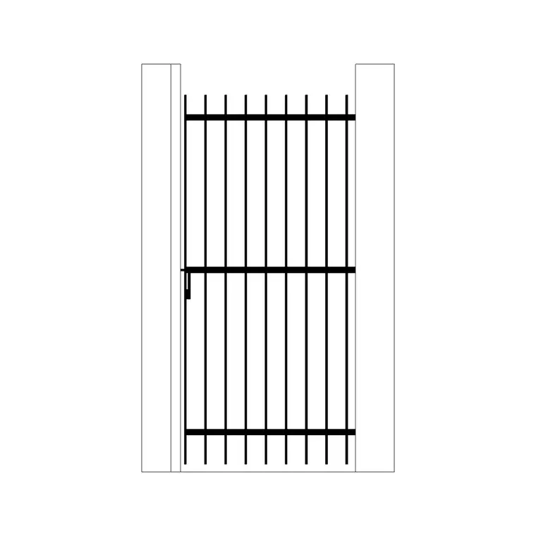
Matching block line weight to a presentation drawing style
How to set consistent line weights across downloaded CAD blocks so furniture, trees and figures match the tone of the rest of your presentation drawing.
Saumyajit MaityUpdated 22 June 20265 min read
The problem with mismatched line weight
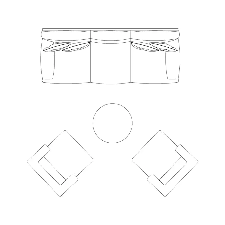
Download ten CAD blocks from ten different sources and you'll almost always get ten different default line weights, some drawn hairline thin for a rendered look, some drawn heavy and bold for a diagrammatic look, and dropped straight into a drawing without adjustment they fight each other visually even when every block is individually well drawn. I run into this constantly with mixed libraries, a sofa set plan block that came in at a chunky 0.5mm outline sitting next to a wall lamp block drawn at a delicate 0.13mm, and on the plotted sheet it just looks unplanned even though nothing about either block is actually wrong.
Line weight is basically the drawing's tone of voice, and a presentation drawing needs one consistent tone from the building outline down to the smallest accessory block, otherwise the viewer's eye keeps getting pulled to whichever element happens to be heaviest rather than what you actually want them looking at.
Setting up a line weight hierarchy before you insert anything
The fix is deciding your hierarchy before you start pulling blocks in, not after. A workable starting hierarchy for most presentation drawings looks something like this: cut lines and primary structure at 0.5mm to 0.7mm, furniture and major entourage at 0.25mm to 0.35mm, fine detail and hatching at 0.13mm to 0.18mm, and a single heavier accent weight around 0.9mm reserved for the outer sheet border or a ground line that needs to anchor the whole composition.
Once that's decided, every block you bring in gets reassigned to the appropriate layer in that hierarchy rather than kept on whatever layer it arrived on, and in AutoCAD this is a quick fix through the layer properties manager, select the block, change its layer, and let ByLayer color and weight settings do the rest of the work automatically.
Working with color-coded vs monochrome block sets
Some downloaded blocks come drawn with color doing a lot of the differentiation work, different colored layers for canopy versus trunk on a tree elevation, for instance, and that's fine for a working drawing where color helps a reviewer parse information quickly. For a presentation drawing going out in black and white or muted tones, though, color-coded differentiation has to get translated into line weight differentiation instead, since color often won't survive the print or export process the way you expect.
The practical move is to check every block's plot style assignment against your chosen palette before finalizing a sheet, and where a block relied purely on color to separate two elements, add a line weight or linetype difference so the distinction still reads once color is stripped out or muted for print.
Adjusting weight for different presentation styles
A soft, hand-rendered-feeling presentation board generally wants a narrower range between your lightest and heaviest line, everything pulled closer together so the drawing feels sketch-like rather than hard-edged, maybe 0.18mm at the low end up to 0.5mm at the high end instead of the fuller diagrammatic range. A crisp, modern minimalist board, on the other hand, usually wants the opposite, a wider spread with very fine detail lines against one or two genuinely bold structural lines, so the contrast itself becomes part of the visual style.
Neither approach is more correct, it depends entirely on what tone the presentation is going for, but the mistake to avoid is picking a style intention and then not actually adjusting your block line weights to match it, which is how you end up with a soft watercolor-style board that still has hard 0.5mm furniture outlines fighting the rest of the composition.
A quick audit before you plot
Before finalizing any presentation sheet, do a layer audit, list every layer in the drawing along with its assigned line weight and color, and look specifically for outliers, a stray block still sitting on layer 0 with default weight, a figure block that came in pre-assigned to a random color that doesn't match anything else on the sheet. This takes maybe ten minutes on a typical presentation set and it catches the vast majority of visual inconsistency before it shows up on a printed board where it's much harder to fix.
Worth remembering too that AutoCAD's plot style tables, whether you're using color-dependent or named plot styles, are what actually determine final printed weight regardless of what's set in the drawing, so always do a test plot at real scale rather than trusting the on-screen preview, since screen and paper can genuinely diverge more than people expect.
Building a reusable line weight template
Once you've settled on a hierarchy that works, the smart move is saving it as a template rather than rebuilding it project by project, either as a DWT file with your layer structure and plot style assignments already baked in, or as a standalone CTB or STB file you can import into any new drawing. I keep one such template for presentation work and a slightly different one for construction sets, since the two contexts genuinely want different weight relationships, and reaching for the right template at the start of a project saves the entire audit-and-reassign process described above on every future job.
Over a handful of projects this pays back the setup time many times over, since every new downloaded block just gets dropped onto the correct pre-built layer immediately on import rather than needing individual reassignment, and the presentation drawings that come out the other end have a consistent tone from project to project as well as within any single sheet, which is a nice side benefit if you're building a portfolio or a firm-wide visual standard.
How this differs across other CAD tools
This whole hierarchy concept translates outside AutoCAD too, even if the exact settings dialog looks different, block-based line weight assignment through layer or object properties works basically the same way whether you're in a DWG-native tool or something like SketchUp for early massing work, the principle of a consistent weight hierarchy between structural, furniture and detail elements holds regardless of which software actually produced the final sheet. Where things get trickier is on projects that move between tools, a plan roughed out in one program and finished in AutoCAD, since layer names and weight assignments don't always survive an import cleanly.
When that happens, budget time for a layer cleanup pass immediately after import rather than assuming everything carried over correctly, checking a handful of representative blocks against your intended hierarchy before you commit to finishing the drawing in the new environment, since catching a weight mismatch early is far less work than discovering it during a final plot review.
Further reading
Questions
Frequently asked
What line weight range should furniture and entourage blocks use in a presentation drawing?+
A common working range is 0.25mm to 0.35mm for furniture and major entourage, sitting lighter than primary structure at 0.5mm to 0.7mm and heavier than fine detail hatching at 0.13mm to 0.18mm.
Why do downloaded CAD blocks have inconsistent line weight?+
Blocks pulled from different sources are drawn to whatever convention the original author used, so mixing libraries without reassigning layers almost always produces mismatched weight. Reassigning every block to your own layer hierarchy fixes this in one pass.
Does color-coded block linework matter for black and white presentations?+
Not directly, since color often won't survive print, but wherever a block relied on color alone to separate two elements you need to add a line weight or linetype difference so that distinction still reads once color is removed.
Free downloads from this article


Free CAD block library
Download the blocks from this article — free, no signup