Traffic Sign Categories and Standard Sizes for Site Drawings
How traffic signs are typically categorised and sized on site drawings, plus how to check sign height and sightlines against real vehicle CAD blocks.
Saumyajit MaityUpdated 26 June 202611 min read
Why traffic signs show up on site drawings at all
Traffic signs end up on a lot of site drawings that have nothing to do with a public highway, because any site with vehicle movement, a car park, a loading yard, a gated compound, tends to need at least a handful of directional, warning or regulatory signs to keep pedestrians and drivers apart and to guide unfamiliar visitors through the layout. On the drawing itself, a sign is usually represented as a simple symbol at a located point, with the sign's category, size and mounting height called out in a schedule rather than drawn in full detail, since the actual sign face design is normally standardized and sourced from a signage supplier rather than custom drawn.
A good sign scheme also follows a hierarchy, right, a handful of larger, clearly placed signs at key decision points, entrances, junctions within the site, do more good than a large number of small signs scattered everywhere, since a driver or pedestrian trying to read six competing signs at once absorbs none of them properly. Planning that hierarchy, which signs matter most at which decision point, is as much a wayfinding design exercise as it is a compliance one.
It's worth walking the proposed route yourself, on the drawing at least, as if you were a first time visitor rather than the designer who already knows the layout, since a scheme that makes perfect sense to someone who drew it can still leave a genuine first time visitor guessing at the one junction where two routes split without a clear sign to say which way to go.
Broad sign categories, and the families within them
Most sign systems, whatever country's specific regulation they follow, group into three broad functional categories that are worth knowing generally even before you get into a specific national standard. Regulatory signs tell a driver what they must or must not do, stop, give way, no entry, speed limit, and are usually the ones with legal weight behind them. Warning signs alert a driver to a hazard or change ahead, a bend, a pedestrian crossing, a low bridge, and are typically distinguished visually, often a triangular shape or a distinct colour, from regulatory signs so a driver's eye separates must obey from be aware. Informational and directional signs, the third category, guide a driver toward a destination or tell them where they are, and these carry the least legal weight but are often the most numerous on a private site, since a large car park or campus can need a lot of simple wayfinding.
Within those three broad categories, a real site drawing usually ends up specifying several more specific sign types worth naming individually: parking restriction signs, no parking, permit holders only, time limited zones, directional and destination signs pointing to a specific building, department or car park zone, one way and direction of travel signs controlling circulation, and speed limit or speed reduction signs within larger sites like campuses or business parks. Each of these tends to have its own conventional shape, colour and, often, size band within a given national standard, which is one more reason a generic sign schedule should be checked against the specific regulation for your project rather than assumed from general knowledge alone.
Typical size bands and what drives them
Sign size on a real road is rarely a single fixed dimension, it typically scales with the road's design speed and the distance a driver needs to read and react to the sign at that speed. A sign on a slow, low speed site access road can be considerably smaller, sometimes in the range of 300 to 450mm across the main dimension, than an equivalent sign on a faster public road, where the same message might need to be 600, 900mm or larger to be legible at a glance from a moving vehicle. This is exactly why you shouldn't lift a sign size straight from a fast road reference drawing and drop it into a slow speed private site plan, or vice versa, the reading distance assumption baked into that size no longer matches your actual site conditions.
The number of words or symbols on a sign face also drives size in practice, even within the same speed category, since a sign carrying a longer worded message, a set of complex parking instructions, for instance, needs a bigger panel to keep the individual letters at a legible size than a sign carrying a single simple symbol. It's often better design practice to split a complicated message across two smaller, sequential signs than to shrink the text on one oversized panel trying to say everything at once.
A worked example: sizing signage for a small business park entrance
Take a small business park with a single shared entrance off a moderately busy local road, feeding three separate car parks for different tenants. The entrance itself needs a regulatory give way or stop sign sized for the approach speed of that local road, not the slower speed inside the park itself, since a driver arriving at the entrance is still moving at the outside road's pace when they first need to see and react to it. Once inside the boundary, the signage job changes completely, the site's own internal roads are slow, so the same size sign inside the park would look oversized and could arguably even be more distracting than useful, and this is where I'd typically drop the panel size down a category and lean more on directional and informational signs, three separate tenant destinations, for instance, each needing a clear, simply worded sign at the one junction where the routes actually split.
The honest test for whether the scheme works is standing at that junction, in the drawing at least, and asking whether a delivery driver who has never been to the site before can tell at a glance which of three roughly similar looking access roads leads to the tenant they're actually delivering to. If the answer depends on already knowing the layout, the sign scheme needs another look, usually either a bigger, clearer sign right at the split point or an earlier confirming sign further back that primes the driver for the decision before they're already in the middle of making it.
Mounting height conventions
Mounting height conventions typically separate signs meant to be read by a driver from signs meant to be read by a pedestrian. Vehicle facing signs are commonly mounted with their lower edge somewhere in the range of 1.5 to 2.1 meters above ground level, high enough to clear most vehicles' sightlines and stay visible over a queue of cars, while pedestrian facing or informational signage nearer a building entrance is often mounted lower, closer to natural eye height. Anywhere a sign sits near a pedestrian route, mounting height also needs to be checked against accessibility guidance to make sure a projecting sign face doesn't become a head height hazard for a visually impaired pedestrian using a cane, which is a detail that's easy to miss when a sign is added late in a design process purely to solve a wayfinding gap.
The post or frame supporting a sign also needs a foundation sized for local wind loading and ground conditions, which is a structural specification rather than a drafting one, but it's worth flagging on the drawing that a taller or larger sign panel, one with a bigger surface area catching more wind, generally needs a more substantial foundation than a small low level sign. Oversizing a sign purely out of caution has a downstream cost in foundation size as well, so it isn't a purely cosmetic decision.
Reflective sheeting and documenting the sign in a schedule
Sign visibility at night or in poor weather depends heavily on the reflective sheeting specified for the sign face, and most sign standards define a small number of reflective performance classes, broadly split between a standard grade suitable for lower speed, well lit environments and a higher performance grade intended for faster roads or areas without street lighting. This is a materials and specification decision that sits alongside the size and mounting height decisions covered elsewhere in this article, and it's worth calling out on a sign schedule explicitly rather than assuming a supplier will default to the right grade for your specific site conditions.
On a drawing set, individual sign symbols are usually kept simple, a small circle, triangle or rectangle at the located point, with the detailed specification, sign category, exact size, mounting height, post type and foundation, called out in an accompanying schedule table rather than crowded onto the plan itself. This keeps the plan readable while still giving a contractor everything needed to order and install the correct sign at each location, and it's a much easier document to update than trying to annotate every dimension directly next to a small plan symbol.
Sightlines and clearance
A sign is only useful if a driver can actually see it in time, which means checking it against real sightlines, not just placing it at a logical looking point on the plan. Parked cars, planting, and even other signage can block a sign's visibility from the approach direction a driver actually arrives from, so it's worth tracing the sightline from a realistic driver eye position, roughly windscreen height, through the site rather than assuming a sign visible in plan view is automatically visible from the road.
This is worth checking at more than one point along the approach too, since a sign that's clearly visible from 30 meters away can still be hidden at the critical last few meters by something closer, a parked delivery van, a low hedge that's grown since the landscape drawing was issued, or even another sign mounted slightly in front of it. Tracing a sightline is quick to do properly on a plan and easy to get wrong by only checking it from a single, convenient viewpoint.
It's also worth remembering that a sightline check done at the point a landscape scheme is first planted won't necessarily hold true a few years later, since a hedge or a young tree specified at a modest height on a planting schedule can grow well past that height within a handful of seasons if it isn't maintained to a specific clearance line. A sign schedule that's genuinely relying on a sightline staying clear over the long term is worth cross referencing against the landscape maintenance schedule, flagging explicitly that a particular hedge or tree run needs to be kept trimmed below a stated height specifically to preserve that sightline, rather than leaving it to a general landscaping maintenance note that doesn't call out the sign relationship at all.
Checking sign placement against real vehicle CAD blocks
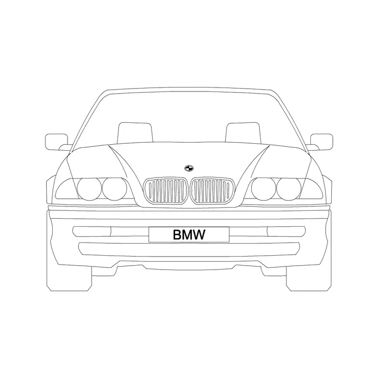
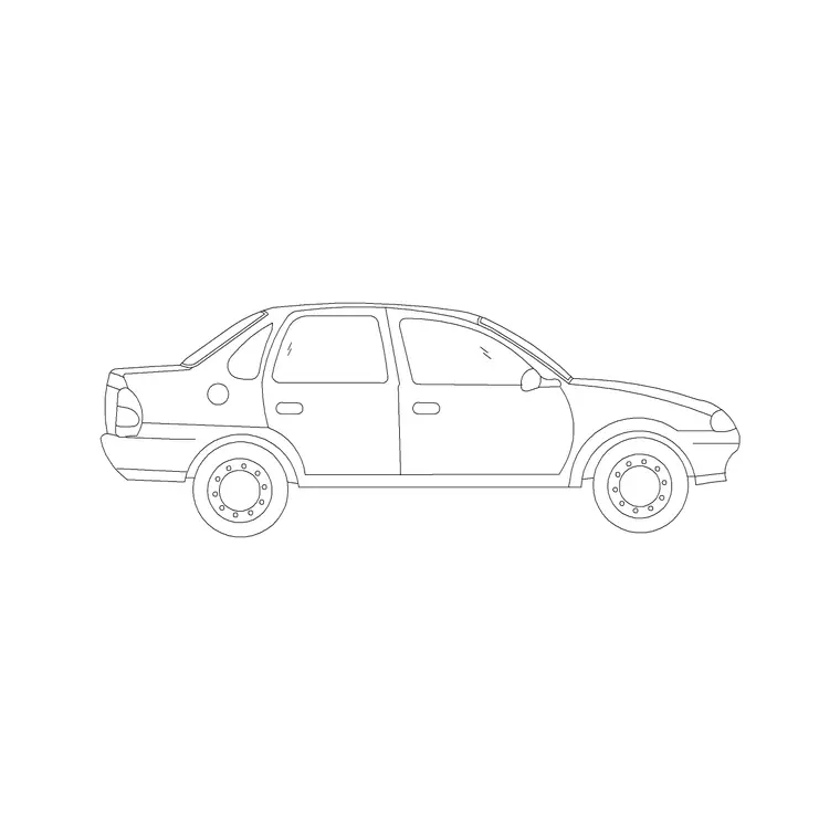
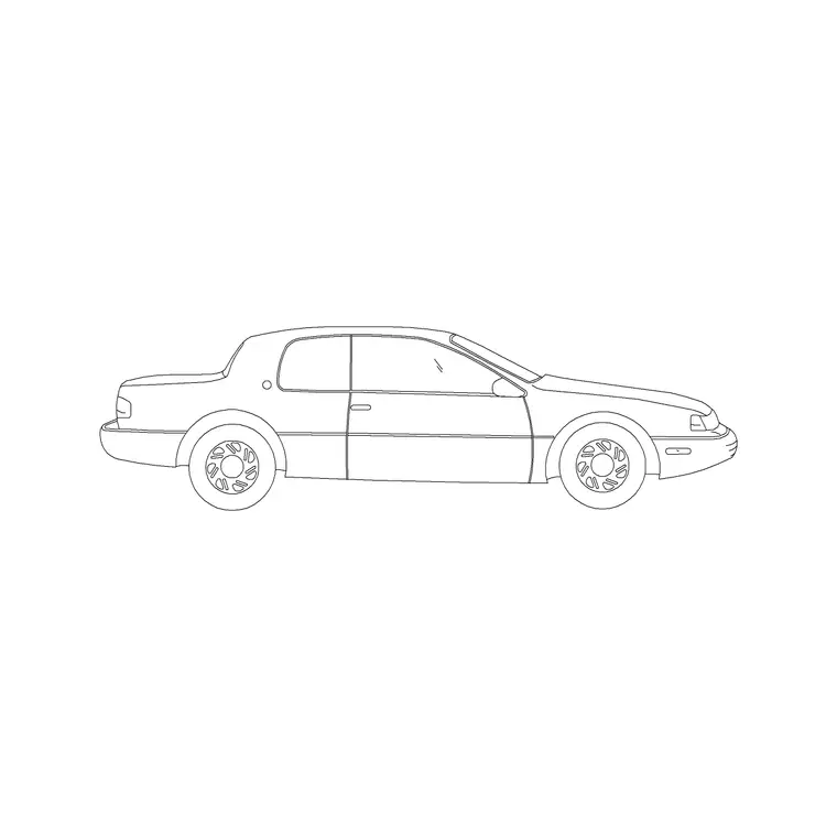
This is a case where our vehicle elevation blocks earn their keep on a drawing that isn't primarily about vehicles at all. Drop the BMW car front elevation block or the compact sedan car into a section or elevation view near a proposed sign location, and you get an immediate, honest check of whether the sign's mounting height clears the vehicle roofline with a sensible margin, and whether a queue of parked or waiting vehicles would block the sightline to the sign from an approaching driver's position. It's a quick way to catch a sign mounted too low, or placed just behind where a parked car would block it, before it becomes a site problem discovered after installation.
It's worth running this same check against more than one vehicle type where the site genuinely sees a mix, a low sports car and a tall SUV parked at the same spot present quite different sightline problems, and a sign height that clears comfortably over a sedan roofline can still be blocked by a van or SUV queued in front of it. Checking against the tallest common vehicle expected on site, not just an average car, is the more robust way to size this.
What we do and don't have as downloadable blocks
We don't currently carry dedicated traffic sign face blocks, stop sign, give way sign, directional panel, as standalone downloads in the library, so if a specific sign face symbol is what you need for a schedule, that particular download isn't here yet. What our vehicle blocks are genuinely useful for, as covered above, is checking sign height and sightline logic against a real vehicle footprint and elevation, which is a different but equally important part of getting sign placement right.
Mistakes worth checking
- Reusing a fast road sign size on a slow private site access road, making the sign oversized and visually cluttered - Mounting a sign at a height that clears an empty sightline check but not a sightline with a parked or queuing vehicle in front of it - Placing pedestrian facing signage at vehicle mounting height, or vice versa - Forgetting to check a low mounted sign against accessible route head height clearance - Specifying standard grade reflective sheeting for a sign in an unlit area where a higher performance grade is actually needed - Crowding a plan with fully detailed sign symbols instead of a simple located point plus a clear, cross referenced schedule
Further reading
Questions
Frequently asked
What are the main categories of traffic sign?+
Most systems group into regulatory signs, what a driver must or must not do, warning signs, alerting to a hazard ahead, and informational or directional signs for wayfinding, though the exact category names vary by country.
How big should a traffic sign be?+
Size typically scales with the road's design speed and the driver's reaction and reading distance at that speed, so a slow private site road sign can be considerably smaller than an equivalent sign on a fast public road.
How high should a traffic sign be mounted?+
Vehicle facing signs are commonly mounted with their lower edge somewhere around 1.5 to 2.1 meters above ground, high enough to clear typical vehicle sightlines, while pedestrian facing signage is often mounted lower.
Do you sell traffic sign CAD blocks?+
Not currently as standalone sign face blocks. Our vehicle elevation blocks are useful for checking sign mounting height and sightline clearance against a real vehicle profile.
Free downloads from this article

Free CAD block library
Download the blocks from this article — free, no signup