Text Height, Dimension Style and Annotation Scale Conventions
How text height, dimension style setup and annotation scale work together so text and dimensions plot at a consistent, legible size.
Sumana KumarUpdated 13 July 202610 min read

Why the same drawing can be readable at one scale and not another
I've zoomed into plenty of drawings where the plan looks perfectly clean at 1:100 and then the same sheet gets revised to include a blown up detail at 1:20, and suddenly half the dimension text is either microscopic or the size of a small billboard, because nobody accounted for how text height and scale interact before adding the new viewport. Getting text height, dimension styles and annotation scale right isn't really about typography, it's about making sure a number or a label reads at the same physical size on the printed sheet regardless of which scale the underlying geometry happens to be drawn at.
What makes this genuinely tricky rather than just fiddly is that the problem is invisible in model space, everything looks reasonable at whatever zoom level you happen to be working at, and only becomes obvious once you look through an actual scaled viewport or, worse, once the sheet is already printed and sitting in someone's hands. So the discipline here isn't really a one time setup task, it's a habit of checking annotation through the lens of the final plotted scale every time a new viewport gets added, not just at the start of a project.
It's worth being honest that this is one of the more mechanical, math heavy corners of drafting convention, there's no creative judgment call involved, just a multiplication that has to be applied consistently, which is exactly why it's also one of the easiest things to get systematically right once, bake into a template, and never have to think about again, versus one of the most visible things to get wrong on a sheet that goes out the door without a final scale check.
Model space plotted text height: the relationship to memorize
The relationship every drafter eventually memorizes is this, text height on the plotted sheet equals the model space text height divided by the drawing scale factor, or multiplied by it depending on which direction you're solving from. So if you want text to plot at 2.5mm tall on a 1:100 drawing, you set the model space text height to 2.5 times 100, which is 250mm, because when that text gets viewed through a 1:100 viewport it shrinks back down to 2.5mm on the actual paper. This is the single calculation that trips up more new CAD users than almost anything else, because 250mm looks absurdly huge while you're drawing it in model space, right up until you look at it through the scaled viewport and it's exactly the size it should be.
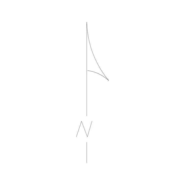
The same multiplication applies to anything else you want to read at a consistent physical size, arrowhead sizes, hatch pattern scale, even the size of a symbol like a north arrow if you're placing it as a plain, non-annotative block directly in model space rather than through paper space, so it's worth internalising the scale factor calculation once and reusing it consistently rather than re-deriving it by trial and error on every new drawing.
A quick sanity check that catches most mistakes before they cause real problems is to simply zoom into your text in model space and ask whether the height looks proportionate to the real world object next to it, room-scale text at 1:100 that's genuinely 250mm tall should look roughly knee height against a drawn door, and if it looks either room ceiling height or ankle height instead, that's usually a sign the scale factor was applied in the wrong direction or with the wrong drawing scale entirely.
Dimension style setup: the settings that actually matter
A dimension style bundles together every setting that controls how a dimension line, extension line, arrowhead and dimension text look and behave, and the handful of settings that actually matter for day to day drafting are the overall dimension scale, which should generally match your drawing scale factor unless you're using annotative dimensions, arrowhead size, commonly somewhere around 2.5 to 3.5mm on a plotted sheet though this varies by office convention, extension line offset and extension beyond the dimension line, and text height, which should match whatever general annotation text height you've settled on for the sheet. Building one dimension style per common scale, or using annotative dimension styles, means you're not manually recalculating these numbers every time a new viewport gets added at a different scale.
A detail that trips up newer drafters specifically is the difference between the dimension style's own overall scale setting and the drawing's model space linear units, because the two interact, changing one without checking the other is exactly how a dimension style that looked correct on the previous project suddenly produces oversized arrowheads and text on a new one drawn at a different base scale. Whenever you copy a dimension style across from an old template into a new project, it's worth explicitly re-checking the overall scale value rather than assuming it will simply transfer correctly.
Annotation scale and annotative objects: what problem they solve
Annotative objects, a feature AutoCAD introduced specifically to solve this recalculation headache, let you assign a single real world size to text, dimensions or a block like a north arrow, and then attach multiple annotation scales to that same object, so the same north arrow symbol automatically displays at the correct size whether it's being viewed through a 1:50 viewport or a 1:200 one, without you creating separate copies at different sizes. The practical upside is huge on a drawing that gets revised across several scales over its life, because you set the true size once and let the annotation scale list handle the rest, rather than manually re-scaling text and symbols every time a viewport scale changes.
The underlying mechanism worth understanding is that an annotative object actually stores multiple scale representations internally, one geometric footprint per attached scale, and AutoCAD automatically shows only the representation that matches whichever viewport or model space scale you're currently looking through, which is why an annotative object can appear to change size as you switch viewports without you ever touching it directly. It's a genuinely different mental model from simply scaling a copy of the object manually, and it's worth taking the time to understand that distinction once, because it explains a lot of otherwise confusing behaviour, like an annotative block seeming to vanish in a viewport where its matching scale was never added.
A practical workflow across multiple viewport scales
A workable day to day approach looks roughly like this, decide your primary drawing scale before you start annotating, set your text style's height either as a fixed model space value calculated against that scale, or as an annotative style with the correct annotation scale added, build or select a matching dimension style, and insert any symbols, a north arrow being the most universal example on almost every plan sheet, at their annotative scale rather than manually resizing them by eye. When a second viewport at a different scale gets added later, either add the new annotation scale to your existing annotative objects, or if you're using fixed, non-annotative text, be honest that it will need a second, separately sized set of annotation for that viewport, because there's no shortcut around the math otherwise.
For a small office that only occasionally works across mixed scales on the same sheet, sticking with fixed, non-annotative text calculated manually per viewport is a perfectly reasonable choice, the annotative workflow genuinely pays off once a project has several detail viewports at different scales sharing common symbols and labelling, but it does add a layer of setup overhead that isn't worth the learning curve on a simple, single scale drawing.
Whichever approach you pick, the important thing is picking it deliberately at the start of a project rather than mid way through, because retrofitting annotative behaviour onto text and blocks that were placed as fixed, non-annotative objects partway through a drawing set is considerably more tedious than setting it up correctly from the first sheet, and it's exactly the kind of cleanup work that tends to get skipped under deadline pressure, leaving a set with inconsistent annotation behaviour baked in for the rest of its life.
Typical text height and dimension conventions by drawing type
Typical plotted text height conventions vary a bit by drawing type and office, but as a rough guide, general notes and room labels often sit around 2.5 to 3mm, dimension text usually matches that or goes slightly smaller depending on how dense the drawing is, drawing titles under each viewport tend to run larger, often 5 to 7mm, and sheet level titles or the drawing number block are larger again for visibility on a folded or pinned up sheet. None of these are hard universal rules, the closest thing to an enforceable standard is usually the client's own drawing standard or the office template you're working from, but they're a sane starting point if you're setting up a new template from nothing.
Density matters as much as the raw number here, a sparse detail sheet with plenty of white space can comfortably carry slightly larger text without feeling cluttered, while a busy floor plan with tight room layouts and lots of overlapping dimension strings often needs to drop toward the smaller end of that range just to physically fit everything in without the text overlapping itself, which is a judgment call worth making deliberately on a sheet by sheet basis rather than applying one fixed number blindly across an entire set regardless of how crowded each individual sheet actually is.
It's worth remembering that legibility ultimately depends on the final medium too, text that reads comfortably on a large format printed sheet held at arm's length can feel noticeably smaller on a laptop screen viewing a PDF at a reduced zoom, so if a set is genuinely going to be reviewed primarily on screen rather than printed full size, it's worth erring toward the larger end of whatever range you've settled on, rather than optimizing purely for the physical plotted sheet.
Where annotation scale setups commonly go wrong
The most common failure mode is a drawing set that started clean at a single scale and then grew extra detail viewports over time without anyone revisiting the text height or dimension style setup, so by the fifth revision there's a visible mismatch between the crisp original plan text and the oversized or undersized text on a bolted on detail. The second common failure is treating annotation scale as optional rather than actually adding every scale a drawing gets viewed at to each annotative object, which quietly leaves some viewports showing text at the wrong size because the object was never told it would be viewed at that scale in the first place.
Building the habit into a reusable template
The most durable fix for all of this is making the correct text style, dimension style, and annotation scale list part of your starting template rather than something each drafter recreates from memory on every new project, a text style with the right annotative behaviour already configured, a dimension style already matched to the office's usual scales, and a habit of adding every relevant scale to the drawing's annotation scale list the moment a new viewport is created rather than after the fact. Templates that get this right pay for themselves almost immediately, because the alternative, every drafter working out the scale factor math independently on every project, is exactly the kind of repeated, error prone work a shared template exists to eliminate.
It's also worth periodically auditing a live drawing's actual annotation scale list against the viewports genuinely in use on the sheet, because it's easy for a scale to get added once for a detail that later gets deleted, leaving stale entries that clutter the list without doing any harm, but also easy to genuinely miss adding a new scale when a viewport gets duplicated and rescaled quickly under deadline pressure, which is exactly the situation where a five minute check saves a much longer fix once the sheet has already been issued.
New CAD users especially benefit from writing the scale factor formula down somewhere permanent rather than trying to hold it in memory, a sticky note on the monitor, a line in the office wiki, anywhere it's genuinely quick to glance at, because the calculation itself is trivial once you have it in front of you, and the actual skill worth building is simply remembering to check it every single time a new scale enters the picture, not memorising the arithmetic itself.
Further reading
Questions
Frequently asked
How do I calculate model space text height for a given plot scale?+
Multiply your desired plotted text height by the drawing scale factor, so for 2.5mm text on a 1:50 drawing you'd set the model space text height to 125mm.
What's the benefit of annotative text and dimensions over fixed height text?+
Annotative objects let you set one true size and attach multiple viewport scales to it, so the same text or block, a north arrow for instance, automatically displays correctly across every scale it's viewed at instead of needing separate resized copies.
Does the dimension style scale need to match the drawing scale exactly?+
For a non-annotative dimension style, yes, the overall scale setting should match your drawing's scale factor so arrowheads, text and extension lines come out at a consistent, readable size on the plotted sheet.
Is there a single correct text height for architectural drawings?+
No fixed universal number, but 2.5 to 3mm for general notes and dimension text is a common, legible starting point on most plotted architectural sheets, adjusted up or down based on office or client standards.
Free downloads from this article


Free CAD block library
Download the blocks from this article — free, no signup