Stacked books CAD blocks for filling out a shelf elevation
How stacked books CAD blocks fill out a bookshelf or console elevation, with realistic proportions and styling combinations.
Saumyajit MaityUpdated 18 April 20265 min read
The problem an empty shelf elevation has
An empty bookshelf on an elevation is one of the fastest ways to make an otherwise well drafted interior look unfinished, because shelving is furniture that's specifically meant to hold things, and a shelf with nothing on it reads less like a deliberate minimalist choice and more like the drawing ran out of time. Stacked books solve that problem efficiently, they're quick to place, they read instantly to anyone looking at the sheet, and unlike a lot of accessory blocks they actually get more convincing the more casually you place them rather than the more precisely.
It's also one of the cheapest fixes available on a tight deadline, when there isn't time to fully style every surface on a large elevation set, a books block dropped onto the emptiest looking shelves does more to lift the overall presentation quality per minute spent than almost any other accessory in the library, which is exactly why it's worth keeping close at hand rather than buried deep in a folder structure.
What a stacked books block actually gives you
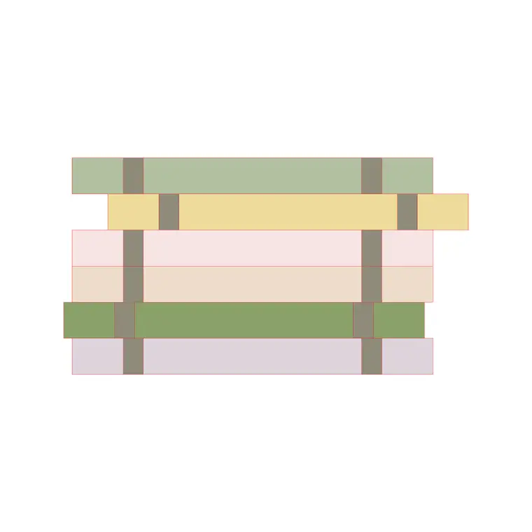
The books-stacking-2 block in the accessories library gives you a horizontal stack, several books laid flat one on top of another, which is honestly the more versatile of the two common book arrangements for elevation work. A horizontal stack works as a standalone accent on a low shelf or side table, it works as a base for something to sit on top of, a small vase or a clock for instance, and it reads convincingly at a wider range of scales than an upright row of spines does, because you're not relying on the viewer being able to make out individual book widths at a distance.
Because the horizontal stack reads well at a range of scales, it's also a forgiving block to use when you're not entirely sure yet what the final shelf styling will look like, it holds a shelf's visual weight reasonably well as a placeholder during early concept work, then gets refined or supplemented with more specific decor once the design direction is locked, rather than needing to be swapped out entirely.
Horizontal stacks versus upright spines
Upright spines, the row-of-books-on-a-shelf look, is the other common arrangement and it's better suited to filling a full shelf width in a study, library, or office elevation where the intent is genuinely to show a working book collection rather than a styling accent. The two aren't really interchangeable, a horizontal stack on a mantel styling vignette and a full upright row on a study shelf are doing different jobs, so pick based on whether the books are meant to be the visual detail or the functional backdrop.
A hybrid approach also works well on a taller bookcase elevation, upright spines filling the bulk of a shelf run to suggest genuine volume, with a horizontal stack breaking up one section to prevent the whole wall from reading as a uniform grid of vertical lines, which is closer to how an actual well used bookcase looks after years of books being pulled out, read, and put back in slightly different spots.
Realistic proportions so the stack doesn't look like a brick
Proportion is where a stacked books block can go wrong fast if you scale it carelessly. A typical hardcover in a decorative stack runs somewhere in the range of 20 to 40 millimeters thick and 200 to 300 millimeters in width and depth, so a stack of four or five books, which is a realistic decorative grouping, lands somewhere around 100 to 180 millimeters tall total. Scale the block up past that without checking and you end up with a stack that reads like a stone plinth rather than a scattering of books, which undercuts the whole point of the accessory.
It's worth building a mental habit of checking book block proportions the same way you'd check any furniture block, hold the dimension range in your head, 20 to 40 millimeters thickness per book, and glance at the inserted block relative to a known reference nearby, a door handle, a power outlet, anything on the elevation with a dimension you already know well enough to eyeball a comparison against.
Layering books with other shelf accessories
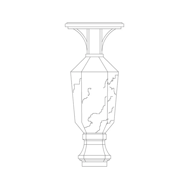
Books rarely sit alone in a convincing shelf vignette, in my experience the strongest combination is a horizontal book stack with a vase or small decor object placed either beside it or resting on top of it, the height variation between a tall vase and a low flat book stack is exactly the kind of asymmetry that makes a shelf read as styled rather than staged in a grid. If your accessory set includes a carved vase or a small framed piece, grouping it against the book stack does more for the elevation than either block would do sitting alone.
Color and shading matter here too even in a line drawing, if your book stack block includes any hatch or fill variation between individual books in the stack, keep that variation visible rather than letting it get lost under a heavier decor object placed on top, since that visual texture, rather than any single detail, is what actually sells the stack as a collection of individual objects rather than one solid shape.
Getting it onto the right layer and scale
Insert the block with INSERT so the base sits correctly on your shelf line, keep it on a decor or accessories layer separate from the shelving unit itself so you can hide styling elements independently when you need a clean furniture-only elevation for construction documentation. Double check scale against the shelf depth you've drawn, a book stack deeper than the shelf itself is an easy error to miss at a glance but obvious the moment someone actually measures the drawing.
On a larger set with multiple bookshelf elevations repeated across different units or rooms, resist the urge to copy the exact same book stack placement onto every instance, even a small variation, a different number of books in the stack, a slightly different position along the shelf, keeps a repeated elevation from reading as an obviously duplicated template once a client flips through several sheets in sequence. It's a small discipline, but it pays off the same way varying accessory placement pays off anywhere else in a styled elevation, a set of drawings that all look individually considered rather than mechanically duplicated reads as more professional the moment a client or reviewer starts comparing sheets side by side.
Further reading
Questions
Frequently asked
Should books be shown on every shelf in an elevation?+
No, an every-shelf-full look reads busier and less realistic than a few shelves styled with books and objects and a few left more open, real shelving is rarely uniformly packed.
What's a realistic height for a stack of five books?+
Roughly 100 to 180 millimeters depending on the book sizes you're representing, check that against your shelf spacing before finalizing the elevation.
Horizontal stack or upright spines for a study elevation?+
Upright spines generally read more convincingly for a working study or library shelf, horizontal stacks work better as a styling accent on a lower or more decorative shelf.
Free downloads from this article
Free CAD block library
Download the blocks from this article — free, no signup