A Signage and Wayfinding Designer's Guide to CAD Blocks
Free CAD blocks for wayfinding plans, accessible signage symbols and site context, with scale tips for sign schedules.
Saumyajit MaityUpdated 10 May 20265 min read
Wayfinding is a plan reading problem before it's a graphic design problem
The part of wayfinding design that non specialists usually underestimate is how much of the actual work happens on a scaled site plan long before a single sign face gets designed, because you can't decide where a directional sign belongs, or whether a monument sign will actually be visible from an approaching car, without a properly scaled drawing of the site and the decision points a visitor will hit as they move through it. I always start a wayfinding project the same way, walking the site plan at real scale and marking every decision point, a fork in a corridor, a lobby, a car park entrance, before I even think about what a sign should say.
That sequence matters because a beautifully designed sign in the wrong location solves nothing, and it's genuinely surprising how often a project skips the scaled site analysis step and jumps straight to sign face design, only to discover during installation that a key decision point was missed entirely. That upfront analysis stage feels slow compared to jumping straight into sign face design, but it's genuinely the part of the process that determines whether a finished wayfinding scheme actually works once real visitors are using it, rather than just looking coherent on a presentation board. I'll typically walk the actual route myself where possible, or at minimum a very recent site photo set, rather than relying purely on an architect's floor plan, since decision points a visitor genuinely experiences, a confusing lift lobby, an ambiguous stair landing, don't always jump out from a flat drawing the way they do when you're physically standing in the space.
Accessibility symbols, the backbone of a compliant sign schedule
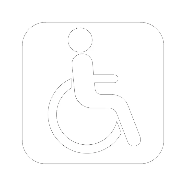
The wheelchair accessible block from Building Symbols on cadblockdwg.com is essentially non negotiable on any signage project with an accessible route component, since most jurisdictions require the International Symbol of Access on signage marking accessible entrances, parking, toilets and routes, and having a correctly proportioned reference block on your plan helps you place and size that symbol consistently across every sign in a schedule, rather than eyeballing it fresh for each one.
I keep a dedicated Building Symbols layer that carries every accessibility and directional symbol reference used across a project's sign schedule, so a client or reviewer can isolate exactly what's required at a glance, and cross referencing that layer against the sign schedule document catches a missed accessible route marker long before installation day.
Testing sightlines and visibility with context blocks
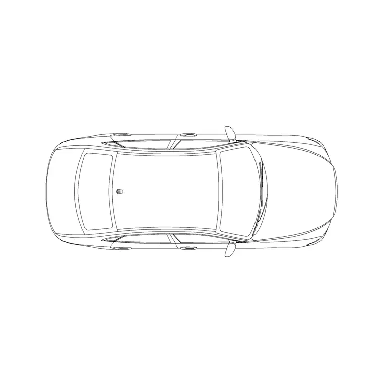
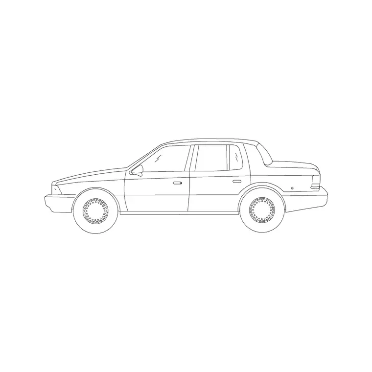
A sign that reads perfectly in an elevation drawing can still fail on site if a parked car, a mature tree or a piece of street furniture blocks the sightline to it from the direction most visitors actually approach from, so I'll routinely bring in a sedan car block from Vehicles and a pine elevation block from Trees & Plants to test visibility along realistic approach paths, checking sign height and setback against those obstructions rather than assuming a clear line of sight that might not exist once the site is fully built and landscaped.
This check matters especially for vehicular signage, a monument sign or a directional sign meant to be read from a moving car, where the available reading time is genuinely short and a single obstruction, a delivery van parked in the wrong spot on a busy day, can be the difference between a driver catching the turn or missing it entirely.
Scale and sheet size, the part that determines legibility
Sign face sizing is ultimately a legibility calculation, viewing distance drives letter height, and letter height drives overall panel size, but you still need an accurate site plan at a consistent scale to place and dimension every sign correctly relative to the paths and decision points it's serving. Work at 1:100 or 1:200 for a full site wayfinding plan, and remember that your final printed output still has to respect standard paper conventions, most consultants working internationally reference [ISO 216 paper sizes](https://en.wikipedia.org/wiki/ISO_216) when setting up sheet layouts, so a plan built cleanly at a fixed scale drops straight into an A1 or A0 sheet without last minute rescaling.
Getting the sheet size decision right early also saves a genuinely annoying problem later, discovering your carefully dimensioned plan doesn't actually fit cleanly on the paper size your printer or your client expects for a formal presentation.
Building a sign location plan that survives revisions
Keep each sign type on its own layer, DIR for directional, ID for identification, REG for regulatory and accessibility, so a revision to the directional sign family doesn't risk accidentally moving or deleting an identification sign sitting nearby on the same plan. I also number every sign location directly on the plan and cross reference that number to a separate sign schedule document, which is standard practice and saves an enormous amount of confusion once a project has gone through two or three rounds of client revisions and the sign count has shifted.
This numbering discipline pays off hugely at the fabrication stage too, since a fabricator working from a sign schedule with matching numbers on the location plan can install with far fewer clarification calls than one working from a plan that's only labelled with generic descriptions.
A final check before the schedule goes to fabrication
Before locking a sign location plan for fabrication, walk it once more checking every symbol block against a known dimension to confirm nothing drifted out of scale during the revision process, this happens more often than you'd expect when a plan has been edited by multiple people over several weeks. And keep in mind a site plan is fundamentally a [scale](https://en.wikipedia.org/wiki/Scale_(ratio)) representation of real distances a visitor will actually walk.
So the catch here is that a decision point that looks close together on a crowded A3 print might be a genuinely long walk on site, worth double checking against real world distances before you finalise directional sign copy that promises a destination is closer than it actually is. A quick trick I use is measuring actual walking time off the scaled plan at a typical pedestrian pace, somewhere around 1.2 to 1.4 metres per second, so any distance or minutes figure printed on a sign is grounded in the real geometry of the site rather than a rough guess made while staring at a small scale printout.
Further reading
Questions
Frequently asked
Where do I find accessible signage symbol CAD blocks?+
The wheelchair accessible block is in the Building Symbols category on cadblockdwg.com, useful as a reference for International Symbol of Access placement and sizing across a sign schedule.
What scale should a wayfinding site plan be drawn at?+
1:100 or 1:200 works well for a full site wayfinding plan, keeping the drawing legible while still fitting standard sheet sizes when it's time to print or export the sign location plan.
How do I check whether a sign will actually be visible on site?+
Bring realistic context blocks, a parked car, a mature tree, into your plan along the approach path a visitor would actually take, and check sightlines and setback against those obstructions rather than assuming a clear line of sight.
Free downloads from this article

Free CAD block library
Download the blocks from this article — free, no signup