Metal vs glass chandelier blocks: which reads better in elevation
Why metal and glass chandelier blocks need different line weight and hatching to read correctly in a flat CAD elevation.
Saumyajit MaityUpdated 25 March 20265 min read
Material reads differently the moment you draw it flat
A chandelier's material, metal frame versus glass or crystal detailing, does not just change how the fixture looks in a photo, it changes how the block should be handled once you flatten it into a 2D elevation, because metal and glass communicate very differently through line weight and hatching, and treating both the same way on a drawing is one of the quicker ways to make an elevation look generic.
Metal chandelier blocks: let the line weight do the work
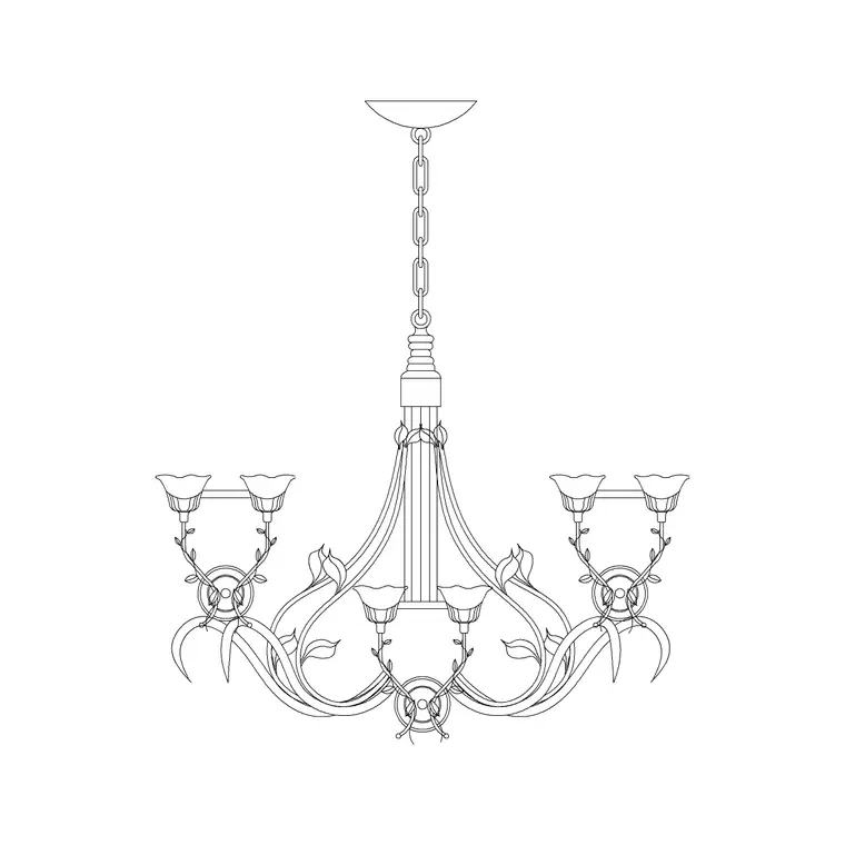
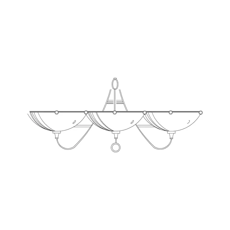
The Long Suspended Chandelier Metal Type A block is built around a visible metal frame, arms, a central stem, sometimes a cage or drum structure, and in elevation this kind of fixture reads best with confident, slightly heavier line weight on the frame elements so the structure itself is legible even at a smaller plot scale. Metal fixtures also tend to read well with a bit of hatching or shading on the frame to suggest dimensionality, since a metal chandelier's visual interest is mostly in its structure and silhouette rather than in transparency.
A quick way to check whether you have overdone the line weight on a metal fixture is to squint at the printed elevation from a normal reading distance, if the chandelier reads as a solid black silhouette with no internal structure visible, the hatching or line weight has gone too far and the fixture has lost the very detail that made it worth specifying as metal in the first place, so back off the density until individual arms or frame elements are still distinguishable even at a glance.
Glass and crystal chandelier blocks need the opposite treatment
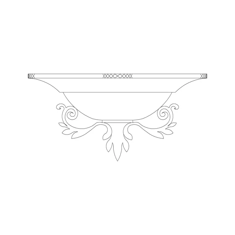
A glass or crystal heavy fixture, closer to what the round chandelier style often represents, depends on transparency and light scatter for its visual character, which a flat black and white elevation cannot really show directly, so the trick is using lighter line weight and leaving more open, unhatched space within the fixture's silhouette to suggest the material is letting light through rather than blocking it. Overhatching a glass fixture is the single fastest way to make it read as solid and heavy on paper, which defeats the entire point of specifying glass in the first place.
A light grey or pale hatch at low density across the glass elements, rather than leaving them completely blank, can help distinguish the fixture from the empty background of the wall behind it without tipping back into looking solid, a balance that usually takes a test print or two to calibrate correctly for your specific plot scale and line weight table.
Rendered views tell the material story better than pure line elevation
If a project genuinely needs to sell the difference between metal and glass to a client, a flat DWG elevation is honestly a limited tool for that job, and this is where pairing the CAD elevation with a rendered view, built in a tool like SketchUp or a similar 3D package, earns its keep, since material and light transmission are things a rendered image communicates far more convincingly than line weight conventions ever will. Use the DWG elevation for the working drawing set and technical coordination, and lean on a render for the material conversation with the client.
Which one actually reads better depends on the room, not a universal rule
In a dense, detail heavy elevation, say a kitchen or a study full of cabinetry and casework, a metal chandelier's stronger silhouette tends to hold its own against all that surrounding detail better than a lighter glass fixture would, which can get visually lost in a busy drawing. In a clean, minimal elevation with a lot of negative space, a glass or crystal fixture's lighter touch fits the mood of the drawing better and does not compete with the room's simplicity. Pick based on what is actually surrounding the fixture, not a blanket preference for one material over the other.
It is also worth considering the drawing's eventual output, a chandelier destined for a printed black and white construction set can lean more heavily on line weight contrast to do the material storytelling, while one destined mainly for a colour rendered presentation can afford a slightly lighter touch in the base CAD file since the render will carry most of the material read anyway.
Practical steps for either material in your DWG
Whichever material you are drafting, insert the block as DWG with INSERT to keep it as a clean named block, set it on its own lighting layer, and adjust line weight or hatch density through your layer or object properties rather than redrawing the geometry, since both blocks already carry the correct proportions and just need the line treatment adjusted to suit the surrounding drawing's density and mood.
Plot scale and paper size affect this more than people expect too, a line weight and hatch density that reads well on a large format print can look completely different once the same DWG is plotted down onto a smaller ISO 216 sheet, an A1 set reduced to A3 for a client meeting, so if the elevation is likely to travel across multiple sheet sizes, test the chandelier's line treatment at the smallest size it is likely to be printed at, not just the largest, since a fixture that reads with rich material contrast on a big sheet can collapse into a flat blob once it shrinks onto a handout sized page.
Mixed material fixtures split the difference
A lot of chandeliers on the market today are not purely one material or the other, a metal frame with glass or crystal drops hanging off it, or a metal cage wrapped around a cluster of small glass globes, and drafting these well in a flat elevation means applying both conventions to the same block rather than picking just one. Draw the frame or structural elements with the heavier line weight and hatching that suits metal, and leave the glass or crystal elements lighter, with less fill, so the eye reads the fixture correctly as structure plus light rather than one uniform material. This takes a little more care than a single material fixture, since you are essentially applying two different line treatments within one block, but it is worth the extra five minutes because a mixed material chandelier drawn with one flat treatment across the whole thing tends to lose exactly the contrast that makes it visually interesting in the first place.
Further reading
Questions
Frequently asked
Does line weight actually change how a chandelier block reads in elevation?+
Yes, noticeably. Heavier line weight and some hatching suits a metal frame fixture, while lighter line weight and open space within the silhouette suits a glass or crystal fixture.
Should I use a render instead of a DWG elevation to show material?+
For selling the material story to a client, a render communicates transparency and light far better. Keep the DWG elevation for your working drawing set and technical coordination.
Which material suits a busy, detail heavy elevation better?+
A metal frame fixture generally holds its own better in a dense elevation full of cabinetry or casework, since its stronger silhouette does not get visually lost the way a lighter glass fixture can.
Free downloads from this article

Free CAD block library
Download the blocks from this article — free, no signup