What CAD Blocks You Need to Draw a Metro or Railway Concourse
The real stairs, signage, doors and people blocks that fit a metro or railway concourse plan, and why the platform, gates and train aren't included.
Sumana KumarUpdated 31 May 202611 min read

A concourse drawing lives or dies on wayfinding, not architecture
A station concourse is one of the few building types where the actual walls matter less than the signage and circulation logic layered on top of them, because the entire design brief is moving a large, constantly changing crowd from the street entrance to a platform, or the reverse, with as few decision points and bottlenecks as possible. I've found that a concourse plan reads as credible the moment it shows real people moving through real openings past real wayfinding symbols, and reads as a rough sketch the moment any of those three things is missing or just implied with a label.
I'll be upfront that this library does not carry ticket gates, platform edges, departure boards or a train, those are specialist transit infrastructure products with their own manufacturer and safety standards, sourced from a transit authority's own component library rather than a general CAD block catalogue. What it does carry, genuinely well for this building type, is stairs, wayfinding and accessibility signage, doors, people, and an information counter, and that's the checklist I'm walking through here.
The honest framing I'd give this post is that a concourse drawing is really two overlapping systems on one sheet, the architecture, which this library supports, and the transit operator's own systems, gates, signalling, platform equipment, which it doesn't, and keeping that boundary clear in your own head from the start avoids a drawing that quietly promises more transit-specific detail than it can actually deliver, whether the project is a small suburban metro entrance or a major intercity terminal concourse.
Stairs and the escalator symbol, drawn honestly
Vertical circulation is the single most important system in a multi-level concourse, connecting street level to ticket hall to platform, and the stairs category's 40 real products, dog-leg, L-shape, U-shape and circular staircase plans with matching elevations, cover the pedestrian stair requirement genuinely well for showing a proper flight rather than a schematic diagonal line.
The building-symbols category also carries a real escalator symbol, esclator, and I want to be precise about what that actually is, it's a 2D wayfinding and plan symbol showing where an escalator sits and which direction it runs, not a modelled mechanical escalator with its own structural and equipment detail, which is a genuinely different, specialist item sourced from an escalator manufacturer's technical drawings once the specific unit is selected.
Using the escalator symbol alongside a real stair block at the same circulation point is actually the honest way to draw most concourse vertical cores, since almost every escalator installation in a public transit building runs alongside a parallel stair for when the escalator is out of service, and showing both together is standard practice, not redundancy, on a station drawing.
The stairs category's spiral and circular options are also worth considering for a tighter vertical core where a full dog-leg run genuinely won't fit, though I'd flag that a spiral stair is a poor substitute for a straight or dog-leg run as a primary means of escape in a high-occupancy public building, since most fire codes restrict spiral stairs to secondary or low-occupancy routes, so treat the circular blocks here as suited to a plant access stair rather than a main passenger escape route.
People, in the volume a concourse actually needs
A quiet corridor drawing needs one or two human figures to establish scale, a station concourse needs considerably more, because the whole point of the drawing is checking whether a crowd, not an individual, can move through the space without a bottleneck forming at a pinch point. The people category's 174 real blocks, standing and sitting figures across a genuine range of poses, let you populate a realistic crowd density along a concourse route rather than the single lonely figure that under-represents how the space will actually be used at peak hours.
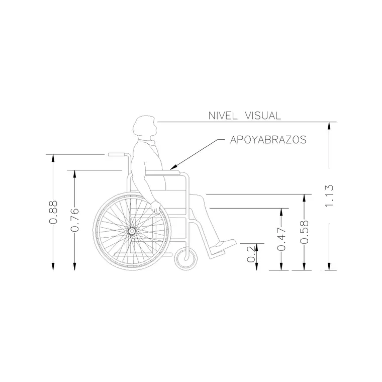
human-figure-disable-1 belongs at every accessible route through the concourse, the step-free path from street to platform, the accessible ticket gate where one exists, the platform lift lobby, because a station's accessible route is one continuous journey rather than a single compliant door, and showing the figure at each link in that chain is what actually demonstrates the route is unbroken.
I'd also place a few seated figures near any concourse seating or waiting area, using the human-figure-sitting set, since a concourse that provides seating for passengers waiting on a delayed service is a genuinely different, more humane design than one that assumes everyone is always in transit, and showing that seating in use helps make the case for including it in the first place.
Crowd density in a concourse also isn't uniform across the day, and while a single static plan can't show that variation directly, I'll sometimes prepare two versions of the same people layout, a typical off-peak density and a busier peak-hour density, using the same set of figures at different spacing, because that comparison is a genuinely useful way to communicate to a client or reviewer just how much headroom the circulation width actually has before it becomes uncomfortable at the busiest point of the day.
Wayfinding and accessibility symbols, the real strength of this library here
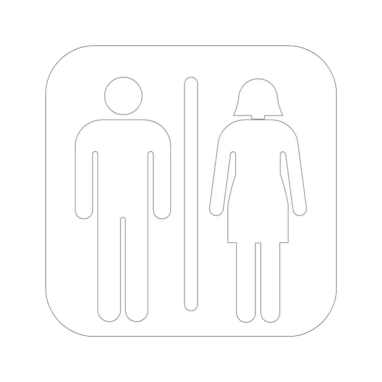
This is genuinely the category where this library punches above its weight for a station drawing, the building-symbols category's 112 real products include, alongside north arrows, a wheelchair-accessible symbol, an emergency-exit symbol, male-female toilet signage, and the escalator symbol already mentioned, all of which are exactly the wayfinding language a transit authority's own signage standard expects to see represented on a submitted concourse plan.
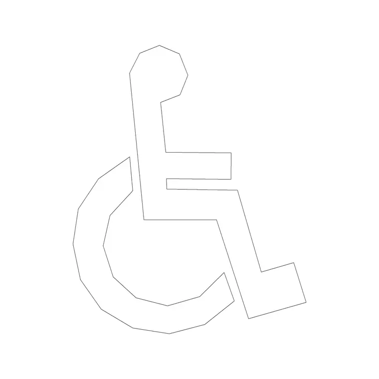
I'd place the wheelchair-accessible symbol at every lift, accessible gate and accessible toilet rather than just once near the main entrance, because station accessibility audits specifically check for a continuous, clearly marked accessible route rather than a single token symbol near the ticket hall, and the drawing should reflect that continuity honestly.
Emergency-exit symbols matter more on a concourse than almost any other building type in this whole series, given the sheer number of people who can be in the space at once during peak hours, and marking every final exit route clearly, not just the main entrance doors, is exactly the kind of life-safety detail a fire strategy reviewer checks first on this kind of drawing.
Male-female toilet signage is worth placing at the correct door with the correct orientation too, since public toilet facilities on a station concourse see a genuinely high volume of use across a huge range of visitors, and getting the small, unglamorous details, the correct symbol, the correct door width, right is part of what makes a station feel properly designed rather than merely built to a minimum spec.
Doors at the entrance, ticket hall and platform access points
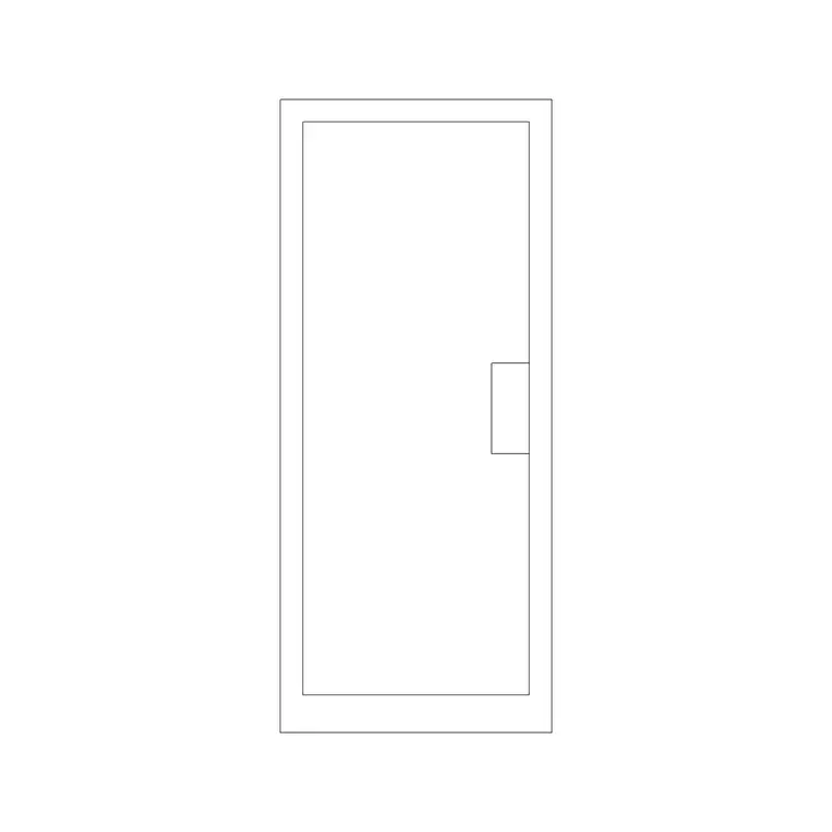
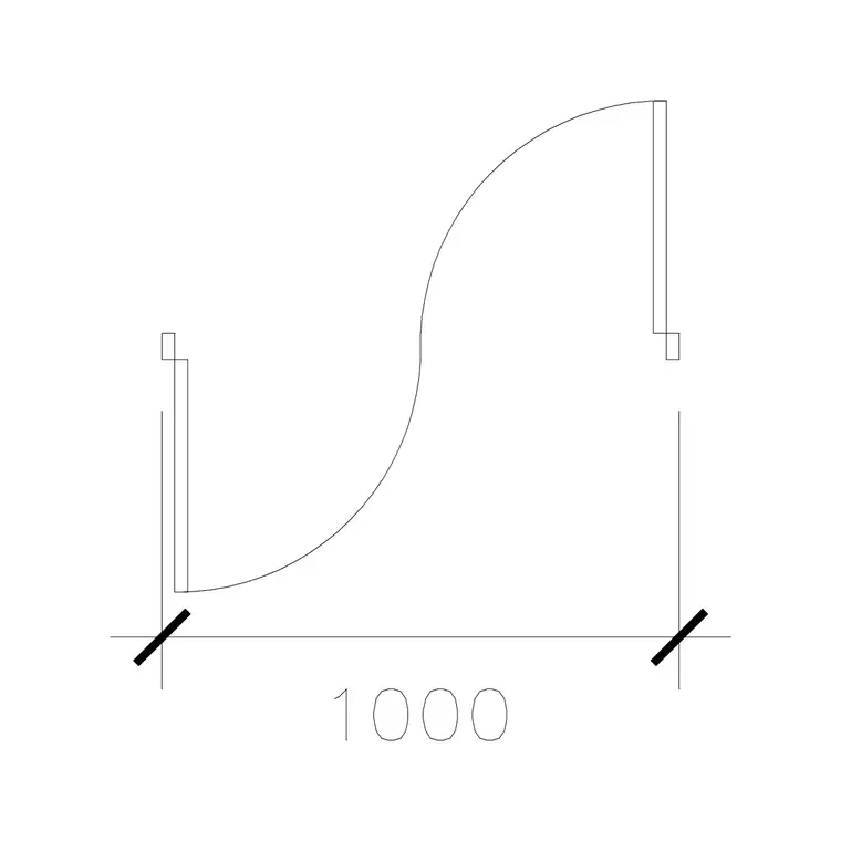
For the main street entrance, a wider glazed door reads more honestly than a standard single leaf, and the doors category's glass-door block, alongside the wider 190-product range, gives you a realistic glazed entrance option, while 1000-mm-door-type-1 covers the standard internal doors, staff areas, plant rooms, secondary access points, throughout the rest of the concourse.
What I'd flag specifically is that ticket gates and platform access barriers themselves are not doors in the conventional sense, they're transit-specific access control equipment with their own manufacturer footprint and clearance requirements, so a ticket hall's gate line is better drawn as a dimensioned zone from the actual gate supplier's data sheet than represented with a generic door block that would misstate both the footprint and the function.
I'd still use a door block to check the clear width of any manual accessible gate or side gate next to the automated gate line, since that specific opening genuinely is a door in the traditional sense and needs to clear the same accessibility width as any other accessible route through the building.
Staff-only doors, plant room access and any back-of-house corridor also deserve a properly scaled door block rather than a schematic line, because a concourse's operational areas, cleaning stores, staff rest rooms, electrical risers, are drawn to the same real-world dimensioning standard as the public areas even though they're rarely the focus of a client presentation, and skipping that detail on the assumption that nobody looks closely at back-of-house is exactly the kind of shortcut that surfaces as a problem during construction.
An information point, and the small furniture that makes a concourse feel staffed
Most station concourses of any real size have an information counter or a staffed ticket office window, and the office category's reception-table block is a reasonable stand-in for this kind of counter at the space-planning stage, giving the drawing a genuine staffed point rather than an unlabelled rectangle in the middle of the concourse.
I'd place a standing figure at the counter, on both sides, staff and passenger, to check whether the queuing space in front of it is genuinely adequate for a busy period, since an information counter with too little standing room in front of it becomes its own bottleneck in exactly the kind of high-traffic space this whole drawing exercise is meant to be checking for.
A small seating cluster near the information point, using ordinary furniture blocks rather than anything station-specific, is also worth including if the brief allows for it, because passengers checking a delayed departure or waiting for assistance genuinely benefit from somewhere to sit close to the point of information rather than being expected to stand in the main circulation flow while they wait, and showing that consideration in the drawing is a small but genuine quality-of-design signal to anyone reviewing the layout.
Retail kiosks along the concourse, and keeping them clear of the flow
Larger concourses very often carry a run of small retail units along one wall, a coffee kiosk, a newsagent, a phone charging point, and while this library doesn't carry a dedicated transit retail kiosk block, the office category's reception-table or a simple counter block works as a reasonable stand-in for blocking out that retail frontage at the early planning stage, before the actual shopfitter's joinery design takes over.
What matters more than the kiosk furniture itself is keeping any retail unit's queue entirely clear of the main pedestrian flow line running between the entrance, the ticket hall and the platform access, because a coffee queue that spills into the primary circulation route is exactly the kind of pinch point that a concourse this heavily trafficked cannot absorb at peak hours without creating a genuine safety issue, not just an inconvenience.
I'd check this by placing a row of standing figures for the queue itself, offset from the main through-route by at least the width of one more standing figure, and confirming that offset holds even when the main flow is populated at the busier peak-hour density mentioned earlier in this checklist, since a retail queue that looks fine against an empty concourse can very easily become the exact bottleneck the whole layout was designed to avoid once real crowd volumes are considered.
Retail units also need their own back-of-house access for stock deliveries, separate from the public concourse wherever the site allows, and that's worth marking on the plan with its own door from the doors category rather than assuming deliveries will happen through the same public entrance passengers use, since a delivery trolley crossing a crowded concourse at a busy time of day is a genuinely avoidable operational problem if it's planned for at the drawing stage.
Concourse flooring, and the honest gap list
The paving category's 83 real products cover the concourse floor surface pattern cleanly for a plan at this stage, useful for showing a change in floor finish between the ticket hall and a retail concourse zone, or a tactile paving strip approaching a platform edge, without manually hatching every zone from scratch.
To close the loop honestly, this library does not carry ticket gates, ticket vending machines, departure and arrival boards, platform edge doors, or a train, all specialist transit infrastructure sourced from the operator's own equipment suppliers and safety-certified separately from the architectural shell. What it does carry, and carries genuinely well for this building type, is the architecture, stairs, doors, the escalator symbol, wayfinding and accessibility signage, people at realistic crowd density, and an information point, which together are most of what makes a concourse plan look complete and legible at the design stage.
So the practical split for a station project is this, use this library confidently for the building shell and the human-scale wayfinding story, and treat every piece of transit-specific equipment, gates, boards, platform systems, as a separate, safety-certified drawing that comes from the transit authority's own standards, because conflating an architectural block library with certified transit equipment is exactly the kind of shortcut that shouldn't happen on a public safety project.
If I had to leave one instruction for anyone drafting their first concourse layout, it would be this, draw the people and the wayfinding symbols with as much care as the walls, because on this building type, more than almost any other in this series, that's genuinely where the design review's attention goes first, and a concourse plan that gets the human circulation right will forgive a lot of roughness elsewhere, while one that gets it wrong won't be saved by beautifully drawn walls, regardless of how much architectural detail sits elsewhere on the same sheet.
Further reading
Questions
Frequently asked
Is there a ticket gate or turnstile CAD block?+
No, ticket gates and turnstiles aren't in this catalogue. They're transit-specific access control products, so draw the gate line as a dimensioned zone from the actual equipment supplier's data sheet.
Does the library have an escalator block?+
There's an escalator wayfinding symbol, esclator, in the building-symbols category, useful for plan signage, but not a modelled mechanical escalator. The physical escalator comes from the manufacturer's own technical drawing.
What symbols cover accessibility on a station concourse?+
The wheelchair-accessible symbol from building-symbols, placed alongside human-figure-disable-1 at every lift, gate and toilet along the accessible route, is the combination that shows a continuous compliant path rather than a single token symbol.
Is there a train or platform edge block?+
No, trains, platform edges and platform edge doors aren't in this library. Those are safety-certified transit infrastructure items that belong to the railway or metro operator's own specialist drawings.
Free downloads from this article

Free CAD block library
Download the blocks from this article — free, no signup