Blocks for a signage and wayfinding plan
The symbol set that makes a signage and wayfinding plan legible to a fabricator, from direction arrows to accessible signage markers.
Saumyajit MaityUpdated 4 July 20266 min read
A wayfinding plan is written for a fabricator, not a client
There's a real difference between a wayfinding concept board, which is meant to sell a client on a signage family's look, and a wayfinding plan, which is a working drawing meant to tell a fabricator and installer exactly where every sign goes and what it needs to communicate at that point. I draft the two very differently, the concept board gets renders and mood, the plan gets plain symbols, tags, and a schedule, because a fabricator reading a plan under deadline doesn't need atmosphere, they need clarity.
I'll usually attach a short legend directly on the plan sheet itself too, not buried in a separate document, translating each arrow weight and symbol into plain language, because a fabricator working across several projects at once benefits from a plan that's self explanatory on its own rather than one that depends on institutional knowledge from an earlier meeting they may not have attended.
Direction arrows as the backbone of the plan
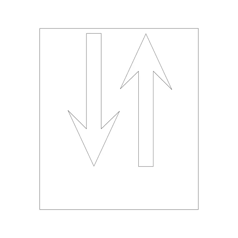
An arrow block is the single most used symbol on any wayfinding plan I draft, marking directional signage at every decision point along a circulation route, lobby to lift core, corridor junction to exit stair, and it's worth keeping two or three arrow variants in your palette, a simple directional arrow and a heavier one for primary wayfinding versus secondary. Consistency matters more than variety here, use the same arrow style for the same signage tier across the entire plan so a reviewer can tell at a glance which signs are primary wayfinding and which are secondary or informational.
Test the arrow density on the plan against how someone would actually experience the space in sequence, walking it mentally from the main entrance outward, because it's easy on a static plan to under place directional signage at a junction that looks obvious from a bird's eye view but is genuinely ambiguous at eye level on site, a corridor that splits behind a structural column for instance reads completely differently in person than it does from directly above on a drawing.
Viewing distance is worth checking against each sign location too, not just message content, since a directional sign mounted where someone only has a few metres to read it before reaching a decision point needs shorter, punchier wording than one positioned along a long approach corridor where there's time to read a fuller message, and a wayfinding plan that specifies the same message length everywhere regardless of approach distance tends to produce signs that either feel sparse in a long corridor or genuinely unreadable in time at a tight junction. I note approach distance roughly on the plan at each sign location precisely so the message content, decided later in the process, gets sized to match how much time a person actually has to read it.
Accessible signage as its own tagged category
Accessible route signage, tactile signage at accessible entries, accessible restroom markers, needs to be visually distinct from general directional signage on the plan, so I tag every instance of it with a wheelchair accessible symbol placed right next to the sign location marker, which does double duty, it flags the sign as accessible category to the reviewer and it cross references directly back to the accessible route verification if one exists for the same project. Per Universal design and Accessibility guidance, wayfinding for accessible routes generally needs to be continuous and unambiguous, so don't let those signs get buried visually among general directional ones.
I also keep a running note on the plan of which accessible signs are tactile versus visual only, since the two often have different mounting height and approach clearance requirements even within the same accessible category, and lumping them together under one generic symbol tends to create ambiguity for the fabricator about which spec applies to which specific sign location on the schedule.
Entry points, gates, and the start of the journey
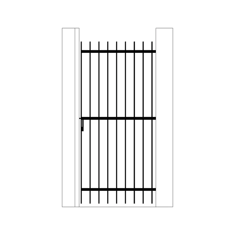
Wayfinding starts before someone is inside the building, so a gate block like an iron gate is worth marking on the plan wherever a wayfinding sign needs to sit at a site entry, a vehicular gate, a pedestrian gate, because the first sign someone reads is often the one that tells them they're at the right entrance at all. Missing this on the plan is a common gap, teams design beautiful interior wayfinding and then realise post construction there's no sign at the property boundary telling a visitor where to actually go.
Building the sign schedule alongside the plan
Every sign marker on the plan should carry a tag that maps to a schedule row, sign type, message content, mounting height, and material finish, the same tagging discipline as an FF&E schedule, and mounting height deserves its own column since it varies by sign type, ADA style tactile signage is commonly specified at a particular height range that differs from a large format directory sign, so don't assume a single mounting height works across the whole plan.
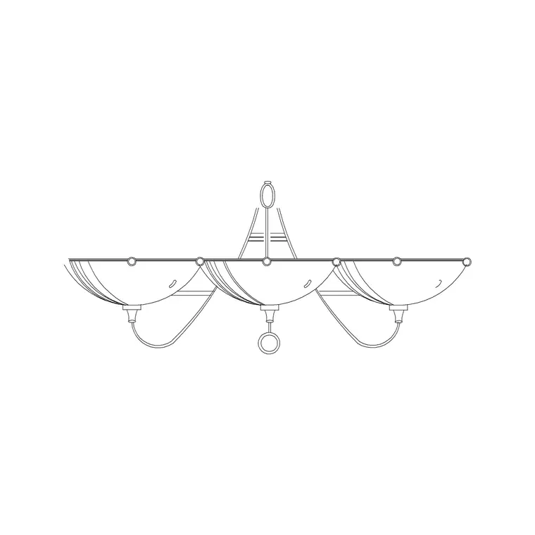
Where a sign is specified as illuminated, note the fixture alongside it, a wall lamp style block placed next to the sign marker gives the reviewer a quick visual of how the sign is lit without needing to flip to a separate electrical sheet to understand the intent.
Mounting substrate matters as much as mounting height on the schedule, since a sign specified for a stud partition wall needs different backing hardware than the same sign mounted to solid masonry or, worse, glazing, and a fabricator who discovers the substrate mismatch on install day is going to either delay the install or improvise a fix that wasn't part of the original spec. I add a substrate column to the schedule specifically to catch this before fabrication, cross checked against the architectural wall type drawings rather than assumed from the plan alone.
Print legibility for a plan that gets marked up on site
Wayfinding plans get printed, folded, and carried around a construction site more than most drawings, so keep symbols bold enough to survive a black and white photocopy and a coffee stain, arrow blocks especially benefit from a slightly heavier lineweight than you'd use on a polished client sheet, because this drawing's real audience is someone standing in a half finished corridor trying to confirm where sign fourteen actually goes.
Keep a revision column on the accompanying schedule too, since wayfinding content, the actual text and room names on each sign, tends to change more than the physical sign locations do, a department gets renamed, a suite number changes, and it's much faster to update one schedule column than to hunt through the plan itself for every instance of an outdated room name.
It's also worth running a rough check on message length against the actual panel size specified for each sign type before the schedule goes final, since a generously worded message that fits comfortably in a rendered concept image can end up needing a smaller font than the accessibility or legibility standard allows once it's actually laid out on the panel dimensions being fabricated, and catching that mismatch on the plan, where adjusting either the message or the panel size costs nothing, is far cheaper than catching it after a batch of signs comes back from the fabricator with type that's technically illegible from the specified viewing distance.
Further reading
Questions
Frequently asked
What's the difference between a wayfinding concept board and a wayfinding plan?+
A concept board sells the look and family of signage to a client using renders and mood imagery, while a wayfinding plan is a working drawing with plain symbols and a tagged schedule that tells a fabricator exactly where each sign goes.
How should accessible signage be marked differently on a wayfinding plan?+
Tag it with a wheelchair accessible symbol distinct from general directional arrows, so it's immediately identifiable as accessible route signage and cross references cleanly with any separate accessible route verification drawing for the same project.
Should exterior site entry signage be included on the same plan as interior wayfinding?+
Ideally yes, or at least cross referenced. The first sign a visitor reads is often at a site or gate entry, so leaving exterior entry signage off the plan entirely is a common gap that shows up only after construction.
Free downloads from this article


Free CAD block library
Download the blocks from this article — free, no signup