Blocks for a fire escape and evacuation plan
The symbol set for a clear, code-minded fire escape and evacuation plan, from route arrows to accessible refuge points and exit gates.
Sumana KumarUpdated 7 April 20266 min read

An evacuation plan has one reader, someone in a hurry
Every other drawing on this checklist gets read by someone with time, a client in a meeting, a fabricator with a schedule, but an evacuation plan's actual reader is someone glancing at a wall mounted sheet during an emergency or a drill, which changes how it should be drawn entirely. Symbols need to be large, unambiguous, and consistent, because this is the one drawing type where 'looks a bit cluttered but technically correct' is a genuine safety failure, not just an aesthetic complaint.
Post the plan at a consistent location relative to the door on every floor, right beside the exit rather than tucked somewhere less obvious, since even a perfectly drawn plan fails at its actual job if someone can't find it quickly during a real emergency, and consistency of posting location across floors matters almost as much as the accuracy of the route itself.
Route arrows as the primary language of the plan
An arrow block is doing almost all the communicative work on an evacuation plan, marking the primary route from every point on the floor to the nearest exit, and I keep these bold, high contrast, and consistent in style across the whole sheet, because a viewer under stress needs to follow a line of arrows without hesitating over which one to trust. Where a floor has multiple viable routes to different exits, use a slightly different arrow treatment for each so someone can quickly identify which route applies to their location without cross referencing a legend they won't have time to read carefully.
It helps to physically walk each marked route yourself before finalising the plan, timing roughly how long it takes to travel from the furthest point on the floor to the nearest marked exit, because a route that looks short and direct on a two dimensional plan can involve an unexpectedly long real walk once stairs, direction changes, and door operation time are actually accounted for in person.
Route width relative to expected occupant load is worth a rough check too, even on a plan that isn't a full fire engineering calculation, since a corridor that's technically wide enough for normal daily circulation can become a genuine bottleneck if the full occupant load of several rooms is trying to funnel through it simultaneously during an evacuation, and a route that narrows at any single point along its length, a doorway, a stair landing, deserves particular attention because that pinch point is where real world evacuation time actually gets lost, not along the wide open stretches of corridor that look fine on the drawing.
Accessible egress and refuge areas
Not everyone evacuates a building the same way, and a proper evacuation plan needs to show accessible egress routes and, where required, refuge or assembly areas for anyone who can't use a stair during an emergency, marked clearly with a wheelchair accessible symbol at each refuge point. Per Universal design and Accessibility principles, an evacuation strategy that only accounts for one mode of egress is an incomplete strategy, so this symbol needs the same visual weight on the plan as the general exit route, not tucked into a corner as an afterthought.
Confirm the refuge area capacity is actually documented on the plan too, not just its location, since a refuge point that's correctly marked but has no noted capacity leaves a real ambiguity during an actual emergency about how many people it can safely hold, and that's exactly the kind of detail an evacuation plan exists to remove rather than leave implied.
Communication at the refuge point deserves a note on the plan too, since many codes require some form of two way communication, an intercom or a direct line to the fire control point, at a designated refuge area, and a refuge point that's correctly located and correctly sized but has no communication method documented leaves a real gap for anyone actually sheltering there during an emergency, unable to confirm to responders that they're present and waiting. I mark the communication device location directly next to the wheelchair accessible symbol at each refuge point specifically so a reviewer checking the plan can confirm both requirements are met from the same glance rather than having to hunt through a separate specification to find out whether the intercom was actually included.
Exit doors, gates, and hardware that must stay clear
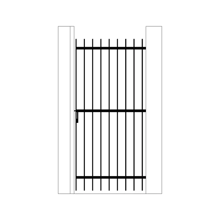
Mark every exit door and, where relevant, exterior gate along an evacuation route, an iron gate on a perimeter fence line for instance, with a note confirming it opens in the direction of egress travel and has hardware that doesn't require a key or special knowledge to operate from the inside. This is a detail fire inspectors check specifically, a gate or door that swings the wrong way or locks from the inside during an emergency defeats the entire purpose of the route drawn leading to it.
Emergency and egress lighting along the route deserves its own marker too, a wall lamp style fixture block noted at each required interval, since a route that reads clearly on a daytime drawing can still fail in practice if the corridor loses ambient light during a power outage and there's no dedicated emergency fixture keeping the path visible.
Panic hardware, where specified, should be called out explicitly rather than left to the door schedule alone, since an evacuation plan reviewer often isn't cross referencing every door schedule during a life safety review, and a quick note directly on the plan, push bar fitted, opens outward, confirms the detail is actually resolved rather than just assumed.
Keeping the plan legible against the base floor plan
The evacuation route needs to visually dominate the sheet over everything else, furniture, finishes, dimensions, so I strip the base floor plan down to walls, doors, and room labels only, then lay the route arrows, exit symbols, and refuge markers over that simplified base at a heavier lineweight and often a distinct colour, red or orange is conventional for exactly this reason, it reads as 'emergency information' at a glance even before someone consciously processes the symbols.
I also cross check the evacuation plan against the current furniture and fit out layout before issuing it, since a route that was clear when the floor plan was empty can end up partially obstructed once furniture, planters, or temporary equipment get added later, and an evacuation plan that doesn't reflect the room's actual current state is a liability rather than a safety asset no matter how correctly it was originally drawn.
Posting locations and print considerations
Evacuation plans get printed small, often laminated at A3 or smaller for wall posting near each exit, which is a much tighter print scale than most working drawings, so test every symbol at that final print size before finalising, an arrow or wheelchair symbol that's crisp at A1 can turn to mush at A3 if the linework was drawn with too much fine detail. This is one of the few drawing types where I'd rather a symbol look slightly oversized on screen than risk it being unreadable on the wall.
Further reading
Questions
Frequently asked
What symbols are non negotiable on a fire evacuation plan?+
Direction arrows marking the route to the nearest exit from every point on the floor, exit door markers confirming direction of swing, and accessible egress or refuge point symbols, all drawn with enough visual weight to dominate over the base floor plan.
Should exterior gates on an evacuation route be checked the same as doors?+
Yes. Any gate along an egress path, an iron gate on a perimeter for instance, needs the same confirmation as an interior exit door, that it swings in the direction of travel and has hardware operable from the inside without a key.
Why do evacuation plans use bold colours and heavy lineweights?+
Because the reader is often glancing at the sheet under time pressure, during a drill or an actual emergency, so the route needs to be immediately legible without close reading, unlike a working drawing meant for someone with time to study it.
Free downloads from this article


Free CAD block library
Download the blocks from this article — free, no signup