Choosing block styles for a client-facing furniture layout board
How to pick furniture and lighting CAD block styles that read clearly to a non-technical client, without dumbing down the actual layout information.
Saumyajit MaityUpdated 9 April 20265 min read
Clients read drawings differently than drafters do
A furniture layout board that's perfectly legible to another drafter can genuinely confuse a client who's never read a plan before, and that gap is worth designing for rather than ignoring, because a client-facing board that fails to communicate clearly, no matter how technically correct it is, doesn't do its job. I've sat across the table from clients staring at a beautifully drafted plan with a completely blank expression, not because the drawing was wrong but because it was speaking a visual language they'd never been taught to read.
The fix isn't dumbing the drawing down, it's choosing block styles and a presentation approach that meets a non-technical viewer where they are, which usually means leaning toward blocks with a bit more visual character, filled or shaded rather than pure outline, and away from the purely diagrammatic conventions that make total sense to another professional but read as abstract to everyone else.
Filled vs outline furniture blocks
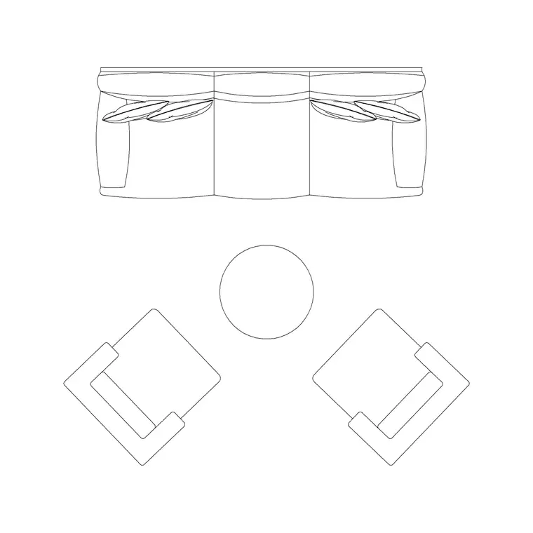
Pure outline furniture blocks, just linework with no fill, are standard for working drawings because they're fast to read at a glance for someone trained on the convention, but for a client board a filled or lightly shaded version of the same sofa set plan block reads more immediately as "this is a sofa" to someone without that training. A light gray or tan fill with a slightly heavier outline, rather than the thin hairline weight typical of a construction drawing, tends to land best on a client-facing piece, since it gives just enough visual weight to feel like furniture rather than an abstract shape.
This doesn't mean going full photorealistic, that's usually overkill and can actually slow a client down as they try to process rendering detail rather than the layout decision the board is trying to communicate, the sweet spot is somewhere between diagram and rendering, filled enough to read instantly, simple enough not to distract.
Lighting blocks that communicate mood, not just fixture location
A wall lamp or fixture block on a technical lighting plan is often just a small symbol marking a location for the electrician, but on a client-facing furniture and lighting layout, the same fixture benefits from a warmer treatment, a soft glow fill or a subtle radial hatch suggesting light spread, since clients are usually far more interested in the mood a lighting layout creates than the exact fixture model or circuit it's on.
That said, don't lose the functional information in the process of making it prettier, a client board still needs to accurately show where fixtures actually sit relative to furniture, since a client approving a layout is implicitly approving fixture placement too, and discovering after installation that the reading lamp position on the board didn't match reality is the kind of mismatch that erodes trust fast.
Keeping the board legible without losing accuracy
Simplify what's shown, not what's true, which means it's fine to drop construction-level detail like exact clearance dimensions or code-reference callouts from a client board since that's not information a client needs to make a furniture decision, but it's not fine to actually change a furniture block's real footprint just to make a layout look more spacious than it is. A layout that looks great on the board and then doesn't actually fit once furniture arrives is a far worse client experience than a board that was honest about tight clearances from the start.
What I do on client boards is keep every block at its true scale and real footprint, and instead simplify by removing non-essential technical annotation and by choosing the friendlier filled block style discussed earlier, so the accuracy underneath the drawing never changes even as the presentation layer on top gets more approachable.
A quick style checklist before sending a board out
Before a client board goes out, check that furniture blocks are filled or shaded rather than bare outline, that lighting blocks suggest warmth or mood rather than sitting as pure technical symbols, that a scale reference, a simple bar scale or a labeled dimension like room width, is visible somewhere on the sheet since clients rarely intuit scale from a plan alone, and that any remaining technical annotation genuinely helps rather than clutters.
One more thing worth doing, walk the board past someone who isn't a designer before it goes to the actual client, a partner, a colleague from another department, anyone without drafting training, and watch what they understand at a glance versus what they have to ask about, since that quick outside check catches communication gaps far more reliably than reviewing your own work with trained eyes that already know what everything means.
Handling revisions after client feedback
Client feedback on a furniture layout board almost always comes back as plain language rather than drafting terms, "can the sofa face the window instead" rather than a dimensioned instruction, and translating that back into an accurate block move is where the friendlier presentation style has to reconnect with the underlying accurate geometry underneath it. Because every block on the board was kept at true scale from the start, this translation is usually simple, move the block, recheck the same clearance and orientation logic you applied originally, and reissue the board rather than starting the layout over.
Keep a version number or date visible on every issued board too, since client-facing furniture layouts often go through two or three rounds before approval, and nothing undermines confidence in a design process faster than a client and a drafter referencing two different versions of the same board without realizing it, a small labeling habit that costs nothing and prevents a genuinely common source of confusion.
Presenting the board in person versus sending it ahead
A board walked through in person, where you can point at a grouping and explain the thinking behind a lighting choice or a furniture pairing in real time, can afford to be slightly less self-explanatory than one sent ahead of a meeting for a client to review on their own, since a board sitting unattended in someone's inbox has to communicate everything the labels and layout can carry without a voice alongside it. If a board is going out cold, lean a little harder on clear labeling, a short one-line description under each grouping, and a friendlier block style overall, since there's no one there to fill in context the drawing itself doesn't provide.
Knowing in advance which situation a given board is headed for is worth building into the workflow from the start, since it genuinely changes how much the drawing itself needs to carry versus how much a conversation around it will carry, and adjusting for that ahead of time beats reworking a board after realizing it needed more explanation than it had.
Further reading
Questions
Frequently asked
Should furniture blocks be filled or outline-only for a client-facing board?+
Filled or lightly shaded blocks generally read more clearly to non-technical clients than pure outline blocks, which are standard for working drawings but can feel abstract to someone without drafting training.
How do I keep a client board simple without misrepresenting the layout?+
Simplify what's shown, not what's true, drop construction-level annotation like exact clearance callouts, but keep every furniture block at its real, accurate footprint so the layout that gets approved actually matches what will be installed.
Why does lighting need different treatment on a client board than a technical plan?+
On a technical plan a fixture block is mainly a location marker for installation. On a client board, a warmer treatment like a soft glow fill communicates the mood the lighting creates, which is usually what a client cares about most.
Free downloads from this article


Free CAD block library
Download the blocks from this article — free, no signup